While in the Netherlands recently, I took a day trip to Leiden to visit the Naturalis Biodiversity Center. I didn’t know a lot about it before I arrived, and it was much bigger than I expected – particularly since it looks pretty modest upon arrival. For some reason, the entrance is via a historic building that includes the shop, cafe and storage lockers, with entrance to the main centre (a large modern building spanning some 6 floors) via a long enclosed pedestrian bridge across a highway. This brings you to the second level of the main building, with the path upstairs looking the most inviting.
Arrival point to the main exhibitions.
This upstairs gallery, Nature’s Theatre, is an impressively comprehensive overview of biodiversity, encompassing not just animals but also plants and fungi (and a few microbes here and there as well) – areas that often get overlooked in favour of more animal-centric displays.
Birds display. I liked how many of the birds were shown in flight, in contrast to the flightless birds that were anchored to the plinth.A walk through the plant kingdom.
There was a lot more to this exhibition’s layout than first met the eye. On the floor of the plants picture above, you may notice a couple of greenish yellow lights set within metal discs. At first these didn’t really mean a lot to me, with their seemingly haphazard positioning and labelling only in Dutch. Their significance only dawned on me after visiting the Primeval Parade, on the level below.
An early section of the Primeval Parade (note the lit-up structures set into the ceiling- they’re important later).
This exhibition follows a spiral path through the earliest stages of Earth’s history, the formation of life and the world’s earliest fossils through to the era of the dinosaurs and concluding with extinct species from the last Ice Age.
A view into the Primeval Parade.
While in this exhibition, I’d noticed a rather dense array of tree-like structures set into the ceiling. They appeared to be linked to a central spiral structure that lit up periodically. I never did quite figure out how that worked (whether it was triggered by visitor use or followed a predetermined cycle), but it gradually dawned on me that the central spiral represented an evolutionary timeline, and the tree-like branches were different evolutionary lineages.
The central spiral exhibit.
Some of the tree branches terminated in white discs with a genus(?) name on it, as you can see in the picture above. Others went through the ceiling and into the floor of the Nature’s Theatre exhibition above . . . becoming those greenish floor lights! Thus the layout of Nature’s Theatre was driven by the evolutionary history of each lineage, as outlined in the Primeval Parade exhibition below.
Once the penny dropped and I knew what was going on, this added a whole new meaning to the layout of each exhibition space. I spent a lot more time looking around and across the two floors than I would have otherwise. The arrangement of these two floors is one of the most complex and clever bits of 3D spatial communication I’ve seen. And I was impressed – as a scientist. But as a visitor researcher, I have some questions/caveats. How clever is too clever? Do visitors generally grasp what’s going on? (It might be more obvious to Dutch speakers, as Dutch labelling is more extensive than English, understandably enough.) How much does it matter if they don’t? What difference does it make if the main target audience is schools rather than general visitors, and the layout is used as a teaching tool?
Either way, I’m glad I had a chance to see it on an opportunistic day-trip to Leiden.
I did a few laps of the Rijksmuseum yesterday – alternating between the printed guidebook and the museum’s free app to find my way around. In my last post I focused on the analog navigation, today I’ll review the app.
The app is essentially the same as the multimedia tour (the successor of the good old audioguide), although by bringing your own device you save yourself 5 euros. As I imagine most people do, I downloaded it while on site using the museum’s free wifi. This worked fine – although the biggest problem I had with using the app was the patchiness of the wifi coverage. Some parts of the museum seemed to be wifi blackspots, meaning parts of the tour wouldn’t download. But when the wifi was working, the app was a useful and easy-to-follow guide.
Some of the guided tours available via the app
The app offered a LOT of different guided tours – ranging from general ‘highlights’ tours to tours covering a specific collection or time period. Each tour also had two different versions: a shorter 45-minute version, and a longer 90-minute one.
Navigation using the app was also made very simple by a combination of navigational photographs and annotation of the same museum map used in the guidebook and in signage.
Navigation images made it clear where you were supposed to be heading to follow your chosen tour.Close up of the guide map showing the next stop of the tour.
Besides the guided tours, you could also use the app to listen to audio descriptions of selected works by entering in its three-digit number. Importantly, the tours saved your progress. So if you followed a diversion while in the middle of a tour, looking up a couple of different works, you could then go back to the tour and pick up where you left off.
Audio commentary is organised into concise tracks.
Audio descriptions averaged about 1 minute in duration (maybe even less). I think this was the perfect length: short and to the point, with the option to listen to further tracks with additional information if you wished. And the commentary was pitched at the right level, not assuming too much knowledge of art or Dutch history.
The app also revealed some hidden gems that would have been easily missed otherwise. These two paintings were displayed in the same gallery, although not next to each other:
Dignified couples courting, by Willem Buytewech (ca. 1620)The fete champetre, by Dirck Hals (1627)
Look at the woman in red to the right of the lower painting. Does she look familiar? Apparently, artists copying each other like this was not uncommon – it was a way of them showing off their comparative skill.
Although only officially launched earlier this week, the Australian War Memorial’s new First World War Galleries have been open since late last year. I was in Canberra earlier this month, so I swung by to check them out.
My interest in this exhibition was twofold:
A significant new exhibition is always worth a look
It’s linked to some of my current work. I’m currently part of a research team that is exploring how Anzac* heritage experiences are related to Australian national identity. So far I’ve conducted 16 in-depth telephone interviews with people who have visited the Gallipoli landing site.
It’s a slightly unusual refurbishment, in that significant portions of AWM’s original World War 1 galleries are heritage pieces in their own right, particularly the original dioramas that were conceived by official war historian Charles Bean. It means that in some cases, the new galleries don’t look all that new at all (although the original dioramas have been significantly reinterpreted and seem far better lit than I remember them being).
The exhibition opens with a display of one of the boats used in the Gallipoli landings.
To be honest, I was expecting a more dramatic threshold statement for the exhibition – the boat shown above, while a very signficant object, is in a space that feels pretty much like an extension of the cloakroom area rather than a gallery setting. For me, the layout didn’t herald the end of the logistical process of arriving, and the beginning of an exhibition experience. However, there are interesting uses of thresholds later in the exhibition, in particular the transition from the Turkish/North African theatre of war to the trenches of France. There is a change of colour scheme from one that is dominated by warm shades and sandy tones, to one that is dominated by glossy blacks and uses a vibrant, dramatic red to highlight certain displays.
Looking across the threshold into the exhibits on the France/Belgium stage of the war.
Also visible in the image above is what I called the “Ikea style” visitor route set into the floor. The exhibition is laid out chronologically, and this timeline spine works its way throughout the exhibition with displays off to each side (hence the Ikea reference). Personally I liked this feature – it gave you a clear sense of the order of the narrative without dominating the design or forcing you to take a particular route if you didn’t want to.
Most object labels were on adjacent touchscreens. Thumbnail images of all the objects scrolled across the screen, and I found it quite easy to find and select the object I was interested in.The original dioramas were also given another layer of interpretation through touchscreens linking the diorama scene to documents and stories of real soldiers.
The use of audio throughout the exhibition was well done: subtle but reinforced the mood of each space. Ambient audio was primarily sound effects; spoken audio (which can be annoying and distracting when you’re trying to focus on something else) was kept to a minimum and mainly used to emphasise key points/events – for instance Ataturk’s tribute to the Anzacs is played on a loop just before you leave this section of the exhibition.
Juxtaposition of (what I assume to be) old and new displays.I saw these women spend a lot of time at several of these photograph displays. They were apparently more interested in the human stories than the hardware.
I think this exhibition would be an interesting one to study with Pekarik’s IPOP model of visitor preference. Both Objects and People displays were strongly featured in the exhibition, and there were some sensory/tactile aspects as well (Physicality), although I’m not sure how strongly Ideas came through (by which I mean the big-picture context of the conflict). Admittedly, this is a difficult brief when the topic is an extended war, fought on multiple fronts for complex reasons.
*For the benefit of my non-Australian readers: on April 25, 1915, troops from the Australian and New Zealand Army Corps (the ANZACs), landed at Gallipoli Peninsula in Turkey as part of an ill-fated campaign early in the First World War. The anniversary has gained national significance and Anzac Day is the main day of rememberance in Australia.
Recently I wrote about three interesting books on the psychology of choice. In this post, I want to explore a couple of books that help to explain why humans sometimes make bad choices. Basically, our brain works in ways that can trick us into irrationality.
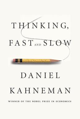
Nobel prize-winning economist Daniel Kahneman illustrates this with the following example: imagine a bat and ball together cost $1.10. The bat costs $1 more than the ball. How much does the ball cost?
Without thinking, most people will jump in and say 10 cents. Your brain is probably itching to shout it out! But think about it: if the ball cost 10 cents, then the bat would have to cost $1.10 (we know the bat costs $1 more), meaning the two together would be $1.20. If we sit down and do the sums we can see the only answer that satisfies the supplied facts is that the ball costs 5 cents, the bat costs $1.05, and together they are $1.10. It’s basic arithmetic. So why are so many people fooled?
System 1: Fast, automatic, frequent, emotional, stereotypic, subconscious
System 2: Slow, effortful, infrequent, logical, calculating, conscious
System 1 is the quick, instinctual and heuristic-led thinking that takes place without any real effort or control on our part. While it’s useful (we sometimes need to act rapidly without methodically thinking through every possible option), it’s also easily fooled in a way that our more methodical System 2 is not. But because System 1 acts subconsciouly, it can be hard not to listen to it. Even when System 2 thinking leads us to the correct answer (such as in the bat and ball example above), System 1 is still nagging us in the background, meaning the rational answer often just doesn’t “feel” right.
There are a number of heuristics the System 1 brain uses. One example is the availability heuristic – we tend to think things are more likely if we can recall specific examples of them happening. This is why people tend to think plane travel is riskier than it actually is, and might also be an explanation for why people tend to consistently overestimate the number of immigrants or the proportion of the population claiming unemployment benefits (two topics that are mainstays of the tabloid media).
In Predictably Irrational, Dan Ariely describes how our economic decisions are affected by the way we think. Some of my favourite examples show how money can skew behaviour in unexpected ways.
In our market society, money is seemed as the ultimate incentive. However, as Ariely shows, it’s not as good a motivator as economic theory would have us believe, and can actually lead to perverse incentives. He describes research in which people who were paid to do a simple task did it less efficiently than people who were doing it without payment, as a favour. Adding money into the equation turns a social contract into an economic one, and it changes the nature of the transaction.
In one striking example, Ariely describes a study of a child care centre in Israel that started to charge fines of parents who collected their children late. Market logic would dictate that the fine would be a financial disincentive, and fewer children would be picked up late as a result. In fact, the opposite happened: rather than parents apologetically arriving late (because they had transgressed a social norm), late pickups became more common. The fine was essentially seen as a fee-for-service, one which parents could pay for unapologetically. A social transaction had become an economic one. Interestingly, the tardy behaviour continued even when the fine was subsequently removed. A transaction based on goodwill had permanently shifted to one based on financial exchange.
Other studies show how things offered for free are perceived as qualitatively different from ones that attract a charge, even when that charge is quite modest. Even when the free offer is not the best offer available, most people will still opt for the free deal.
One of the huge benefits of being a graduate student (or otherwise in possession of a university library log-in) is access to published research that otherwise is locked behind paywalls. Paywalls for academic journals are EXPENSIVE – per-article costs around the US$30 mark are not uncommon. Given that even a relatively narrow search of the academic literature can yield dozens of articles, the cost soon gets prohibitive and many museum professionals are effectively locked out from accessing these papers.
Museum staff without academic affiliations can find themselves locked out of valuable research (Image source: sharynmorrow on Flickr – Creative Commons)
There is a lot of discussion about open access in academic circles, which I won’t repeat here besides to say I’ve made the decision to make my PhD thesis open-access once my degree is conferred (weeks, if not days away – I promise!). Once it’s available, I’ll post a link.
But this post is not about the open access debate per se. Rather, I wanted to share ways that you *can* get access to original research, or at least decent summaries that extend beyond what the abstract tells you, without having to fork out the big bucks:
– Academia.edu: essentially “Facebook for academics”, this site allows researchers to upload versions of their papers (often pre-prints that are not subject to publisher copyright) as well as conference papers that may not be easy to get hold of elsewhere. You can follow subjects, groups and researchers of interest, and while you need to set up a profile first, I don’t think you need a current link to an academic institution – putting down your alma mater would probably suffice.
– Relating research to practice: unlike academia.edu, which covers all disciplines, this site is specific to museums and informal learning. It doesn’t reproduce original papers in its entirety, rather it includes useful summaries of key research articles that are searchable by topic.
– Informalscience.org: Another subject-specific portal and a great way of accessing evaluation reports and other “grey literature” that wouldn’t get published in academic journals anyway. If you’re doing an exhibition on a particular topic, it’s worth having a browse to see if there are any front end, formative or summative evaluation reports from another museum that has previously tackled the same topic. Also, don’t let the name put you off if you’re not in a science-based informal learning institution: there are also reports from art and history museums as well (albeit fewer in number).
In addition, every so often, on this blog I produce my own summaries of key research papers and books. I do this for two reasons: firstly, it gives me the impetus to properly read and get across what it says; and secondly it’s a way of giving research I find interesting/useful/important a wider audience past the paywall.
Are there any other similar resources that you have found useful?
The SA Museum has recently opened its refurbished Ediacaran Fossils gallery, a small permanent exhibition showing the fossilised remnants of some of the earliest multicellular animals on Earth.
I did a few accompanied visits in this gallery during the first phase of my PhD research. In this earlier iteration, the dominant colour scheme was a strong red, presumably intended to evoke the red earth of the Flinders Ranges, the outback location where the ediacaran fossils were discovered. That’s how my participants tended to see it:
“in retrospect that red colour kind of seems to connect to the area itself of the Flinders. . .”
“Er the fossil room was very red. Was very red. But then again so’s the area where they all came from”
A view of the original Ediacaran Fossils Gallery. The mural at the back is a large photograph of Wilpena Pound (a well-known site in the Flinders Ranges). The vertical display in the foreground is a section of what was once sea bed – abut 600 million years ago.A view along the back wall of the original Ediacaran Fossils gallery.
In my study, participants had different opinions on the red colour:
“I think it’s good that it’s a really strong colour because it’s very vibrant and it and it um, it makes it a really warm rich colour, and then the sense maybe that you’re actually on a cliff wall, that is like a cliff wall of where you might find things or . . .”
“. . . you sort of wonder whether it would be better off with a neutral, with neutral walls, to draw more attention to the exhibits . . . .I mean to have a red fossil wall that looks great, but then to have it in a room, I think that room was red, it sort of detracts from it a bit.”
The refurbished gallery has retained the same basic layout, but has changed the colour palette to a deep green-blue:
The refurbished fossils gallery. The Wilpena Pound image is still there, but to me felt somehow less dominant now it’s in a mostly green backdrop rather than surrounded by red.
I believe the rationale[1] behind the colour change was to be more evocative of what the environment would have been like when the creatures were alive (ie. the sea bed) rather than the outback setting that the area is now. This sense of being “under the sea” is enhanced by the line drawings of Dickinsoniaet al up at high level. It also seems to increase the sense of height in the space.
The back wall in the refurbished gallery
I don’t know if it is the increased sense of height or that the back wall has been smoothed out and simplified a little, but it somehow seems more spacious in this new gallery (at least to me). It could also be that the size of the gallery, while not changing physically, has been enlarged conceptually by making what previously felt like a hallway become part of the exhibition proper.
Unfortunately I don’t have a shot of the original gallery from this angle, but you can see where the lift comes out (silver doors) and the doorway to the stairs is at the far left. In the old gallery, the bit between the pylon and the lift/stairs felt more like a corridor as there was a window in the far corner (now blocked off and turned into more display space). There were also some display plinths around this area that seemed to “block off” the corridor from the rest of the exhibition space.
So now, as soon as you come out of the lift/stairs, you feel like you’re in the gallery straight away rather than some ante-chamber or holding space. Blocking off the window has also dropped the light levels in this area, perhaps adding to that sense of “under the sea” immersion.
Overall I found this a calmer space to be in than the earlier iteration – they do say red is a highly arousing colour after all, and perhaps this colour scheme is a little gentler on the senses.
The new gallery has also made use of technology to help interpret the fossils, many of which can look like amorphous smudges to the untrained eye. iPad-based labels highlight the outline of the fossil imprints on the corresponding rock sections, making it easier to see what you’re looking at.
[1] Disclaimer – I had no involvement in the gallery refurbishment although I know the design team through being based at the SA Museum (also the senior designer, Brett Chandler, is a former colleague of mine and we’ve collaborated on exhibitions in the past). My commentary on the design is based on my own interpretations alone.
On my recent trip to Hobart I took in the recently refurbished Tasmanian Museum and Art Gallery. Overall I was impressed, but now it’s a couple of months later I think the thing that sticks in my mind the most is an exhibit on the top floor of the refurbished Bond Store building – the Parrawa, Parrawa! exhibition. This deals with the European invasion of lutruwita (Tasmania) and the resulting war between 1823 and 1831.
The space is fairly understated in its design and is reasonably sparse with respect to density of exhibits (I mean this in a good, less is more sort of way).
The exhibit I spent the most time at was a set of paired projections – on opposite sides of the gallery from one another – one telling stories of battles from a European perspective and the other from an Aboriginal perspective. It’s hard to capture in images but here’s a few examples:
This short video clip (15 secs) might give a better idea of the juxtapostion of the screens within the gallery. I took the video from a bench that was positioned offset from but between the two screens. I sat there for a while alongside a fellow visitor, while we periodically turned our heads from side to side to see the two screens, as they are both screening simultaneously (I mused that we might have looked like spectators at a tennis match, although we weren’t always moving in sync with one another!).
It’s interesting for me to reflect on this experience from both the perspective of a visitor and a former exhibition designer. Had I been on the design team for this exhibition, I can imagine that I may well have argued against this positioning of the screens such that you had to keep turning your head to follow them both. However, I would have been proven wrong as I think in this instance it actually works.
For a start, it positions the two opposing views as more clearly “facing off” against one another. It’s hard to see both perspectives at once (which mirrors the intellectual concept of the exhibit nicely – war is often about ‘taking sides’ whether you want to or not). Also, the provision of a bench makes all the difference – it signals a vantage point from which you can view both screens without obstructing others. And viewing them seated also allows a more reflective engagement with the content. I overheard one visitor say to her companion that “it’s hard to look at*, but that’s good because it makes you want to watch it again.”
This would be an fascinating exhibit to observe visitors at – once visitors did engage with it, they did seem to spend a fair bit of time at it. But if you breezed past, you may not necessarily have “got” what the exhibit was all about – it could have looked like two disconnected screens depending on what was going on when you walked past. I wonder how these different levels of engagement would look over an extended period of time – over to you, TMAG!
* From the context it was clear she meant physically difficult, not ‘hard’ as in the ‘hot’ nature of the subject matter – although that may also apply in this instance.
Visiting MONA was my birthday present. An odd choice maybe, but when I clocked up another year back in February I couldn’t think of anything I wanted. But a chance to visit (arguably) Australia’s most talked about museum? I couldn’t pass that up. So in lieu of a gift, my family helped fund a trip to Hobart, which I finally got around to doing earlier this month (I also saw the recently refurbished Tasmanian Museum and Art Gallery, more on which in a future post).
So . . . what is there write about a place that has already attracted hundreds of column inches already (including some penned by yours truly)?
MONA’s owner/founder David Walsh on the cover of the February 2013 issue of The Monthly.
The problem with visiting such a well-known place is that the answer to the question “so what did you think of it??” is so often “pretty much as I was expecting”. You’ve heard so much, there’s not much room for surprises. That’s still better than when you visit a place and don’t think it lives up to the hype. For me this wasn’t the case, although what I saw vindicated my decision to visit solo (my partner is less than impressed by most contemporary art and I think the whole thing would have just infuriated him).
The other thing is that I think I’m getting really badat being just a visitor and experiencing museums for what they are. My visits have become “meta-visits”: rather than being able to just be in the moment, part of me is always mentally standing back – observing how things are laid out, watching what others were doing, deconstructing my own responses. Occupational hazard I suppose.
To get to MONA I took the ferry, which I think is the usual way for tourists to get there. And this is where the MONA experience starts. There is a dedicated terminal and ferry, the MONA Roma, which is decked out in the sort of irreverent fashion you’d expect given MONA’s “brand”:
On board the MONA ferry. Graffiti art adorns the stairs while model cows and sheep (which double as seating) adorn the deck.
So the ferry doubles as a mode of transport and a (pre-) entrance statement – something akin to what Falk and Dierking would call an “advance organiser”. And while I didn’t realise it at the time, I think this pre-experience had an impact on how I approached the museum visit itself. But more on that later.
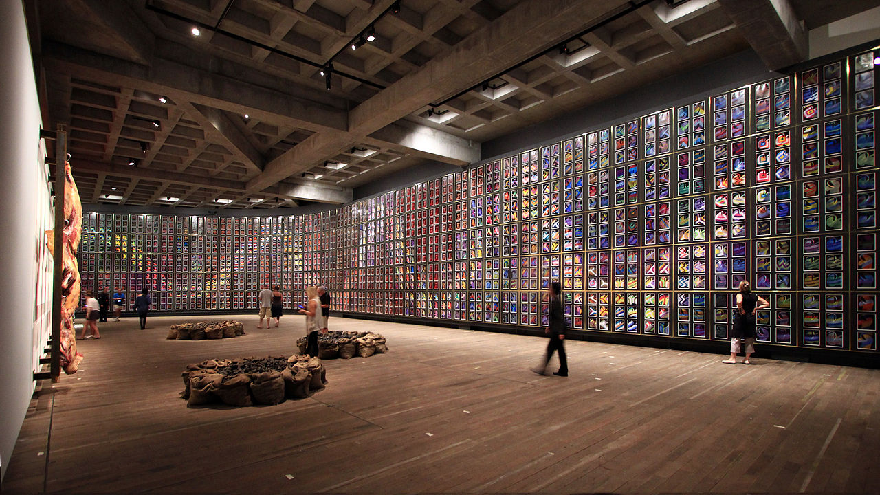
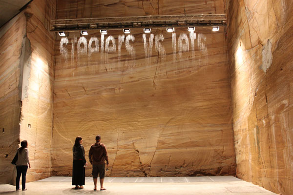
Upon arrival we were escorted up the stairs from the dock and into the museum, heading back down again to start the visit at B3 level (three levels underground). Here we were given our “O” devices to guide us on our visit (more on those below). In the distance I could hear some periodic pumping and hissing which added to a sense of anticipation / apprehension (it turned out to be Julius Popp’s Bit.Fall which spells out words in falling water droplets). I turned a corner and found myself heading down a long corridor, lined with red velvet drapes that made me feel like I was walking into a scene from Twin Peaks. Heading out of this area I went up some industrial-type steel stairs that intersect at odd angles across the void, exhibits in view in semi-darkness above and below. Here the feel is more like the video game Half-Life (pop-culture references came to mind readily for some reason!).
Mid-way along this level the corridor narrows, with small galleries off to each side. One of these works is Brigita Ozolins’ Kryptos – an eerie-feeling room-within-a-room-within-a room that you meander into like a labyrinth.
Brigita Ozolins work Kryptos
This work brought out the environmental psychologist in me – the darkness, confined space and the lighting effects creating the sense of a floating floor all worked together to give me a real sense of trepidation about walking in (even as my rational side was telling me there was no real reason to fear). It was interesting to see how this environment was able to elicit such a visceral response in me (there I go, meta-visiting again . . .) Shortly after leaving this space, the corridor opened out into a wide open space covering two levels. After such a sense of confinement, this sense of openness an relative light (it was still pretty dark) provided a sense of welcome relief. I wonder if it’s just me, or if this orchestration of emotion was a deliberate move on the part of the architect.
The open space featuring Sidney Nolan’s “snake” along the wall
From Driver to Passenger – going along for the ride
I’ve written a couple of times this year about how some visitors like to know where they are at in a museum’s spatial and content narrative, whereas others are happy to go with the flow. I’m usually in the former but at MONA, I was happy to surrender myself to the experience more than I usually do. That raises the question – why?
I had a chance to give this a bit of thought during a workshop held as part of the Museums Australia conference in Canberra last week. I’ll flesh this out in more detail in a later post, but I started to think about how we “cast” ourselves in a visitor experience – do we like to be in control (a driver) or surrender to the experience (a passenger)?*
Reflecting on my own experiences, I’ve decided that in most cases I like to drive. But in this instance, I decided to be a passenger. I think that was partly because of some specific circumstances, and partly because my expectations of MONA were different from those of a “typical” museum.
Although they have visitor maps, I didn’t actually pick one up upon entry (they escorted us, the first ferry arrivals of the day, in a way that we bypassed the main ticket desk which is where they are located). So I only had the “O” device to guide me, and while this does have a map function, I didn’t feel overly worried about using it. I only picked up a map towards the end of my visit, just to double-check there wasn’t anything I had inadvertently missed.
As I said before, I’m also wondering if the ferry ride had a role to play in all this, by providing a temporal separation between the first sense of arrival (embarking on the ferry) and getting into the museum experience proper. Once you were on the ferry, all the logistics of worrying about whether you were in the right place, had the right ticket, etc. etc were behind you and you were – literally – cast in the role of passenger. Did this make it easier for me to be a passenger during the visit itself?
The “O”
Anyone who has read anything about MONA will know that they have no labels. Instead, you are given a device called the “O”, which is essentially an ipod touch made location-aware by wifi transmitters installed around the museum. I already knew a bit about how this worked (having researched it for an article I wrote back in 2011), so it was interesting to have a go and see how it worked in practice. Generally speaking it worked quite well, and it does offer quite a different experience to that with standard labels.
As you move around the museum, the O lists works which are near to you and you can select them to read a standard label (these are titled “artwank”) or more atypical musings (titled “gonzo” or “ideas”). You are also invited to “love” or “hate” works and when you do so, you find out how many other visitors felt the same way. Not all labels are accompanied by audio but some works were pieced with music which I thought was an interesting idea, and one which had me lingering longer at some works than I otherwise would have.
A couple of things about using the O though – while each work had an identifying thumbnail image, sometimes it took a while to find the corresponding piece of work because of scale – the work you were looking for might be a tiny thing in a peephole, or a giant installation hanging overhead. Also (and this might just be me) I found the O gave me an obsession with “collecting” all the works in a particular area before moving on – I wanted to mark everything as “seen” in a way I wouldn’t have worried about with just regular labels.
If you enter your email address, you get sent a summary of your visit as recorded by the O. This is a screengrab of mine, which shows my visit in impressive detail. It’s also interesting to see how the visit unfolded over time. Oh how I would love to get hold of all of MONA’s visitor data!!
Technically speaking, the O worked well overall – in some instances the location got a little confused, but this was easily fixed by pressing a reset button. The only thing is, I think my device didn’t record all of my visit. Going through the summary, I noticed a number of works that the website says I “missed”, when I know I did in fact visit it. Looking at what’s been missed, I wonder if I accidentally reset something when I nipped into the loo because it doesn’t seem to have recorded anything I visited after that. Oh well.
*Extending the metaphor, you might end up being a “backseat driver” when an experience affords you less control than you’d like.
I’ve recently returned from two weeks in China as part of the Student Leadership in International Cooperation project. While most of the trip was spent visiting university campuses, we did manage to fit in some sightseeing. On our first day in Beijing we had a couple of free hours in the afternoon, so we headed to the Forbidden City (otherwise known as the Palace Museum).
It’s a huge site and we were on a tight timeframe – we just managed to buy tickets before the box office closed at 4pm, giving us an hour to make our way through before the site closed at 5pm. We hired the location-aware audioguides that are available in multiple languages:
The audioguide incorporated a map of the Palace Museum using LEDs to indicate your location. Sites still illumianated are those you have yet to get to.
The audioguide was small and light, with minimal controls – basically just volume adjustment and a pause function:
Rear of the audioguide, made by lightour, a Beijing-based company.
The introductory track starts pretty much as soon as they give you the guide – which means I missed it the first time around while I fiddled with the earpiece so that it didn’t keep falling off (an issue exacerbated by the filter mask I was wearing due to the high pollution levels in Beijing that day). I accidentally changed the language by pressing “option”, but was able to scroll through until I was back at English. “Help” restarted the introductory track and then I was back in business.
Overall it worked fairly well and it was useful to have the guide double as a mini-map. However it does not lend itself well to the “walk and look” approach you tend to take when you’re trying to get through a site quickly (like we were). It meant that sometimes the audio description cut out mid-way through because I had moved out of range. There also didn’t seem to be a way of restarting a description if you wanted to. But the location awareness of the device meant that it was pretty much set-and-forget, which is probably a reasonable tradeoff of control for simplicity.
As far as I can tell from the Lightour website (using Google translate as I coudn’t see an English version), it seems that this technology is being used in several tourist sites in China, but apparently nowhere else as yet.
This series started off with art museums and then moved on to natural history. Now, for the third and final review of apps I used in the US, here are a couple of history museum apps.
This museum is only a block away from AMNH and offers a welcome relief from the throngs of holiday crowds there. It was one of the less high-profile museums on my itinerary, but one I made a point of visiting as I had the opportunity to meet someone from the Society at the VSA conference.
The app was designed to accompany the New York and the Nation Exhibition, a new permanent exhibition and the first space you encounter on the ground floor. I liked this exhibition, which covered the history of New York and its broader influence on the US. It combined historical/archaeological objects, art pieces and technology in a clean and simple (but not too minimalist) style. Unfortunately they did not allow photography so I won’t be able to share my favourites in any detail.
App home page
The app features additional content such as videos and interviews that added an extra layer to the experience. For instance, while the ceiling structure over the ticketing desk was unmistakably Haringesque*, the app revealed that it was an actual part of Haring’s Pop Shop from the 1980s (I’m not sure if this information was duplicated elsewhere – if it is I didn’t see it but then again I was using the app as my main guide through this exhibition).
The app lists exhibit by title and there also is a map (which something has happened to since I visited so I can’t put up a decent screen grab). I remember having a bit of trouble using the map at times, as the icons were quite large in relation to the map, so sometimes it was hard to tell if you were in the right place (that could be just my map reading skills). Besides that I thought the app worked well. It often had more detail than I wanted to read or look at but I think that’s OK so long as you can find what you want to look at easily enough.
Interpretation of a multi-part sculpture which is positioned right at the entrance. At first glance, it looks very much like a typical ‘grand old men’ sculpture with marble busts. Closer inspection reveals something more sinister, in the form of slave shackles and badges. The interview with the artist reveals the intent was to show two sides to ‘heroic’ figures such as Washington – as freedom fighters on the one hand, slave owners on the other. I wish I was able to take a picture to show in better detail.
This app is an interesting idea, although I have to confess I really struggled with it in practice. It’s a bilingual (English and Spanish) “crowdsourced” companion to the American Stories exhibition at the Smithsonian Museum of American History. So it means you can contribute as well as hear the voices of others. It’s also intended to enhance the experience of visitors with low vision.
You can choose whose voices you wish to listen to, and what they will be talking about:
Select or deselect the voices you wish to hear.
You could then choose the gallery section:
So far, so good. However I found that when you selected a particular setting, off it went, and there was no way of easily corresponding what you were listening to to what you were looking at (the gallery sections above all contain numerous exhibits). It seems to leap straight into a description of something and you’re desperately looking around to see what it might correspond to. It felt a bit like listening to an audio guide that was stuck on shuffle play.
I might have got the hang of it had I persevered – but I was just trying to get my bearings of the exhibition in general and (like all my museum visits in DC) I was on a pretty tight schedule to see as much as possible. I think this exhibition was pretty new when I visited (late July this year) so I’d be interested to hear if there have been any evaluations of the exhibition and the app.
*Assuming you are familiar with Keith Haring of course. Visiting a Haring exhibition in the Museum of Contemporary Art, Sydney, in 1996 was one of my foundational museum experiences.


