Photography not allowed

Photography is a spectator sport only in most galleries

The “No Photography” sign. It’s so ubiquitous that even when I don’t see a sign, I’m still wary that if I whip my camera out a stern-looking security guard will materialise to have words. ‘No photographs’ is still the default setting in many museums and most galleries, to the extent that when the ban is mostly absent, as it is in GoMA, it brings a markedly different complexion to the exhibition environment.

Not all exhibitions are so censorious of photographic activity – indeed, in one of the first exhibitions I worked on, at the National Space Centre in Leicester, some exhibits were deliberately planned to work as photo opportunities. Generally speaking, hands-on exhibitions and venues that target families seem to welcome photography as an important way for their visitors to record, share and recollect experiences.

A quick tot-up of my ‘Exhibit Photos’ file folder revealed some 3000 images of exhibits and exhibitions, in approximately 20 cities around the world, all taken since I first bought a digital camera back in 2003. For me, this is a valuable repository of all the places I’ve visited; the good, bad and ugly of exhibit ideas; and a way to remember far more than if I’d travelled with just my eyes, ears and unaided memory. Just looking at the pictures brings back the experiences, and I remember far more about what I did, how I felt and what I learned at all the exhibitions I’ve been fortunate enough to have visited. Without these images, most of these experiences would have been lost in the blurry mists of time.

Admittedly, the purpose of my photographic jaunts was primarily professional (and the emphasis of each batch of photos is an inadvertent record of whatever particular kind of exhibition I happened to be researching at the time – it inevitably influenced what was ‘photo-worthy’). Even so, compact digital cameras (and more recently smartphones) have transformed photography from a way of documenting holidays and special occasions to the way we increasingly document and share our day-to-day lives. We see, therefore we photograph. We photograph, therefore we share. These actions help to reinforce our memories and add value to our experiences. But have museums recognised this cultural shift? And are they doing anything to accommodate it?

The photography ban is based on some sound reasoning. However, I want to deconstruct some of this reasoning to see if it still holds in the 21st century, or whether museums and galleries are simply sticking to historical habit to the detriment of the visitor experience:

  • Conservation reasons: Light damages delicate objects like paper and textiles. Their ideal environment from a conservation perspective is complete darkness, so having sensitive objects on public display at all is always a matter of compromise at some level. So banning flash photography makes sense. Non-flash photography may be impractical (although not damaging) as the objects are often displayed in low-light environments. However, while it depends on the objects of course, I wonder if the ‘no flash’ rule is applied more liberally than it needs to be, given that modern camera flashes are nowhere near as UV-intensive as the old-fashioned ones that the rules were presumably designed for?
  • Pointless or disruptive photography: in these circumstances, banning photography makes perfect sense. Other people snapping and flashing away (in the photographic sense) can inhibit the experience of other visitors, particularly during shows or theatrical presentations.  One person’s right to document their day shouldn’t trump the rights of other visitors to enjoy the experience in peace if they so wish. Live animals displays are also an inappropriate subject for flash photography. A final note in this regard, I always have to have a bit of a giggle to myself when I see people attempt to take a flash-photograph of a projection. Do they really not realise that all they are capturing is a blank screen?
  • Copyright reasons: this is the big one. And by far the knottiest. It sounds serious, but at the same time is sufficiently vague that it can seemingly be used as a convenient excuse to point to in order to stick to the comfort zone of the status quo. This is a cynical interpretation, to be sure, but visitors are seldom given any evidence to counter such cynicism. Sometimes it seems as if copyright is too complicated to figure out; that it’s easier for museum and gallery management to just lump everything together into the intellectual property equivalent of the maximum security wing. Looking at society more broadly, the copyright genie is well and truly out of the bottle – attempts to bring it back under old business models seem doomed to failure (the recording industry and rights management is a salutary tale here). In any case, I find it hard to understand how a few iPhone snaps in a gallery pose a serious copyright threat to anyone: people will still want to buy properly produced prints and postcards of the items they really like, and how can the extra publicity generated by the sharing of photos be a bad thing for artists’ careers?
I’m not saying that photography should be a free-for-all by any means. But I think the default should be for museums and galleries to allow photography unless there is a good reason not to (rather than the ban being the norm). Rules with clear reasons (i.e. signs which explain why photography or flash are not permitted in certain areas) are more likely to be respected than blanket bans which appear to treat the public with suspicion.
Some people, because they do not value photography themselves, may not consider it an issue. Going further, some may even consider taking snaps too vulgar or somehow not reverent enough for the gallery environment. But then again, the ‘establishment’ has been complaining about the poor behaviour of  ‘the uneducated masses’ in museums for as long as public museums have been in existence. And if photography is done respectfully of objects, their creators and other visitors, where is the harm?

Recommended: “Please Be Seated” blog

The other day, as I was trawling the net for images of the good, bad and ugly of museum lobbies and signage (for an upcoming presentation), I found this excellent blog – Please Be Seated: visitor comfort in museums and other public places. It is hosted by Beth Katz and Steve Tokar, who set out to:

. . . promote and discuss the idea that comfortable museum visitors are happy visitors who are more likely to enjoy their visits and more likely to return. Thus, museums and other public spaces are better and more successful in all ways when they provide basic comforts including (but not limited to) good seating, readable signs and labels, lounges and other areas of visual and psychic relief, and navigable restrooms. Our intent is to analyze museums and other public spaces in terms of comfort, a word we use inclusively to mean visual, aural, intellectual, and emotional comfort as well as physical comfort for a wide range of humans of all ages and types.

The blog is well illustrated with a wide range of examples (it looks like they are all US examples, but the general idea is universal) and covers topics such as lobby layouts, orientation signage, disabled access and public spaces. As I touched upon recently, I believe attention to these details can make or break a museum visit.

The Please Be Seated blog is one for the bookmarks list of anyone interested in the visitor experience.

Quick review: National Museum of Scotland

On my recent trip to the UK, I managed a quick visit to the newly refurbished National Museum of Scotland in Edinburgh.

Our visit was on a Sunday morning at the height of the Fringe season, on our way to meet some friends for lunch. Having somewhere we had to be, combined with the fact that one of our group was only five months old, meant that realistically this was only ever going to be a lightning trip. Consequently, this review will be of first impressions and a critique of what I did get time to see.

According to this blog post by museum commentator Tiffany Jenkins, the refit took three years and £47 million. It’s proved popular, with visitor numbers passing the 100,000 mark less than a week after opening. Exhibition spaces were certainly beginning to fill up by the time we left.

Arrival and Entrance

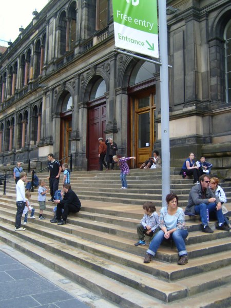
One of the changes they have made is to the way visitors enter the building – rather than scaling the prominent steps, you now enter via an adjacent street-level door (although once inside the building it feels more like a basement than an entrance statement).

The steps to the original entrance, with signage pointing to the new entrance. (Photo from Tiffany Jenkins' blog, see link above)

In her review Jenkins criticised this move, observing that many visitors gravitated toward the more prominent original entrance and missed the new entrance completely. To be honest I’m still in two minds about what I think about this myself – on the one hand, the street-level entrance was much easier to negotiate with a baby stroller, and I can see the rationale for having an entrance which meets universal access requirements. On the other hand, changes to navigation that go against the grain of usual expectations can be disorienting and counterproductive. It will be interesting to see how this settles in – the photo above shows how the steps have already been adopted as an informal outdoor gathering and relaxation space now that they don’t have to deal with volumes of visitor traffic. If this new purpose settles in and gains currency over time, then the street-level entrance could easily become ‘the new normal’*.

Once you pass through the basement you reach the central atrium of the original grand hall – this is where the original entrance would have taken you. This has been left quite open and minimal with only a few key objects – this works well as a space where you can make the psychological transition from ‘street’ mode to ‘museum’ mode. Most of the exhibition spaces run off this central space; this aids visit planning and site orientation. It could do with a bit more seating though:

The central atrium, National Museum Scotland

Exhibitions

We started our visit in the Natural History area, and having a limited time budget this was one of the few galleries I managed to look at properly. (Later I broke away from the group so I could have a whistle-stop tour around more spaces and get more of an overall sense of the place.)

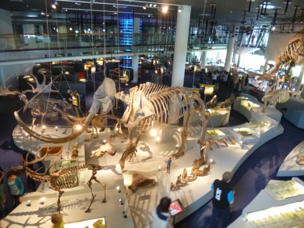
In the animals exhibition, displays were organised by characteristics of animals, eg. flight, adaptation to climate extremes, locomotion, size. This allowed interesting comparison of different animals’ adaptation to their respective environments and ecological niche. These displays were generally well grouped and signposted, so it was clear why certain animals had been placed together.

Overview of the animals exhibition, National Museum Scotland

The introductory signage in each exhibition space gave a good, simple overview of the intended interpretive goal:

Introductory text to "Animal World"

However, while I generally liked the succinct and well-layered interpretive text, I think it erred too much on the side of brevity. For instance, in many cases I was left wondering where certain animals were from, and whether they were extinct or abundant in the wild. Such information was all but absent, which struck me as a real gap (particularly as we are used to thinking about animals in terms of where they are from; the displays were not organised by habitat so there wasn’t any conceptual ‘anchor’ in this respect).

There were a few tactile displays, such as this one which allowed you to feel and compare the difference between horns which were made of bone, tooth or keratin:

Tactile display, National Museum Scotland

Next to the Natural History galleries were the spaces dedicated to World Cultures. These were arranged by theme, allowing you to compare and contrast how different peoples around the world approach common aspects of human experience. I watched an interesting video about different wedding traditions, and found a Ghanaian coffin shaped like a Mercedes Benz both fascinating and disconcerting.

Regrouping in the museum cafe afterwards, my partner expressed disappointment that he had not seen anything particularly Scottish during his visit, given that we were meant to be in the country’s National Museum and all. It’s there, but unfortunately the Scottish history and culture displays are tucked away in an adjacent wing. This extension was probably built in the 80s or 90s, but in the layout of the refurbished museum it is a fair way off the beaten track and it was almost by accident that I found it at all.  I’m not sure what the original intent was, but in its current configuration it is a confusing rabbit-warren of dead-end spaces.

The old 'new' part of the National Museum of Scotland - I wonder if this building was conceived and designed from the facade inwards, leaving a legacy of spaces which are less than ideal as exhibition areas.

Few visitors seemed to make it this far, and there was a noticeable thinning of visitor traffic compared to the galleries surrounding the main atrium.

The interior of the museum extension. From this vantage point I could see more exhibition space than I could figure out how to find.

As I said before, I probably only had an hour or so to look around and I’m sure there’s plenty I missed. Plus I never bothered to pick up a visitor map which may have made the extension easier to navigate.

Has anyone else visited NMS either recently or before the refurbishment? What were your experiences?

*Incidentally, I noticed that the National Gallery in London faces a similar dilemma. They have taken the option of maintaining both the original grand entrance as well as a newer alternative at street level. However, the signage was ambiguous and it wasn’t immediately obvious that the street level entrance actually *was* a proper entrance (as opposed to an entrance just for schools or tour groups),  so we ended up needlessly lugging our suitcases up the main staircase.