Review: ArtScience Museum, Singapore

Back in August, en route to the UK on holiday, we broke up the journey with a couple of days in Singapore. A new addition to the landscape since last time I was there (early 2009) was the ArtScience museum, which is part of the Marina Bay Sands development.
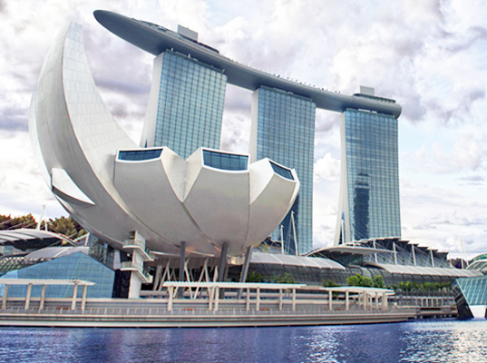
Marina Bay Sands complex with the ArtScience Museum in foreground (image from homedit.com)

It’s a landmark building by celebrity architecht Moshe Safdie, which opened in February 2011 (so still pretty new when we visited). The design was inspired by a lotus flower but it also gets called ‘the welcoming hand of Singapore’, with a total of 10 ‘fingers’ extending from the centre.

Regular readers will know that I have my doubts about ‘statement’ museum architecture. And I was wondering if this one was going to be a navigational nightmare. But surprisingly, it isn’t – mostly because the majority of exhibition space is actually below the lotus / finger structure, essentially at basement level. But before I get into the exhibitions, I’ll give an overview of the museum building itself.

Like several other Singaporean attractions (the Singapore Flyer springs to mind), the building seems geared up for high-throughput crowds. (Given our Singapore stopovers seem to always have us visiting attractions in the middle of a weekday, I have no idea the extent to which these crowds actually materialise.) Operationally it feels more of an ‘attraction’ than a ‘museum’ too – your entry ticket is priced according to the number of temporary exhibitions you decide to visit, and your ticket only gets you into each exhibition once.

The intended visitor flow is ‘waterfall’ style – i.e., you are encouraged to start at the top and work your way down through the 50,000 sq.ft. of exhibition space. At the top is the smallest level with only three gallery spaces; immediately below that is the Upper Galleries that run in a loop through all the 10 ‘fingers’. Each of the 10 spaces link together like pearls on a string. It’s one-way traffic and you enter and leave at the same point, limiting disorientation (and it doesn’t feel unduly constraining but it would depend on the exhibition I imagine). Two floors below the Upper Galleries are the main exhibition spaces and the museum shop (the lobby is sandwiched between these two levels).

The 'finger' structures in the Upper Galleries offer some unusual display opportunities.

Running through the centre of the whole building is the ‘Rain Oculus’, which collects rainwater from the curve roof and channeling it into a pool that is used as the water supply for the rest rooms. Water flows fairly constantly (before I figured out what was going on I thought it was raining outside).

The top floor, inside the tips of the tallest ‘fingers’, is the only permanent exhibition space: Art Science – a journey through creativity. This is divided into three separate spaces: Curiosity, Inspiration and Expression. The exhibition is intended as an introduction to the concept of ArtScience showing it as a manifestation of human creativity. The spaces are sparsely populated and, writing this several months later, my lasting impression is of gobos, lighting effects and projections, along with a couple of touchscreen interactives. Because it sets itself up as an introductory space, I was expecting these concepts to be more explicitly linked to in the rest of the exhibition spaces. However, this didn’t really happen as the rest of the gallery spaces are essentially given over to hosting touring exhibitions brought in from elsewhere (this is what is on now).

Unfortunately, the museum website seems to live in an eternal present and does not link in any obvious way to information about past exhibitions – thankfully, Wikipedia has stepped in to fill this gap. When we visited there were three touring exhibitions: Dali – Mind of a GeniusShipwrecked: Tang Treasures and Monsoon Winds; and Van Gogh Alive.

Dali – Mind of a Genius

I’ve been to Dali exhibitions before (Liquid Desire at NGV in 2009 and as part of a Surrealism exhibition in the Pompidou Centre in 2002), so I thought I was familiar with his work – in particular his paintings and films/animation. So for me, the surprising part of this exhibition was the number of bronzes on display (an element of Dali’s work I hadn’t seen before) as well as his forays into furniture design and the decorative arts.

One of Dali's bronzes

There were several versions of the infamous  ‘Melting Clock’ motif (if anything a bit too much really!) although I thought this use of a wall of regular clocks distorted by fairground mirrors was a cute touch to finish off the exhibition:

Regular clocks rendered Dali-esque by fairground mirrors


Shipwrecked: Tang Treasures and Monsoon Winds

This exhibition was about the mysteries surrounding the wreck of a ninth century Arab trading dhow, found in the Java Sea. Laden with Chinese ceramics, the wreck is proof of a maritime trade route between China and the Middle East from the era of the tale of Sindbad the Sailor.

The scope and significance of what was found on the wreck was interpreted well, along with the concept that such a find inevitably raises just as many questions as it answers. The exhibition was quite dark so I don’t have any good photos, but the website linked to above is very comprehensive. It says that the exhibition is set to tour until 2015, but no additional venues are advertised yet.

Van Gogh Alive

I was expecting this to be a fairly conventional exhibition of Van Gogh’s works (perhaps a tour from the Van Gogh Museum I’d visited in 2000) so at first I was a bit taken aback to be in a large space surrounded by tall projector screens showing Van Gogh’s work and photographs all synchronised to a classical soundtrack. But once I got over that I was able to enjoy this immersive experience (that is hard to describe but maybe these still renderings and this Youtube video gives you a bit of an idea):

It was an exhibition space you moved in rather than through – you could sit anywhere in the space and have essentially the same experience. For some reason, on the day we visited it looked like they were using the usual exit door for both entrance and exit, so it means we didn’t see the interpretive panels explaining the concept until we were just about to leave (and we almost missed it entirely).


So in conclusion? It was a pleasant and interesting way to pass 2-3 hours away from the heat and humidity of mid-day Singapore. Given the unconventional shape, the building is not as visitor-unfriendly as you’d first expect. However, at the moment at least, it feels more like a sophisticated exhibition hall than a museum with its own mission and identity.
 

Benchmarking Museums: Online & Onsite

If you’re interested in which museum is doing what in social media, then you must check out Museum Analytics.

It describes itself as “an online platform for sharing and discussing information about museums and their audiences”. So far there is data for over 3000 museums, including some of the world’s most famous such as MoMA, the Louvre, Tate, and the Smithsonian. (But it’s not just the big global museum brands – I counted at least 20 Australian museums, ranging from the major institutions to a wide range of small and regional ones).

The site lists the most visited museum websites (Metropolitan Museum of Art by a fair margin in 2010 it appears) and the top Facebook likes and Twitter follows. Museums are also individually listed and you can see what’s happening closer to home – for instance these are the summaries for Australia and Adelaide respectively. But it’s not just website and social media – the site also has numbers for onsite visitors as well (although it is the data about online activity that makes this site stand out).

On the topic of museum statistics, there has recently been quite a lively discussion on the ICOM Group on LinkedIn (list members only but it’s easy to sign up) about the information and statistics collected by governments and other bodies around the world. If you’re interested in comparing and contrasting museum statistics from around the world (or even comparing which data are collected, by whom, and why), then I suggest you sign up.

One resource I was directed to from the ICOM discussion was a Culture 24’s project about how to evaluate museum success online. You can download a detailed report about the research project as well as tools and metrics for evaluating online and social media presence. It’s a must if you’re getting to grips with tools like Google Analytics or just wondering how best to track your online presence.


What kind of *non* visitor are you?

In comparison to studies of museum visitors, studies of NON-visitors are much rarer. But, just as we do not consider museum visitors as an amorphous population, it would be wrong to lump all non-visitors into a single group. The reasons people choose not to visit are just as varied and interesting as the reasons behind why people do visit.

The seminal paper in non-visitor studies is “Staying away: why people choose not to visit museums” published in Museum News in 1983 by Marilyn Hood. In a Google search for a link to this paper, I didn’t find it (I’m not sure if it’s available online) but I did find this very helpful summary of non-visitor research (limited as the field is in relation to visitor research).

Hood’s work found that visitors and non-visitors varied in what kinds of experiences they valued in their leisure time, and the extent to which museums offered (or were perceived to offer) these experiences.

I have recently read a paper that offers an interesting complement to Falk’s ‘Identity’ model of Museum Visitors (as described here)  by incorporating categories of non visitors: Theopisti Stylianou-Lambert’s “Museum Perceptual Filters” or MPFs*. Stylianou-Lambert describes the MPFs as ‘spectacles of perception’ that frame the way people think about (art) museums. There are 8 MPFs, five of them relating to visitors and three to non-visitors.  The MPF model emerged independently of Falk’s work, although the author acknowledges the parallels. I’ve related the five visitor MPFs to the nearest Identity in Falk’s model (any error in their allocation is mine):

  1. Professional – artists or museum professionals who visit the art museum to inform or inspire their work (Falk’s Professional / Hobbyists)
  2. Art-Loving – these visitors valued the aesthetic emotional connection to art rather than increasing their knowledge about it. These are the sort of visitors who stop only at a piece of art that ‘speaks’ to them in some way. (Falk’s Rechargers)
  3. Self-exploration – people who come to expand their horizons and learn new things; following a personal and introspective quest (Falk’s Explorers)
  4. Cultural Tourism – people who visit art museums mostly on holiday, as part of taking in the cultural offerings of a destination (Falk’s Experience Seekers)
  5. Social visitation – visitors who come to the art museum primarily in a social context, particularly in the company of art-loving relatives (Falk’s Facilitators)

Stylianou-Lambert extends the Falk model by characterising three main MPFs of non-visitors:

  1. Romantic – people who have a positive view of museums, but for some reason decide that the museum is not for them. This MPF includes people who might feel intimidated by the museum or their lack of knowledge about art.
  2. Rejection – people who view the museum in a negative light, as places that are pretentious or snobbish and full of incomprehensible things. By contrast to the Romantics, who placed themselves as being somehow inferior to the museum, Rejecters appeared more self-confident in their dismissive attitude to museum’s importance.
  3. Indifference – people who felt that art museums had no personal connection or relevance to their lives. This category is probably the one most closely mirrored in Hood’s work about the disconnect between the leisure expectations of visitors versus non-visitors.
Postscript: after I drafted this post I came across an interesting debate about Falk’s Idenity model in the latest edition of Visitor Studies. Abstracts are free online, and while the full articles are behind a paywall they are well worth a read if you have access.

*Reference: Theopisti Stylianou-Lambert (2009): Perceiving the art museum, Museum Management and Curatorship, 24:2, 139-158  http://dx.doi.org/10.1080/09647770902731783

Killer Hooks and Cracking Themes

A good theme puts pictures and ideas in your head. It has action, people, colour, drama . . . get the theme right and the rest will fall into place.

That was my attempt at developing a ‘theme’ for Susan Cross’s “writing with power, precision and passion” training workshop I attended last week. I won’t try to distill all of the day (hard to do when a lot of it was hands-on practice), but I will talk about themes, as these are the cornerstone of good interpretive writing (good interpretation full stop really).

In interpretation-speak, a theme is a core message or ‘big idea’. The purpose of the theme is to act as a bridge between significance (why you think something is important) and relevance (a way for the visitor to connect to it). It’s the main thing you want to leave your visitors thinking about. Themes can branch out into a series sub-themes, although all the sub-themes should in some way support and illustrate the top-level theme.

People tend to confuse themes with topics. A topic is a subject – for instance ‘local bird species’ is a topic not a theme. To turn that topic into a theme, you would need to spell out what exactly you want to say about local bird species, and put it in familiar, conversational language.

Why bother?

Thinking about themes helps to sharpen your focus when you are writing. It acts as a filter for muddled concepts. Crafting a good theme makes you think carefully about what you want to say to your visitors and why. A strong theme will be succinct and use active verbs to bring people into the place and the story. It will usually stick to one key idea.

The theme also sets the tone of what you will eventually write – formal language begets stuffy writing; conversational language sets you on track for a friendlier tone.

Susan gave us plenty of examples on the day and showed how we could turn the dull into the dynamic. It was a good reminder of the centrality of the theme – a tip I’ll be using in my future writing projects.