Looks like there’s a dead bird on the, in the display, presumably purposefully . . .
Well they’re all dead I guess. – visitor to the South Australian Biodiversity Gallery, SA Museum
When it comes to animals in museum displays, it seems that some are more dead than others. There are those that are unapologetically and possibly even offensively dead – insects on pins, dismembered body parts, a beached dolphin in a coastal tableau. But in Natural History displays at least, most specimens are presented in lifelike poses; snapshots of nature scenes rendered in diorama form. It’s like we perceive the creatures to be in some form of suspended animation. Suspended animation or suspended disbelief – the displays don’t seem to trigger that visceral sense of disgust that looking at a ‘dead animal’ seems to do. It’s something I observed several times on my accompanied visits in the Biodiversity Gallery last year:
I like the little, mice doing different things other than just sort of sitting there looking dead.
. . .they’re looking like just dead birds really. Not like the ones in the cases . .
I don’t really like that display because it’s animal parts, like, y’know, having a case full of people’s arms or something . . .oh there’s a large, er Wedge Tailed Eagle, wing, which yeah, that’s all a bit sad really.
Well, I know the dead dolphin, happens every now and then, and it’s probably the best way to present um, marine animals, but it still looks a bit cruel. . .
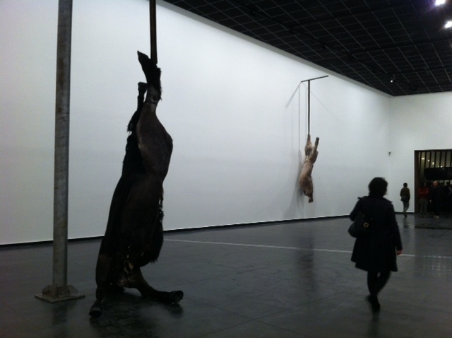
I was reminded of this last week when I went on a preview tour of the newly refurbished Melrose Wing at the Art Gallery of South Australia. Among one of the recent acquisitions displayed in the wing is Berlinde De Bruyckere’s We are all flesh. The work is made of horse skins stretched over a cast of two intertwined horse bodies, suspended in the middle of the room.
A view of the work taken last year (from http://lamblegs.wordpress.com/2012/06/07/we-are-all-flesh-berlinde-de-bruyckere/)
The pending unveiling of the work caused a minor splash in the local media, and I saw at least one letter to the editor of the local paper saying something to the effect of: “If this sort of thing is what’s in the Art Gallery there is no way I’m going to let my grandson go there and be traumatised by it”. Irrespective of any debates about the artistic merit of the work, I doubt the letter writer would have expressed similar concerns about the towering red kangaroo on display in the Biodiversity gallery just next door.
Clearly there are different classes of ‘dead’ when it comes to what we display in our gallery spaces. Why probably matters too – is something that is acceptable when displayed in the name of scientific instruction suddenly scandalous when it’s art?
UPDATE (5/3/13): It looks like the controversy surrounding We are all flesh is prompting renewed interest in the Art Gallery of SA, and possibly reaching new audiences?
This series started off with art museums and then moved on to natural history. Now, for the third and final review of apps I used in the US, here are a couple of history museum apps.
This museum is only a block away from AMNH and offers a welcome relief from the throngs of holiday crowds there. It was one of the less high-profile museums on my itinerary, but one I made a point of visiting as I had the opportunity to meet someone from the Society at the VSA conference.
The app was designed to accompany the New York and the Nation Exhibition, a new permanent exhibition and the first space you encounter on the ground floor. I liked this exhibition, which covered the history of New York and its broader influence on the US. It combined historical/archaeological objects, art pieces and technology in a clean and simple (but not too minimalist) style. Unfortunately they did not allow photography so I won’t be able to share my favourites in any detail.
App home page
The app features additional content such as videos and interviews that added an extra layer to the experience. For instance, while the ceiling structure over the ticketing desk was unmistakably Haringesque*, the app revealed that it was an actual part of Haring’s Pop Shop from the 1980s (I’m not sure if this information was duplicated elsewhere – if it is I didn’t see it but then again I was using the app as my main guide through this exhibition).
The app lists exhibit by title and there also is a map (which something has happened to since I visited so I can’t put up a decent screen grab). I remember having a bit of trouble using the map at times, as the icons were quite large in relation to the map, so sometimes it was hard to tell if you were in the right place (that could be just my map reading skills). Besides that I thought the app worked well. It often had more detail than I wanted to read or look at but I think that’s OK so long as you can find what you want to look at easily enough.
Interpretation of a multi-part sculpture which is positioned right at the entrance. At first glance, it looks very much like a typical ‘grand old men’ sculpture with marble busts. Closer inspection reveals something more sinister, in the form of slave shackles and badges. The interview with the artist reveals the intent was to show two sides to ‘heroic’ figures such as Washington – as freedom fighters on the one hand, slave owners on the other. I wish I was able to take a picture to show in better detail.
This app is an interesting idea, although I have to confess I really struggled with it in practice. It’s a bilingual (English and Spanish) “crowdsourced” companion to the American Stories exhibition at the Smithsonian Museum of American History. So it means you can contribute as well as hear the voices of others. It’s also intended to enhance the experience of visitors with low vision.
You can choose whose voices you wish to listen to, and what they will be talking about:
Select or deselect the voices you wish to hear.
You could then choose the gallery section:
So far, so good. However I found that when you selected a particular setting, off it went, and there was no way of easily corresponding what you were listening to to what you were looking at (the gallery sections above all contain numerous exhibits). It seems to leap straight into a description of something and you’re desperately looking around to see what it might correspond to. It felt a bit like listening to an audio guide that was stuck on shuffle play.
I might have got the hang of it had I persevered – but I was just trying to get my bearings of the exhibition in general and (like all my museum visits in DC) I was on a pretty tight schedule to see as much as possible. I think this exhibition was pretty new when I visited (late July this year) so I’d be interested to hear if there have been any evaluations of the exhibition and the app.
*Assuming you are familiar with Keith Haring of course. Visiting a Haring exhibition in the Museum of Contemporary Art, Sydney, in 1996 was one of my foundational museum experiences.
Nina Simon has just posted a thought-provoking piece on her blog about linear storytelling and how it relates to the design and layout of museum exhibitions. She observes that while the digital world theoretically allows for infinite possibilities when it comes to navigation and storytelling, “simplicity trumps possibility” and most digital storytelling still has a linear backbone. She goes on to ask:
“[D]oes this preference for linearity impact people when visiting museums? Are people overwhelmed or confused by the “infinite paths” that we offer through galleries, collections, and exhibitions?”
Simon describes museums like the International Spy Museum and the US Holocaust Memorial Museums (both in Washington DC) as “fixed march” experiences: visitors are fed into a common entrance and the exhibition galleries follow a fixed linear path, like beads on a string. You always know you’re on the ‘right’ path because there is no real mechanism to stray from it. Simon, like a lot of museum professionals, was sceptical of this approach – aren’t fixed marches dictatorial? Are we sacrificing opportunities for visitors to do their own thing, make their own meanings, because linear exhibitions are easier to operate and manage? But she is now questioning this scepticism – museum professionals likely take this view because they know museums well. The standard experience seems boring and humdrum to them, and they want to explore different ways to subvert it.* But perhaps less frequent visitors like the comfort and grounding of knowing they are on the ‘right’ path?
My PhD research to date would suggest that most visitors like to know they are on the ‘right’ path, or at least that they haven’t missed anything. On accompanied museum visits I conducted last year, some of my research participants said things like:
“. . . it’s very difficult to choose where you’re going to go from here. You almost need like directions about where you should be starting. . . “
“. . .and it’s a bit of a maze, in a way, in terms of um there’s no obvious, um, path to proceed around, in terms of um you could just follow them around but there’s a lot of branches that you could, navigate . . .”
“Um I find it a little bit tricky because I like to, go through and know that I’ve seen everything, whereas if there’s lots of different pockets that you need to go past, um you lost track of which areas you’ve seen and which you haven’t.”
But it is also true that linearity limits a visitor’s options, particularly if they are more interested in seeing something in particular than checking out the museum in general:
“. it’s less linear in terms of, er, it’s not so, it’s um .. .it’s it’s less like a sausage machine you’re going in one and coming out the other, you seemed to be able to get more lost and be able to go from one thing to another as we certainly did today.”
“. . .it’s a gallery to me that makes you wind around, which is probably intentional but, sometimes it’s nice to be able to see a big view and work out ‘yes I’m interested in one particular aspect I’m heading over there’, whereas you are forced to wander around, the gallery to find something.”
I visited both of Simon’s cited examples, the Spy Museum and the Holocaust Museum, earlier this year. While I understand what she means about the ‘fixed march’, the experiences did not seem overly restrictive to me. Yes, the galleries were in a fixed linear order, but once you were in a particular gallery it was sufficiently open and spacious that you could choose what you wanted to see or decide what would be a logical path (or how to navigate around the summer crowds). And you were able to tell when you’d seen everything and were ready to move on.
In this sense I think ‘fixed march’ experiences are suitable for museums where a majority of your visitors are likely to be one-off tourists. I could imagine if you were a regular visitor to such museums, the need to trudge through a line of galleries to get to what you really want to look at would be a chore. It brings to mind a trip to Ikea where (except for a handful of easy to miss ‘shortcuts’) you are forced to walk through every section before you get to the checkouts. The rationale for their strategy is clear of course – I have never left Ikea with the ‘just one or two things’ I went there for!
As an alternative to the fixed path I would suggest layouts that incorporate a common ‘home base’ – for instance a central spine off which galleries radiate (like a lot of ‘traditional’ museums) or a hub-and-spoke or cloverleaf arrangement where all galleries open off a central hub or atrium. This is supported by space syntax [1] studies in museum spaces. Space syntax characterises spaces in terms of two main properties: connectivity (a highly connected room has many other rooms opening off of it) and integration (a measure of how directly you can move from any given room to another in a building). A highly connected central hub or spine (or atrium across multiple levels, as below) limits the linear trudge, while at the same time providing a common navigational reference point: all roads lead to Rome, so to speak.
The central atrium, National Museum Scotland
The need for common points of reference in a building has been reinforced to me during some visitor observations I have been doing this week. Most of the exhibition spaces are in a long, thin building that spans four levels, with stairs and lifts at each end. I was tracking visitors in an exhibition space that takes up the entire second floor, where the ‘logical’ route would be to enter via the stairs/lift at either end, and then exit the other. In contrast, I observed several visitors traverse almost the entire length of the gallery, only to double back to enter where they came from. In a couple of instances, visitors did exit from the other end, but shortly thereafter turned around and re-entered the gallery to head back to the exit they came in from. Presumably ending up somewhere different from where they started meant they felt lost, so their solution was to retrace their steps. I would expect that common hubs (where practical) would eliminate this problem.
*Comments on Nina Simon’s blog suggests a cultural dimension to the distaste for linearity. One commenter observed that linear experiences are the norm in Germany, so it is something that German visitors do not question as it has been ever thus. I wonder if the US, as a highly individualistic culture, has more visitors with a yearning to be able to carve out their own path?
[1] Hillier, B., & Tzortzi, K. (2011). Space Syntax: the Language of Museum Space. In S. Macdonald (Ed.), A companion to museum studies (pbk., pp. 282-301). Wiley Blackwell.
The AMNH is quite a labyrinth and I found it tricky to navigate. It spans five levels over a large historic building plus a more recent extension (Rose Center and Hayden Planetarium).
One of the three (very similar-looking) stairwells in the AMNH’s main building. Signage directs visitors to the special exhibitions and is supplemented by adhesive floor graphics that guide visitors to special exhibits as well as the cafe.
Visitor routing around the planetarium means you can’t easily retrace your steps if you find you’ve missed something (it once took me a couple of attempts to re-locate a gallery as I could not find a way to get back down a floor once I’d gone ‘up’ an escalator with no apparent ‘down’ counterpart). The main building has three main stairways and sometimes special exhibitions (entered through pre-paid timed tickets only) blocked logical pathways if you were trying to tackle the museum fairly systematically floor-by-floor (as I was).
This is where the Explorer apps came in – I used both the paper map and the app to assist my navigation of the complex space, as well as to ensure I hadn’t missed anything noteworthy.
Home page of the AMNH Explorer app
One feature I liked about the Explorer app was the selection of tailored tours:
Special-interest tours of AMNH. I didn’t follow any of these specifically, but did use the ‘highlights’ tour to double check I hadn’t missed any key exhibits.
You could also select specific exhibits:
Search for exhibits by popularity, location, or alphabetically.Featured exhibits included brief information and the ability to share, bookmark or mark as ‘visited’.
In theory, the app also had the capacity to give you directions to a highlighted exhibit from anywhere inside the museum. I say “in theory” because I didn’t have much luck getting this to work in practice – the app struggled to find my location*, and so defaulted back to giving me directions from the main entrance. Sometimes it was tricky to relate these directions back to where you actually were, particularly in the higher/deeper reaches of the museum. But I like the idea, even if the execution was less than perfect.
Beyond Planet Earth
This app was an accompaniment to a specific special exhibition that was showing while I was at AMNH. It’s pitched as an Augmented Reality app, although I don’t think I really grasped that that was the point at the time. The idea seemed to be to find and scan the 11 icons scattered around the exhibition (a good tactic to encourage looking at everything!). You could collect the set and then share them via social media.
Instructions for the app were under four headings: Explore – Collect – Learn – Share
When you scanned an icon a little animation came up on your screen, but calling them Augmented Reality is drawing a bit of a long bow if you ask me. . . But then maybe I just missed the point? Also some of them were a bit hard to scan properly in the low exhibit lighting so I became preoccupied by the task itself rather than the outcome.
An example of one of the info screens.
I’m pretty sure I wasn’t part of the target audience for this app; it seemed to be a game designed for kids rather than for older visitors with pretty good existing knowledge of the subject matter^ (which is fair enough!). I still enjoyed the ‘collecting’ challenge even if there wasn’t really much of a pay off beyond that for me.
In any case, any app was bound to be upstaged by the hero of the hour: the Mars Curiosity Rover, whose safe landing had been announced only a couple of days before my visit.
A full scale model of Mars Curiosity. The people give a sense of scale – it was far bigger than I imagined.
* I wonder if this was a technical glitch because I was using wi-fi rather than 3G.
^ I have a fond attachment to space exhibits: my first major exhibition project was the National Space Centre in Leicester, and I worked on a couple of exhibitions for them subsequently.