Signposts or Serendipity?

There has recently been a fair bit of discussion online about immersive theatre, and what the implications might be for exhibitions (helpfully summarised on Ed Rodley’s blog). One thing that has struck me about this discussion is that people seem to fall into one of two camps: those who cheerfully check their inhibitions at the door, go with the flow and lose themselves in the moment; and others who are consumed by anxiety at not knowing where the whole experience is headed and whether they’re going to miss the most important bit because there’s no obvious route to find it. These are ideas I’ve circled around a couple of times in different contexts over the past few months – firstly in considering meaning making versus meaning reading, and later in a discussion on exhibition layouts.

It seems some people delight in the serendipity of not knowing what’s coming next, while others need their signposts – without them, they feel cast adrift.

This raises a couple of questions for me – are these two inherently different kinds of people, or do circumstantial factors (e.g., audience expectations, social context, design of the setting, how an experiences is framed from the outset) play a significant role?

The answers to these questions have important implications for visitor psychology in general and exhibition design in particular. If we are dealing with distinct personality types, how can they both be accommodated in a given exhibition experience? Is this even possible? If circumstantial factors are important, then which ones? How can we orchestrate experiences and design spaces that assuage the anxiety of the signposters without spoiling the punchline for the serendipitous?


From ‘starstuff’ to ‘dark matter’

Close followers of this blog may have noticed a slight philosophical turn in recent weeks. There is a reason for that. Recent events have given me pause to think of the bigger picture – beyond the world of museums, visitors and my PhD.

On 30th March a friend of mine died, having been diagnosed with terminal cancer in mid January. Things progressed a lot quicker than we expected at the start. But he faced his inevitable demise with both courage and a lack of euphemism – no talk of cancer “battles” here. Rather, he spent the time he had left embracing the passions and the people he cared most about.

One of these passions was photography. In late January he took some photographs of the night sky, and he emailed one around to some friends along with a message pondering on our place in the universe. He included this quote from Carl Sagan, which was repeated at his funeral:

“The nitrogen in our DNA, the calcium in our teeth, the iron in our blood, the carbon in our apple pies were made in the interiors of collapsing stars. We are made of starstuff.”

As my friend no longer exists in physical form, he is no longer ‘starstuff’. However, through shared experiences and memories, both happy and sad, he will continue to exert an influence on me and everyone else he knew. It binds us together, and there are many friendships he helped forge and relationships he helped strengthen by his example. So too, his professional legacy will go on as someone who cared about his work, sought to make a difference and devoted much time to the training and development of others. Extending Sagan’s cosmic analogy, I like to think he has gone from being ‘starstuff’ to ‘dark matter’ – an unseen source of gravitational forces that will continue to affect the shape and structure of the world he left behind. It’s a better world for him having been in it.

Dedicated to the memory of Dr Conrad Williams (1970-2013)


The Half-Life of History

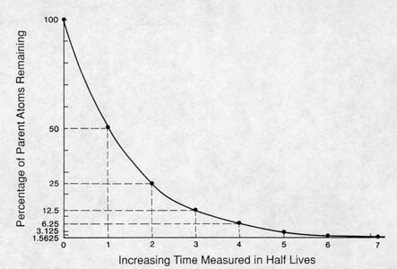
There was a recent post on the Museum Audience Insight blog about “Historical cooties”. In a similar vein, I want to think about history being radioactive. By this I mean considering history as having a “half-life” – and thinking about how this influences what we tell and how we tell it in our museums and heritage sites.

A typical radioactive decay curve. Half of the radioactive nuclei decay in the first half-life, then half of what’s left decays in the second half-life, and so on.

I started thinking about this late last year, in response to Susan Cross’ blog post about Remembrance Sunday. At the time I saw a distinction between events that occurred within living memory (i.e., things we lived through ourselves), events within family recollection (i.e., it was before our time but we know an older relative who was directly connected to it), and events beyond the reach of this living recollection (where the past really is a foreign country). I guessed the limit of this living connection to be about 100 years. Once you get much beyond this, distinctions between eras and events start to diminish and smooth out, a bit like the decay curve above. So 20th century history has an immediacy to it that (say) the Victorian era no longer has. Fewer shared cultural touchstones and assumptions survive that length of time. So, things that would have been self explanatory to the Victorians need re-interpreting for a 21st century audience (an important thing to recognise when interpreting objects and sites from this period). Even more so when we go further back – such as the medieval period or the Roman empire (both of which span several centuries in themselves but are now considered to be more or less homogeneous from this temporal vantage point).

More recently, a discussion with Gretchen Jennings on the Museum Commons blog got me thinking about the other end of the decay curve. When events are so new, so raw, so contested, that museums decide they’re too hot to handle. Gretchen describes how US museums are engaging (or more to the point, not engaging) with the 10th anniversary of the Iraq war as a case in point. Getting back to the radioactivity metaphor, museums might be collecting the hot, unstable material of current events, but then they are “burying” it – until such time as the “stable isotopes” of history (less dangerous, less contested) can be safely recovered and interpreted.

So if history were a radioactive isotope, what would its half-life be? I’d be interested in your thoughts on this. Currently I’m thinking it’s somewhere in the order of a single generation – say 25-30 years. It’s interesting that this is the time period for which most Cabinet records are sealed, suggesting the most “hot” phase has passed by this time. But it might take 2 or 3 half lives before a period becomes a “stable isotope” – something like World War II. This is not to suggest that “stable” history is not contested either – as in the curve above, the “hot” parts of a story might fade with time, but they never completely disappear.


“Hot Interpretation”: Telling Difficult Stories

There is probably no such thing as “value-free” interpretation. But some stories are more sensitive, contested or emotionally-laden than others.

In the context of heritage sites, attention to the emotional content of a visitor experience has been described as “hot interpretation”, to distinguish it from the more cool, detached, and primarily cognitive approach that heritage interpretation has traditionally emphasised [1]. In hot interpretation, emotional engagement is seen as a way of challenging visitors to reconsider their values, preconceptions and beliefs.

There is no doubt that telling difficult stories is an important thing for heritage interpreters to do. This often involves acknowledging past wrongs – such as formal Government apologies for the Stolen Generation in 2008 and forced adoptions last week (to cite two Australian examples). But both of these examples have shown that there is a need to handle the issues sensitively and carefully, and to do your homework – much damage can be done by the wrong choice of words.

A 2012 article by Ballantyne, Packer and Bond [2] identified some general principles to guide the development of ‘hot interpretation’, based on visitor research at the Broken Links exhibition (about the Stolen Generation):

  1. Personal stories: including personal stories of real people helps people make a connection to the subject matter – stories connect more than statistics do. Allowing people to make multiple personal connections gives a story an emotional resonance that isolated facts and statistics do not.
  2. Balance despair and hope: despair is disempowering and ultimately unengaging. Hot interpretation means invoking difficult feelings – anger, shame, regret. Unless there is a way for visitors to deal with and work through these feelings, and see some cause for hope and optimism, they may get overwhelmed or otherwise enter denial.
  3. Educate, not persuade: if visitors get the sense that the interpretation is biased, or is forcing them to reach a particular conclusion, they will put their defences up. This will limit personal engagement with the story and render the interpretation less effective. Personal stories need to be balanced with verifiable facts and avoid propaganda. Of course, bias is in the eye of the beholder and it’s probably impossible to avoid accusations of bias entirely. 
  4. Provide space to reflect: the paper describes reflection as the ‘missing link’ between experience and action. Thus, if the purpose of hot interpretation is to encourage visitors to reconsider previously held attitudes and beliefs, there needs to be an opportunity for visitors to do this. Comment walls and other opportunities for visitors to participate, leave their own thoughts and see the reflections of others were suggested as effective ways for visitors to reflect.
  5. Focus on the past to inform the future: like the need to balance despair and hope, hot interpretation should not dwell solely on the past but also look to the future. What lessons can we learn? What can we do to avoid the mistakes of the past? What can we change about our own lives?

NOTES:

  • Disclosure: two of the authors of this paper, Jan Packer and Roy Ballantyne, are my PhD supervisors. This is just a quick (and possibly ham-fisted) summary of a far more detailed body of work and I encourage you to go to the original source if possible.
  • This blog post came about because someone sent a query to me via this blog’s comment form about difficult content for interpretation. Writing this post seemed like a good way to answer their question. Do you have a question or a suggested topic for a blog post? Feel free to ask me – I’ll do my best to answer if I can.

[1] Uzzell, D., & Ballantyne, R. (1998). Heritage that hurts: interpretation in a postmodern world. In D. Uzzell & R. Ballantyne (Eds.), Contemporary Issues in Heritage and Environmental Interpretation (pp. 152–171). London: The Stationery Office.

[2] Ballantyne, R., Packer, J., & Bond, N. (2012). Interpreting Shared and Contested Histories: The Broken Links Exhibition. Curator: The Museum Journal, 55(2), 153–166. doi:10.1111/j.2151-6952.2012.00137.x


Hallowed Ground

“It’s more than just grass . . . Imagine the amount of history and the superstars of cricket that have been on this grass. It’s a piece of history.”

If someone starts lining up at 1.30am to pick up four 30cm-square pieces of turf, it’s obviously pretty important to them. And this woman wasn’t alone – yesterday hundreds of Adelaideans lined up to get their own piece of ‘history’ in the form of a few squares of turf.

Adelaide Oval, a city landmark much loved by cricket fans, is undergoing a major redevelopment at the moment. Part of this redevelopment involves replacing the turf and the state government decided to give the old turf away on a first come, first served basis yesterday (Sunday) morning. This was promoted on the local evening news late last week but, not being a cricket fan, I promptly forgot all about it.

Then, yesterday morning, I headed off to the Museum (to do some PhD fieldwork). My route passes Montefiore Hill, which overlooks the oval and was the advertised pick-up site for the turf. I saw a queue snaking up the hill and wondered what was going on. Then I saw people returning to their cars with bundles of turf in their arms, and remembered the previous week’s news.

The queue was snaking up the hill like this when I rode past at about 10am. The giveaway started from 9am and the first person had started queuing up at 1.30am.

Footage of long queues and soundbites from happy turf collectors added some local colour to that evening’s news bulletin. Watching the news, my partner found it all a bit baffling – “It’s just grass”, he said. But obviously other people felt differently about this ‘hallowed’ turf. Was it just because it was free, and people love free stuff? Was there an element of jumping on the bandwagon given the high level of airtime the giveaway had received during the lead-up? Or do these squares of turf have a deeper meaning for at least some of these people? And if so, what are the criteria for this meaning? Looking at the comments on this news piece, it seems that some people felt the heritage ‘currency’ of the turf was diminished when they learned that it was only a few years old (the turf had last been replaced in 2007). Other people dismissed the interest as a sign of small-town parochialism and a populace with too little to do. There is also the view that cutting up and giving away the turf destroys the heritage value altogether, as in this tweet: 


So what do you think? Does a piece of ground from a certain place have meaning in and of itself? If so, under what circumstances? And is this meaning destroyed if it’s commoditised?

PhD – Two Years In

It is now a little over two years since I started my PhD, and quite a while since I blogged about it specifically. So it seems like a good juncture at which to reflect on how I’m progressing, and answer the burning questions you may have but are too polite to ask . . .

Two years is a long time. You must really have this PhD thing down by now.

You’d think so, huh? To be honest it really doesn’t feel like I’ve been doing this for two years! A lot of the time I still feel like I’m finding my feet. But I’m starting to think that that is just the nature of a PhD – nearly everything you do, you are doing it for the first time. And each new task has a niggling uncertainty about it – am I doing my data collection the *right* way? Am I asking the *right* questions? Will I recognise the answers to these questions in the mass of data I’m only just learning to analyse? What have I *not* thought of? These niggles have become part of the background hum of my mind, a bit like constantly wondering whether you left the gas on at home or not.

At some point though, you have to take a leap of faith in yourself – or else be paralysed by fear of failure – and have faith in your supervisors that they won’t let you stray *too* far off track (even if a bit of meandering might be a necessary part of the learning process).

And I don’t want to come across as overly pessimistic – I have learned a lot. Sometimes it’s hard to recognise this because no sooner have you passed one learning curve you’re on to the next. If you keep looking forward, all you can see are more mountains to climb. But every so often you get a chance to look back (e.g. offering advice to a PhD student just starting out, or being able to relate what you read in the literature to what you’ve observed in your own research) and you get to see how far you’ve come.

So what have you been doing since your last PhD blog post?

Since last May I have been:

  • Conducting 12 accompanied visits around the SA Museum (and transcribing the 14 hours of interview tapes they produced)
  • Performing an initial analysis of these transcripts to inform the development of a survey instrument, which was piloted with 170 visitors across three exhibitions (in SA and Melbourne) as proof-of-principle
  • Tracking and timing approx. 175 museum visitors in different exhibitions at SA Museum and performing initial analysis of movement and stopping patterns
  • Refining the survey instrument from above for incorporation into a larger questionnaire. Piloting said questionnaire and starting to collect the main survey sample (80 down, about 400 to go over the next few weeks)
  • Presenting a poster on my (as then, planned) research at the Visitor Studies Association (VSA) conference in Raleigh, NC, USA
  • *Finally* submitting my first scholarly article for publication (this is now undergoing peer review)

That doesn’t sound like much for nearly a year’s work. . . .

Yep. I agree with you. All these things have taken far longer to do in practice than I thought they would. I don’t know if that means my expectations were unrealistic, or whether I have been a little slow in getting things done. The logistics of data collection can be time consuming – more so than I anticipated. There are also the other things I did that were not (directly) related to my PhD:

  • Convening the Museums Australia conference in Adelaide last year (for which I took two months off from being officially a full-time PhD candidate)
  • Adding a two week study tour of Eastern USA museums to my trip for the VSA conference
  • Attending the Interpretation Australia conference and presenting a paper (unrelated to my research)
  • Attending the Australasian Evaluation Society conference in Adelaide
  • A few freelance interpretation projects
  • Planning for a trip to China next month (as part of a PhD student delegation being organised by the Group of Eight universities)
  • Various voluntary roles with Museums Australia and Interpretation Australia (and most recently at the Adelaide Festival)
  • Blogging (of course!) and other writing projects, including co-authoring an article for the Exhibitionist.
  • Probably some other things I can’t bring to mind right now

I write this list mostly to justify to myself that I haven’t been twiddling my thumbs, even if I do feel a bit behind on my research. On reflection I don’t think I’ve had the balance between “PhD study” and “other interesting things” quite right. With the long time frame associated with a PhD, it’s easy to think you can find the time for extra opportunities as they come along (particularly when they are all so tempting and rewarding). But each little thing adds up. Conferences are stimulating but they also take momentum away from what you were doing back in the office. I don’t want to be a PhD hermit, losing touch with what is happening in the “real” museums and interpretation world, but at the same time I think I need to be a bit more careful about what I say yes to in the future.

However, despite taking a slightly more scenic route towards a PhD, I’m still on track for my (self-imposed) deadline of completion before I turn 40 (just under two years away).

What’s next?

Over the next few weeks I’m hoping to get the lion’s share of my survey collection done, before heading off to China in the second half of April. May-July will be a chance to really get my teeth into the statistical techniques I need to be able to properly analyse and interpret these data (and also a chance to tidy up any loose ends on the data collection front). August is my last hurrah (a trip to the US with my partner who is attending some training courses there), before heading back to Adelaide, holing myself up and properly getting into writing my thesis.

Before that I intend to go to Hobart at some point (to see MONA and the newly refurbished TMAG) and will post some reviews here in due course. But it also might get a bit quiet on this blog from time to time as I take the time I need to focus on my research and writing up. If you don’t hear from me for a while, you’ll know what I’m doing . . .
 

Museum Moments: Toulouse-Lautrec and the Waitress

I was in Canberra for the weekend and had some free time late on Saturday morning. With no real fixed agenda, I found myself drifting towards the National Gallery of Australia carpark (mainly because I knew how to get there and it’s a convenient location for a few institutions). Almost on a whim I decided to buy a ticket for the Toulouse-Lautrec: Paris and the Moulin Rouge exhibition. While obvious in hindsight, I hadn’t thought about how crowded a blockbuster exhibition would be at 11.30am on a Saturday until I was in and amidst the throng. Crowds might not lend themselves to a contemplative experience, but they offer a ripe opportunity for people watching.

One of the first things I noticed was an interesting example in crowd “training”. In the first gallery, I leaned toward a painting to get a closer look and felt something brushing against my shin. I looked down to see a low barrier set about 50cm off the wall – the clear message was to keep my distance! So I stepped back and continued along the wall, maintaining that distance as I turned the corner. About halfway along the next wall, I noticed there was no longer a physical barrier at shin level, but I still instinctively had kept the same 50cm distance from the gallery wall. And here’s the interesting thing – everyone else had as well! I don’t know if this was a deliberate tactic by the gallery or just a coincidence, but I don’t remember seeing those barriers in the rest of the exhibit and nonetheless visitors kept a reasonably constant distance from the works throughout.

The exhibition was broadly chronological with some sub-themes exploring how Toulouse-Lautrec came to be interested in Parisian street life and brothels. The work that captured my attention the most was not the famous posters (they were as expected), but rather this work about halfway through the exhibition depicting Jeanne Wenz as a waitress:

At the Bastille, Jeanne Wenz, 1887, oil on canvas (National Gallery of Art, Washington DC)

I found this work totally captivating in the flesh (the online images don’t quite convey the light and texture of the original). It’s hard to put my finger on why – perhaps it’s her direct, piercing gaze or the slightly enigmatic expression. Nonetheless this work was the stand-out piece of the exhibition for me (giving my novice, untutored-in-art-history perspective). This triggered my curiosity regarding how other visitors perceived it. And as I was looking at it I overheard another woman discussing the work with her companion, speculating about the woman’s strange half-smile and the likelihood of her sore feet at the end of a hard shift. I made a mental note to come back and have another look once I saw the rest of the exhibition.

Coming back, I sat on a bench near the work and watched. It did appear to be a popular work, with most people stopping at it and reading the label, and some people seemingly drawn to it from across the room as I was. It was a brief and highly unsystematic study though, and I was not able to compare its relative attracting and holding power to the rest of the exhibition.

While I was watching visitors come and go, oblivious to this other visitor in their midst, I noticed that I too was being watched. I had obviously sparked the interest of the security guard positioned near the work and for whom my seat was in the direct line of view. He watched me with a look of slightly amused curiosity. I wonder what he thought I was up to? Did something about me give the game away that I somehow wasn’t an ‘ordinary’ visitor? I guess I’ll never know, but I shot him an enigmatic half smile of my own as I walked on.


(More) Museum and Gallery Visits in England

Back in late 2011 I posted a summary of the latest Taking Part survey of participation in Arts, Sport and Heritage in England. Late last year figures for the period spanning October 2011 – September 2012 were released by the Department for Culture, Media and Sport (DCMS).

Since 2005, when the survey began, these figures have reported an upward trend in the number of people who had visited a museum or gallery in the previous year. For the first time, that proportion has gone above 50%: 51.6% in the most recent survey period. This gets as high as 57.5% in London, with the West Midlands trailing at 48.5%. Despite these variations, all English regions are seeing an increase in visitation.

Online participation is also growing, but still has a long way to go before it catches up to physical visitation – 28.7% of respondents had visited a museum website in the previous year (up from a mere 15.8% back in 2005/6).

Participation rates remain higher in the white and upper socioeconomic demographic groups. However the rise in participation by non-white and non-Christian people continues, with participation rates of 48.4% and 46.0% in the Black and Minority Ethnic and non-Christian religious communities respectively. (This compares with 35.4% and 35.3% in 2005/6). Participation rates are also rising across the socioeconomic spectrum.

Participation rates are the lowest among the over 75s (27%) and those living in socially rented housing (27.9%). However, in 2005/6 the participation rate among social renters was 24.9% – this represents a statistically significant increase. (Participation rates among the 75+ demographic remain steady).

Want to explore further? Summary reports as well as the raw figures (in excel format) are available from the DCMS website.

Exhibition Costs – what’s in *your* budget?

One of the most popular posts on this blog is one from way back in mid-2011: Exhibition Costs – Constants and Variables. Working out what a museum exhibition should cost to develop is *the* FAQ that exhibition planners hear the most. And it’s a subject that’s featured in a recent article by Sarah Bartlett and Christopher Lee [1].

Compared to visitor numbers, data on exhibition costs are hard to come by. Many exhibition projects include, at least in part, contracts with outside design companies and exhibit fabricators, who understandably play their costing cards pretty close to their chest. Most of the available data is therefore derived from informal, self-selected survey responses. Also, whereas it’s pretty easy to agree on what constitutes a ‘visitor’, deciding what counts as part of an ‘exhibition budget’ is not so straightforward. Not everyone factors the same costs into their exhibit budget equation. So even when we do have numbers, it’s hard to tell if we’re comparing apples with apples (a point I have made previously).

Bartlett and Lee cite data from their own informal survey (the full report is apparently available on splitrock studios website but at the time of writing I couldn’t find it) based on 71 responses across the US. Responses were mostly from History / Natural History / Art Museums, with relatively few science centres and children’s museums (this contrasts the survey by Mark Walhimer that I reported in my earlier post, where more hands-on style museums were represented). In the Bartlett and Lee sample, the vast majority of exhibitions came in under US$100/sq.ft., although some were over 10 times this amount. This is reflected in the average cost for science / technology museums and visitor centers being over US$500/sq.ft.

But that’s far from the whole story, because survey respondents didn’t spell out what costs were included in their $/sq.ft. figure – and what was below the line. Bartlett and Lee identify the following categories that may or may not be included in an exhibit budget, to which I’ve added a few additional comments:

  • Differing base fit-out costs of a new versus existing building (to which I’ll add the complexities of working in heritage buildings or in spaces with limited access, which increases on-site costs).
  • Basic finishes such as painting, track lighting and flooring (it’s amazing how much it can cost just to get a space up to an ‘inhabitable’ standard!)
  • Changes to building infrastructure like new walls or electric/data cabling
  • Preparatory costs, such as research, planning, design and management fees (to which I’ll add formative evaluation costs)
  • Audiovisual and Electronic interactives (I’d say it’s worth adding that this could also include software and devices that are not strictly part of the fit-out such as apps or audioguides)
  • Staff costs, both in-house and contract personnel (I’m aware that it’s often hard to quantify the amount of in-house time spent on an exhibition, particularly if staff are not required to quantify hours spent. Anecdotally I’ve heard there is often internal resistance to the idea of doing such quantifying as staff feel they’re being ‘checked up on’)
  • Maintenance costs (to which I’ll add other post-opening costs such as snagging, consumables, staffing costs and of course summative / remedial evaluation!)
  • Object-related costs such as conservation, packing and loan negotiations.

With this many variables in what people routinely count as part of the exhibition budget, it’s easy to see how you can get variations that vary by an order of magnitude or more. The most basic of exhibitions may draw upon the existing collection and not involve any changes to gallery infrastructure such as lighting, painting or display cases, and staff costs may be absorbed into day-to-day operating budgets rather than costed out. At the other extreme are highly media-rich and interactive exhibitions that involve considerable research and hiring in of a multitude of outside experts. Bartlett and Lee also identify geography as a factor in costs, at least across different parts of the US.

1. Bartlett, S., and Lee, C. (2012). Measuring the Rule of Thumb: How Much to Exhibitions Cost? Exhibitionist, Vol 31(2), pp 34-38.

Death and Suspended Animation

Looks like there’s a dead bird on the, in the display, presumably purposefully . . .
Well they’re all dead I guess.
– visitor to the South Australian Biodiversity Gallery, SA Museum

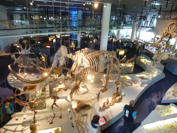
When it comes to animals in museum displays, it seems that some are more dead than others. There are those that are unapologetically and possibly even offensively dead – insects on pins, dismembered body parts, a beached dolphin in a coastal tableau. But in Natural History displays at least, most specimens are presented in lifelike poses; snapshots of nature scenes rendered in diorama form. It’s like we perceive the creatures to be in some form of suspended animation. Suspended animation or suspended disbelief – the displays don’t seem to trigger that visceral sense of disgust that looking at a ‘dead animal’ seems to do. It’s something I observed several times on my accompanied visits in the Biodiversity Gallery last year:

I like the little, mice doing different things other than just sort of sitting there looking dead.

. . .they’re looking like just dead birds really. Not like the ones in the cases . .

I don’t really like that display because it’s animal parts, like, y’know, having a case full of people’s arms or something . . .oh there’s a large, er Wedge Tailed Eagle, wing, which yeah, that’s all a bit sad really. 

Well, I know the dead dolphin, happens every now and then, and it’s probably the best way to present um, marine animals, but it still looks a bit cruel. . . 

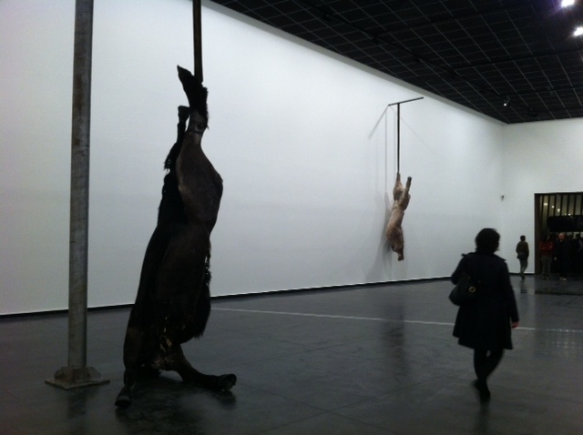
I was reminded of this last week when I went on a preview tour of the newly refurbished Melrose Wing at the Art Gallery of South Australia. Among one of the recent acquisitions displayed in the wing is Berlinde De Bruyckere’s We are all flesh. The work is made of horse skins stretched over a cast of two intertwined horse bodies, suspended in the middle of the room.

A view of the work taken last year (from http://lamblegs.wordpress.com/2012/06/07/we-are-all-flesh-berlinde-de-bruyckere/)

The pending unveiling of the work caused a minor splash in the local media, and I saw at least one letter to the editor of the local paper saying something to the effect of: “If this sort of thing is what’s in the Art Gallery there is no way I’m going to let my grandson go there and be traumatised by it”. Irrespective of any debates about the artistic merit of the work, I doubt the letter writer would have expressed similar concerns about the towering red kangaroo on display in the Biodiversity gallery just next door.

Clearly there are different classes of ‘dead’ when it comes to what we display in our gallery spaces. Why probably matters too – is something that is acceptable when displayed in the name of scientific instruction suddenly scandalous when it’s art?

UPDATE (5/3/13): It looks like the controversy surrounding We are all flesh is prompting renewed interest in the Art Gallery of SA, and possibly reaching new audiences?