Reflections on a visit to MONA

Visiting MONA was my birthday present. An odd choice maybe, but when I clocked up another year back in February I couldn’t think of anything I wanted. But a chance to visit (arguably) Australia’s most talked about museum? I couldn’t pass that up. So in lieu of a gift, my family helped fund a trip to Hobart, which I finally got around to doing earlier this month (I also saw the recently refurbished Tasmanian Museum and Art Gallery, more on which in a future post). 

So . . . what is there write about a place that has already attracted hundreds of column inches already (including some penned by yours truly)?

MONA’s owner/founder David Walsh on the cover of the February 2013 issue of The Monthly.

The problem with visiting such a well-known place is that the answer to the question “so what did you think of it??” is so often “pretty much as I was expecting”. You’ve heard so much, there’s not much room for surprises. That’s still better than when you visit a place and don’t think it lives up to the hype. For me this wasn’t the case, although what I saw vindicated my decision to visit solo (my partner is less than impressed by most contemporary art and I think the whole thing would have just infuriated him).

The other thing is that I think I’m getting really bad at being just a visitor and experiencing museums for what they are. My visits have become “meta-visits”: rather than being able to just be in the moment, part of me is always mentally standing back – observing how things are laid out, watching what others were doing, deconstructing my own responses. Occupational hazard I suppose.

To get to MONA I took the ferry, which I think is the usual way for tourists to get there. And this is where the MONA experience starts. There is a dedicated terminal and ferry, the MONA Roma, which is decked out in the sort of irreverent fashion you’d expect given MONA’s “brand”:

On board the MONA ferry. Graffiti art adorns the stairs while model cows and sheep (which double as seating) adorn the deck.

So the ferry doubles as a mode of transport and a (pre-) entrance statement – something akin to what Falk and Dierking would call an “advance organiser”. And while I didn’t realise it at the time, I think this pre-experience had an impact on how I approached the museum visit itself. But more on that later.

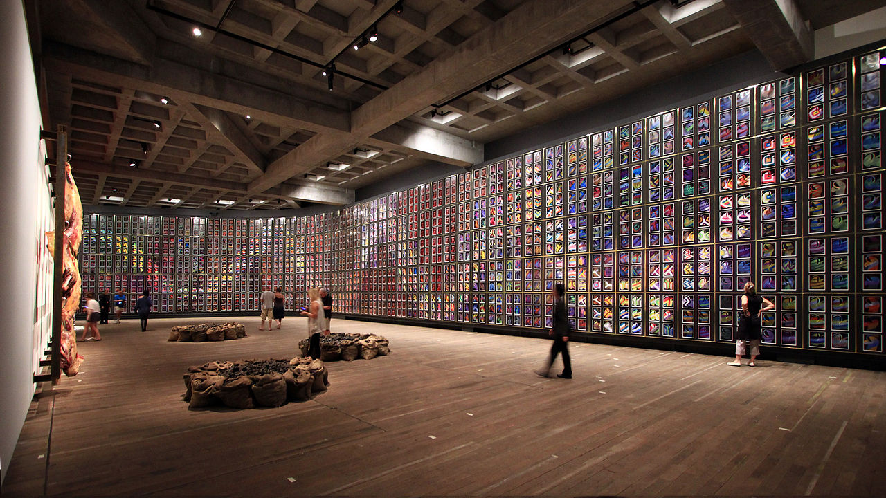
Upon arrival we were escorted up the stairs from the dock and into the museum, heading back down again to start the visit at B3 level (three levels underground). Here we were given our “O” devices to guide us on our visit (more on those below). In the distance I could hear some periodic pumping and hissing which added to a sense of anticipation / apprehension (it turned out to be Julius Popp’s Bit.Fall which spells out words in falling water droplets). I turned a corner and found myself heading down a long corridor, lined with red velvet drapes that made me feel like I was walking into a scene from Twin Peaks. Heading out of this area I went up some industrial-type steel stairs that intersect at odd angles across the void, exhibits in view in semi-darkness above and below. Here the feel is more like the video game Half-Life (pop-culture references came to mind readily for some reason!).

Mid-way along this level the corridor narrows, with small galleries off to each side. One of these works is Brigita Ozolins’ Kryptos – an eerie-feeling room-within-a-room-within-a room that you meander into like a labyrinth.

Brigita Ozolins work Kryptos

This work brought out the environmental psychologist in me – the darkness, confined space and the lighting effects creating the sense of a floating floor all worked together to give me a real sense of trepidation about walking in (even as my rational side was telling me there was no real reason to fear). It was interesting to see how this environment was able to elicit such a visceral response in me (there I go, meta-visiting again . . .) Shortly after leaving this space, the corridor opened out into a wide open space covering two levels. After such a sense of confinement, this sense of openness an relative light (it was still pretty dark) provided a sense of welcome relief. I wonder if it’s just me, or if this orchestration of emotion was a deliberate move on the part of the architect.

The open space featuring Sidney Nolan’s “snake” along the wall

From Driver to Passenger – going along for the ride

I’ve written a couple of times this year about how some visitors like to know where they are at in a museum’s spatial and content narrative, whereas others are happy to go with the flow. I’m usually in the former but at MONA, I was happy to surrender myself to the experience more than I usually do. That raises the question – why?

I had a chance to give this a bit of thought during a workshop held as part of the Museums Australia conference in Canberra last week. I’ll flesh this out in more detail in a later post, but I started to think about how we “cast” ourselves in a visitor experience – do we like to be in control (a driver) or surrender to the experience (a passenger)?*

Reflecting on my own experiences, I’ve decided that in most cases I like to drive. But in this instance, I decided to be a passenger. I think that was partly because of some specific circumstances, and partly because my expectations of MONA were different from those of a “typical” museum.

Although they have visitor maps, I didn’t actually pick one up upon entry (they escorted us, the first ferry arrivals of the day, in a way that we bypassed the main ticket desk which is where they are located). So I only had the “O” device to guide me, and while this does have a map function, I didn’t feel overly worried about using it. I only picked up a map towards the end of my visit, just to double-check there wasn’t anything I had inadvertently missed.

As I said before, I’m also wondering if the ferry ride had a role to play in all this, by providing a temporal separation between the first sense of arrival (embarking on the ferry) and getting into the museum experience proper. Once you were on the ferry, all the logistics of worrying about whether you were in the right place, had the right ticket, etc. etc were behind you and you were – literally – cast in the role of passenger. Did this make it easier for me to be a passenger during the visit itself?

The “O”

Anyone who has read anything about MONA will know that they have no labels. Instead, you are given a device called the “O”, which is essentially an ipod touch made location-aware by wifi transmitters installed around the museum. I already knew a bit about how this worked (having researched it for an article I wrote back in 2011), so it was interesting to have a go and see how it worked in practice. Generally speaking it worked quite well, and it does offer quite a different experience to that with standard labels.

As you move around the museum, the O lists works which are near to you and you can select them to read a standard label (these are titled “artwank”) or more atypical musings  (titled “gonzo” or “ideas”). You are also invited to “love” or “hate” works and when you do so, you find out how many other visitors felt the same way. Not all labels are accompanied by audio but some works were pieced with music which I thought was an interesting idea, and one which had me lingering longer at some works than I otherwise would have.

A couple of things about using the O though – while each work had an identifying thumbnail image, sometimes it took a while to find the corresponding piece of work because of scale – the work you were looking for might be a tiny thing in a peephole, or a giant installation hanging overhead. Also (and this might just be me) I found the O gave me an obsession with “collecting” all the works in a particular area before moving on – I wanted to mark everything as “seen” in a way I wouldn’t have worried about with just regular labels.

If you enter your email address, you get sent a summary of your visit as recorded by the O. This is what I was sent.
If you enter your email address, you get sent a summary of your visit as recorded by the O. This is a screengrab of mine, which shows my visit in impressive detail. It’s also interesting to see how the visit unfolded over time. Oh how I would love to get hold of all of MONA’s visitor data!!

Technically speaking, the O worked well overall – in some instances the location got a little confused, but this was easily fixed by pressing a reset button. The only thing is, I think my device didn’t record all of my visit. Going through the summary, I noticed a number of works that the website says I “missed”, when I know I did in fact visit it. Looking at what’s been missed, I wonder if I accidentally reset something when I nipped into the loo because it doesn’t seem to have recorded anything I visited after that. Oh well.

*Extending the metaphor, you might end up being a “backseat driver” when an experience affords you less control than you’d like.

Survey Responses – Benchmarks and Tips

I’ve now collected a grand total of 444 questionnaires for my PhD research (not including pilot samples) – which is not far off my target sample of 450-500. Just a few more to go! Based on my experiences,  I thought I’d share some of the lessons I’ve learned along the way . . .

Paper or Tablet?

My survey was a self-complete questionnaire (as opposed to an interviewer-led survey) that visitors filled out while on the exhibition floor. During piloting I tried both paper surveys and an electronic version on an ipad, but ended up opting for the paper version as I think the pros outweighed the cons for my purposes.

The big upside of tablet based surveys is that there is no need for manual data entry as a separate step – survey programs like Qualtrics can export directly into an SPSS file for analysis. And yes, manually entering data from paper surveys into a statistics program is time-consuming, tedious and a potential source of error. The other advantage of a tablet-based survey (or any electronic survey for that matter) is that you can set up rules that prompt people to answer questions they may have inadvertently skipped, automatically randomise the order of questions to control for ordering effects, and so on. So why did I go the other way?

First of all, time is a trade off: with paper surveys, I could recruit multiple people to complete the survey simultaneously – all I needed was a few more clipboards and pencils and plenty of comfortable seating nearby. Whereas I only had one tablet, which meant only one person could be completing my survey at a time. By the time you take into account the time saved from being able to collect far more paper surveys in a given time compared to the tablet, I think I’m still in front doing the manual data entry. Plus I’m finding doing the data entry manually is a useful first point of analysis, particularly during the piloting stages when you’re looking to see where the survey design flaws are.

Secondly, I think many visitors were more comfortable using the old-fashioned paper surveys. They could see at a glance how long the survey was and how much further they had to go, whereas this was less transparent on the ipad (even though I had a progress bar).

This doesn’t mean I would never use a tablet – I think they’d be particularly useful for interviewer-led surveys where you can only survey one participant at a time anyway, or large scale surveys with multiple interviewers and tablets in use.

Refining the recruitment “spiel”

People are understandably wary of enthusiastic-looking clipboard-bearers – after all, they’re usually trying to sell or sign you up to something. In my early piloting I think my initial approach may have come across as too “sales-y”, so I refined it such that the first thing I said was that I am a student. My gut feel is that this immediately made people less defensive and more willing to listen to the rest of my “spiel” for explaining the study and recruiting participants. Saying I was a student doing some research made it clear up front that I was interested in what they had to say, not in sales or spamming.

Response, Refusal and Attrition Rates

Like any good researcher should, I kept a fieldwork journal while I was out doing my surveys. In this I documented everyone I approached, approximately what time I did so, whether they took a participant information sheet or refused, and if they refused, what reason (if any) they gave for doing so. During busy periods, recording all this got a bit chaotic so some pages of notes are more intelligible than others, but over a period of time I evolved a shorthand for noting the most important things. The journal was also a place to document general facts about the day (what the weather was like, whether there was a cruise ship in town that day, times when large numbers of school groups dominated the exhibition floor, etc.). Using this journal, I’ve been able to look at what I call my response, refusal and attrition rates.

  • Response rate: the proportion of visitors (%) I approached who eventually returned a survey
  • Refusal rate: the proportion of visitors (%) approached who refused my invitation to participate when I approached them
  • Attrition rate: this one is a little specific to my particular survey method and wouldn’t always be relevant. I wanted people to complete the survey after they had finished looking around the exhibition, but for practical reasons could not do a traditional “exit survey” method (since there’s only one of me, I couldn’t simultaneously cover all the exhibition exits). So, as an alternative, I approached visitors on the exhibition floor, invited them to participate and gave them a participant information sheet if they accepted my invitation. As part of the briefing I asked them to return to a designated point once they had finished looking around the exhibition, at which point I gave them the questionnaire to fill out [1]. Not everyone who initially accepted a participant information sheet came back to complete the survey. These people I class as the attrition rate.

So my results were as follows: I approached a total of 912 visitors, of whom 339 refused to participate, giving an average refusal rate of 36.8%. This leaves 573 who accepted a participant information sheet. Of these, 444 (77%) came back and completed a questionnaire, giving me an overall average response rate of (444/912) 49.4%. The attrition rate as a percentage of those who initially agreed to participate is therefore 23%, or, if you’d rather, 14% of the 912 people initially approached.

So is this good, bad or otherwise? Based on some data helpfully provided by Carolyn Meehan at Museum Victoria, I can say it’s probably at least average. Their average refusal rate is a bit under 50% – although it varies by type of survey, venue (Museum Victoria has three sites) and interviewer (some interviewers have a higher success rate than others).

Reasons for Refusal

While not everyone gave a reason for not being willing to participate (and they were under no obligation to do so), many did, and often apologetically so. Across my sample as a whole, reasons for refusal were as follows:

  • Not enough time 24%
  • Poor / no English: 19%
  • Child related: 17%
  • Others / No reason given: 39%

Again, these refusal reasons are broadly comparable to those experienced by Museum Victoria, with the possible exception that my refusals included a considerably higher proportion of non-English speakers. It would appear that the South Australian Museum attracts a lot of international tourists or other non-English speakers, at least during the period I was doing surveys.

Improving the Response Rate

As noted above, subtly adjusting the way you approach and invite visitors to participate can have an impact on response rates. But there are some other approaches as well:

  • Keep the kids occupied: while parents with hyperactive toddlers are unlikely to participate under any circumstances, those with slightly older children can be encouraged if you can offer something to keep the kids occupied for 10 minutes or so. I had some storybooks and some crayons/paper which worked well – in some cases the children were still happily drawing after the parents had completed the survey and the parents were dragging the kids away!
  • Offer a large print version: it appears that plenty of people leave their reading glasses at home (or in the bag they’ve checked into the cloakroom). Offering a large print version gives these people the option to participate if they wish. Interestingly, however, some people claimed they couldn’t read even the large print version without their glasses. I wonder how they can see anything at all sans spectacles if this is the case . . . then again, perhaps this is a socially acceptable alibi used by people with poor literacy levels?
  • Comfortable seating: an obvious one. Offer somewhere comfortable to sit down and complete the questionnaire. I think some visitors appreciated the excuse to have a sit and have a break! Depending on your venue, you could also lay out some sweets or glasses of water.
  • Participant incentives: because I was doing questionnaires on the exhibition floor, putting out food or drink was not an option for me. But I did give everyone who returned a survey a voucher for a free hot drink at the Museum cafe. While I don’t think many (or any) did the survey just for the free coffee, it does send a signal that you value and appreciate your participants’ time.

[1] A potential issue with this approach is cuing bias – people may conceivably behave differently if they know they are going to fill out a questionnaire afterwards. I tried to mitigate this with my briefing, in which I asked visitors to “please continue to look around this exhibition as much or as little as you were going to anyway”, so that visitors did not feel pressure to visit the exhibition more diligently than they may have otherwise. Also, visitors did not actually see the questionnaire before they finished visiting the exhibition – if they asked what it was about, I said it was asking them “how you’d describe this exhibition environment and your experience in it”. In some cases I reassured visitors that it was definitely “not a quiz!”. This is not a perfect approach of course, and I can’t completely dismiss cuing bias as a factor, but any cuing bias would be a constant between exhibition spaces as I used comparable methods in each.

Forbidden City Audioguide

I’ve recently returned from two weeks in China as part of the Student Leadership in International Cooperation project. While most of the trip was spent visiting university campuses, we did manage to fit in some sightseeing. On our first day in Beijing we had a couple of free hours in the afternoon, so we headed to the Forbidden City (otherwise known as the Palace Museum).

Forbidden City 1

It’s a huge site and we were on a tight timeframe – we just managed to buy tickets before the box office closed at 4pm, giving us an hour to make our way through before the site closed at 5pm. We hired the location-aware audioguides that are available in multiple languages:

The audioguide incorporated a map of the Palace Museum using LEDs to indicate your location. Sites still illumianated are those you have yet to get to.

The audioguide was small and light, with minimal controls – basically just volume adjustment and a pause function:

Rear of the audioguide, made by lightour based in Beijing.
Rear of the audioguide, made by lightour, a Beijing-based company.

The introductory track starts pretty much as soon as they give you the guide – which means I missed it the first time around while I fiddled with the earpiece so that it didn’t keep falling off (an issue exacerbated by the filter mask I was wearing due to the high pollution levels in Beijing that day). I accidentally changed the language by pressing “option”, but was able to scroll through until I was back at English. “Help” restarted the introductory track and then I was back in business.

Overall it worked fairly well and it was useful to have the guide double as a mini-map. However it does not lend itself well to the “walk and look” approach you tend to take when you’re trying to get through a site quickly (like we were). It meant that sometimes the audio description cut out mid-way through because I had moved out of range. There also didn’t seem to be a way of restarting a description if you wanted to. But the location awareness of the device meant that it was pretty much set-and-forget, which is probably a reasonable tradeoff of control for simplicity.

As far as I can tell from the Lightour website (using Google translate as I coudn’t see an English version), it seems that this technology is being used in several tourist sites in China, but apparently nowhere else as yet.

Forbidden City 2

Has anyone seen or used anything similar?