Musing on Interpret Europe

It will take me a while to fully digest the last few days. A conference with a theme of “sensitive heritage, sensitive interpretation“, and that includes field trips to sites such as Auschwitz-Birkenau, is hardly going to be lightweight stuff. A lot of us frequently found ourselves in a reflective mood, and it was interesting to share thoughts and feelings with other delegates, often coming from very different perspectives (in the order of 30 countries were represented). The conference was small enough (around 100 delegates) that you had a chance to meet more or less everyone, however briefly, and this reinforced the sense of us all having a shared experience.

The conference had a good balance of theoretical and practical sessions, so I’m left with much to ponder as well as things I’m keen to try out once I get home. Although there were plenty of long days, most days had the format of a morning keynote, parallel sessions before lunch, and then a field trip running into the evening. This offered a welcome change of pace that helped counter the “session fatigue” you can get when spending whole days in seminar rooms.

Some quick take aways, which I hope to expand upon in future blog posts:

  • James Carter and Patrick Lehnes’ session on Interpretive Philosophy: interpretation can be seen to have a foot in both the Enlightenment and Romanticism. Both have their benefits and pitfalls. But I find this an interesting framework for thinking about the different sides of a controversial heritage topic.
  • Nicole Deufel’s research on “preferred readings” and the interesting differences revealed between English and German visitors to site related to their respective national histories.
  • Visitor journey mapping as a way of conceptualising all facets of the visitor experience in a holistic way (workshop by Jane Beattie and Chuck Lennox)
  • The transition from “history” to “memory”. This was a common thread throughout several sessions, but it crystallised for me during Roger White’s session on interpreting industrial heritage. Similarly to how I’ve described before, it struck me how there is a qualitative difference between heritage related to the recent past (i.e. within a generation of the people who actually lived through it) and that related to more distant times. More recent heritage also seems to be the more sensitive, controversial or contentious. It also presents interpretive and management challenges when a site’s story makes the transition from a “memory” era (within the last 75-125 years typically), to a “history” era (the past as a foreign country).
  • High quality, atmospheric exhibition design at both the John Paul II birthplace museum and the Schindler Factory Museum.
  • Finally, Eva Sandberg’s reminder that controversy is an opportunity: if a topic is controversial, it means it’s relevant, and that people care about it. Controversial and relevant trumps bland and boring.

Now it’s time to head off to Trento for ECSITE 2015. . . .

The Gaze of the Other

Keynote address by Dr Andrzej Leder, Polish philosopher and essayist, at the Interpret Europe conference in Krakow, Poland, 7th June 2015 [1].

Consider the following: an Israeli husband and wife, aged 57 and 60, are arrested at Balice Airport, Krakow, accused of removing objects (spoons and other small domestic items) from Auschwitz and attempting to take them out of the country. The maximum penalty for such a crime under Polish law is 10 years’ imprisonment.

A spokesperson for the Auschwitz-Birkenau Museum considers this a “crime of a special dimension” – such objects are the only things that remain of the 1 million plus people who faced annihilation at the death camp. Removal of these remnants represents a further annihilation.

The couple plead guilty and are fined. They apologise and return home. Once back in Israel, however, the couple are less repentant. While they regret any hurt their actions may have caused Holocaust survivors, they maintain that they did not really ‘steal’ anything. The objects concerned had been recently unearthed by weather, sitting in the ground. Their motivation for removing the objects was to ‘save’ them by turning them over to the custodianship of the Yad Vashem Museum in Israel.

The couple and the Museum spokesperson thus have competing moral frameworks, or “social imaginaries” to use Leder’s term. They may well know and understand each other’s perspectives on an intellectual level, but they choose to ignore or otherwise fail to acknowledge the aspects that challenge their own moral framework.

The couple would have known that Auschwitz-Birkenau is a museum site, and you can’t just take objects from museums whenever you please. However, many Holocaust survivors do not recognise Auschwitz’s legitimacy as a trustee of Holocaust memory. They consider the only true trustee with the moral authority to act in this role to be Yad Vashem.

Similarly, the Museum would have known that the couple, being Israelis of late middle age, would very likely have had direct connections to Holocaust survivors and that their intent was preservation, not destruction. Nonetheless, how can Auschwitz be properly managed and maintained if every visitor with a link to a Holocaust survivor is entitled to treat the place as their own property?

In its response to the incident, the Museum management emphasised the significance of Auschwitz as a grave site, for which they are ultimately responsible. In Polish tradition, the guardian of a grave has a right to speak for the dead. Delegitimising the right of Poles to take this guardianship role is seen as the first step down the road as casting the Polish people as bystanders, complicit in the Holocaust.

In post-war Europe, there were many competing different narratives and social imaginaries at play. There are the perpetrators and victims, those who were complicit (Vichy France and Quisling Norway for instance), and many questions about whether others did enough to stop or prevent what happened. With the lowering of the Iron Curtain, there are further narratives in the West that served to cast Eastern Europeans as the ‘bad guys’.

All of these different social imaginaries create Us and Them moral frameworks. Such comfortable certainties deny ambiguities, and ‘we’ (whoever ‘we’ are) are always the ‘good guys’ in our own moral frameworks. Such positions undermine empathy. We cannot accept what the Other says, even if we understand it on an intellectual level, because to do so would undermine the social imaginaries/moral frameworks of our world.

Resolving this requires what Leder calls a “Kantian imperative of empathy”. This means being ready to face inner tension between your own moral position and that of another. It also means being willing to look at yourself through the eyes of the other – and endure that gaze. Knowledge alone is not enough.


[1] The official session title was Imperative of Empathy – the Kantian pre-condition for any kind of European future. This summary has been hastily pulled together based on my notes taken during the session and without benefit of having a copy of Dr Leder’s slides (I’ll post a link to them if they become available). Any errors or misrepresentations are mine.

Exhibiting Evolution in 3D

While in the Netherlands recently, I took a day trip to Leiden to visit the Naturalis Biodiversity Center. I didn’t know a lot about it before I arrived, and it was much bigger than I expected – particularly since it looks pretty modest upon arrival. For some reason, the entrance is via a historic building that includes the shop, cafe and storage lockers, with entrance to the main centre (a large modern building spanning some 6 floors) via a long enclosed pedestrian bridge across a highway. This brings you to the second level of the main building, with the path upstairs looking the most inviting.

Arrival point to the main exhibitions.

This upstairs gallery, Nature’s Theatre, is an impressively comprehensive overview of biodiversity, encompassing not just animals but also plants and fungi (and a few microbes here and there as well) – areas that often get overlooked in favour of more animal-centric displays.

Birds display. I liked how many of the birds were shown in flight, in contrast to the flightless birds that were anchored to the plinth.
A walk through the plant kingdom.

There was a lot more to this exhibition’s layout than first met the eye. On the floor of the plants picture above, you may notice a couple of greenish yellow lights set within metal discs. At first these didn’t really mean a lot to me, with their seemingly haphazard positioning and labelling only in Dutch. Their significance only dawned on me after visiting the Primeval Parade, on the level below.

An early section of the Primeval Parade.
An early section of the Primeval Parade (note the lit-up structures set into the ceiling- they’re important later).

This exhibition follows a spiral path through the earliest stages of Earth’s history, the formation of life and the world’s earliest fossils through to the era of the dinosaurs and concluding with extinct species from the last Ice Age.

A view into the Primeval Parade.

While in this exhibition, I’d noticed a rather dense array of tree-like structures set into the ceiling. They appeared to be linked to a central spiral structure that lit up periodically. I never did quite figure out how that worked (whether it was triggered by visitor use or followed a predetermined cycle), but it gradually dawned on me that the central spiral represented an evolutionary timeline, and the tree-like branches were different evolutionary lineages.

The central spiral exhibit.

Some of the tree branches terminated in white discs with a genus(?) name on it, as you can see in the picture above. Others went through the ceiling and into the floor of the Nature’s Theatre exhibition above . . . becoming those greenish floor lights! Thus the layout of Nature’s Theatre was driven by the evolutionary history of each lineage, as outlined in the Primeval Parade exhibition below.

Once the penny dropped and I knew what was going on, this added a whole new meaning to the layout of each exhibition space. I spent a lot more time looking around and across the two floors than I would have otherwise. The arrangement of these two floors is one of the most complex and clever bits of 3D spatial communication I’ve seen. And I was impressed – as a scientist. But as a visitor researcher, I have some questions/caveats. How clever is too clever? Do visitors generally grasp what’s going on? (It might be more obvious to Dutch speakers, as Dutch labelling is more extensive than English, understandably enough.) How much does it matter if they don’t? What difference does it make if the main target audience is schools rather than general visitors, and the layout is used as a teaching tool?

Either way, I’m glad I had a chance to see it on an opportunistic day-trip to Leiden.


The language of objects

Objects may not be silent, but what difference does that make if you don’t speak their language?

I’ve been doing a bit more musing on some of the anecdotes Stephanie Weaver shared during her keynote at the recent Interpretation Australia conference (first instalment here). She mentioned the often-heard claim that objects “speak for themselves” (a view that appears especially prevalent in art circles), thus rendering interpretation irrelevant at best, interfering at worst. In response, one time she challenged some “speak for themselves-ists” with an image of a carburettor, similar to this one:

Did the object speak to them about what it was? Was it a particularly fine or noteworthy example? In the absence of any relevant mechanical or technical knowledge, Stephanie’s interlocutors were stumped. They accepted that this object was mute in the absence of interpretation (at least to them).

But Stephanie also told the story of the object that spoke to her immedately, profoundly, and so powerfully it moved her to tears – no interpretation required:

In this case, the painting was the trigger for an avalanche of meaning that lay within Stephanie’s own life experience. It was in the Musee d’Orsay, during a much-anticipated and long-awaited trip to Paris. The painting was beatifully presented in a gallery context. The content resonated with Stephanie’s childhood as a dance student. And of course there is an aesthetic appeal that needs no overt explanation*.

This made me think that the “objects are mute” vs “objects speak for themselves” debate may be missing an important nuance: perhaps objects do speak, at least some of the time, although we as visitors may not necessarily be conversant in the language any given object speaks. And if not, the object is as good as mute to us.

Some communication transcends language: in another conference session, Pamela Harmon-Price described how a Japanese tour guide used timing, gesture and body language to convey considerable meaning, despite Pamela not understanding a word of what was said. Drawing analogy to objects, there may be some aspects of an object: form, colour, positioning, and so on, that can speak to us on some level.

But then there is the Tower of Babel of other languages any given object may speak. And of course the same object may speak multiple languages (the languages of technology, or art, or social history). And that is where interpretation can step in – conveying that meaning to those who don’t know enough of the language enough to understand it.

On a radio interview held with Stephanie, Pamela and John Pastorelli during the conference, they reflected on the fact that people outside the cultural sector tend to assume “interpretation” has something to do with languages. Perhaps on some level they’re right: it’s just that it’s intepreting the languages of objects and places rather than other people.

So next time you see an object that you think “speaks for itself” – ask yourself: can you only hear it because you already know the language?


*At least to people enculturated into a Western perspective of aesthetics. Although there are some aspects of aesthetics that may be ‘hard wired’, so to speak, yet others will be a product of the culture we live in, and we deem those as “universal” at our peril!

What if every label was tweet-sized?

I’ve just read Will Stanley’s article on Medium: Museum tours on Twitter. 

In it, he describes using Twitter to create virtual tours of selected galleries at London’s Science Museum. He describes the challenges of distilling an exhibition into a few dozen select tweets, while still retaining the curatorial voice. What’s essential? What can you leave out? This is often difficult enough with a 140-word exhibition label – let alone 140 characters!

It made me think – often I have to redraft a thought several times to make it tweetable. In the process you realise how many superfluous words and phrases you can live without. You find the core of idea you want to communicate, and that’s all there’s room for.

Makes me wonder – perhaps drafting exhibition labels as if they were tweets might be a useful exercise in becoming more (as Susan Cross would call it), “precise and concise”.

When money trumps message

My local zoo has been all over the news for all the wrong reasons this week. And it’s all because of an ice-cream deal.

Different news reports have slightly different versions of events, but I think this is a fair summary of what’s happened: Zoos SA, which runs the “traditional” zoo just outside the city centre as well as an open-range one about 40km away, had a supply deal with a local ice-cream manufacturer, Golden North. As part of that deal, Golden North had to change its practices to remove palm oil* from its products. Which they did. However, the contract is up for renewal again, and Zoos SA has opted to go with another supplier who offered them a better deal: Streets (part of the multinational Unilever). And their ice creams contain . . . you guessed it – palm oil! It’s been all over the media the last couple of days, (examples here and here), prompted online petitions, and even members of Parliament are asking “please explain” questions of the Zoos SA board. It seems a lot of bad publicity to take, just to save a bit of money on an ice cream contract.

This story has a couple of overlapping issues which is why I think it’s made such a big splash here. Firstly, the fact a local company lost out to a multinational speaks to a wider globalisation narrative and the loss of local brands and jobs at the hands of “faceless” multinational corporations. This, I believe, has acted an an amplifier for the second, more serious issue: the apparent hypocrisy of a zoo (ostensibly a conservation organisation) choosing the financial bottom line over the environmental one. It’s grist to the mill for those who believe zoos are not really committed to conservation, that it’s just a cosmetic veneer to make zoos more palatable in a more animal-aware age. It undermines any conservation messages the zoo may be trying to communicate by basically saying to their visitors and the local community at large: “sustainable practices are great, but as soon as they get too expensive or too hard, then it’s OK to go with the cheap and easy option”.

Now the palm oil issue is a lot more complicated than that, as this recent segment on the (Australian) ABC program The Checkout explains:

There is an argument that sustainably-sourced palm oil is better than many of the non-palm oil alternatives. That’s a more nuanced, harder-to-communicate message than a simple one of “palm oil = bad”. In any case, according to Zoos SA’s own press release, Unilever’s palm oil won’t be 100% from sustainable until 2020.

Zoos SA’s argument seems to be that it’s easier to effect change from “within the tent” than outside it, and they point out they are not the only zoo to sell Streets ice creams. (To be honest the list surprised me, given these zoos’ very visible campaigning against unsustainable palm oil.)

It’s an interesting case study in what can go wrong when financial decisions are made in isolation, without looking at how they may impact your wider mission and the greater social context of your audience and local community. Based on how it’s played out in the media, I think it’s fair to say that Zoos SA were caught napping on this one.

UPDATE 15/8/14: It looks like community pressure has led Zoos SA to partially revisit their decision. Now Golden North and Streets will both be sold at the zoo.

*Because of the link between palm oil production and rainforest destruction, particularly areas that are orangutan habitats, many environmental organisations run anti-palm oil campaigns (including many Australian zoos).

What do you want / need from an exhibition designer?

Exhibition design can be hard to pin down sometimes. It has been described as

“. . .a mode of communication that has meant different things at different times, continues to change and expand, and, in fact, is not even recognised universally as a discipline at all.” (Lorenc, Skolnick, & Berger, 2010, p12)

So if you’re commissioning an exhibition designer for the first time, it can be hard to know what you should be looking for. And it’s not a one-size-fits-all thing.

Many different types of specialists may lay claim to being able to design interpretive exhibitions. Such designers range from those with a grab-bag of soft skills that are hard to encapsulate in a few words, to people with clearly defined and quantifiable skill sets such as architects. And there’s a lot in between. In a tendering process, these apples and oranges may find themselves in direct competition with one another. If you’re the person letting and assessing tenders, on what basis should you choose?

I’ve been thinking through some of the issues I think clients should consider before commissioning a design team. This is what I’ve come up with so far:

Square pegs in round holes

It’s possible for a team to have the right skills, but deploy them in an inappropriate way. For instance, a big architectural firm may have ample experience in large complex buildings and fit-outs such as office buildings or shopping malls. Such a track record can be reassuring. But – if they see a museum as just another fit-out along the same lines, they may try and shoehorn it into the same production processes and protocols. Such a work plan will underestimate the amount of time and iteration it can take to get an exhibition layout, graphics and other media all working together in harmony. Office blocks and shopping malls don’t need to worry about “storylines”, so don’t expect standard fit-out processes to be able to accommodate them.

Such shoehorning is more likely to happen when a client uses a modified version of a boilerplate construction tender to call for bids: it doesn’t take into account the specific variables and vagaries of an exhibition.

A question to ask yourself: Does the firm “get” exhibitions or do they see them as yet another fit-out?

The certainty of the cookie cutter

In any exhibition project, certainty and creativity will be in tension. Maximising certainty will lead to cookie-cutter outcomes. Meanwhile, creativity can only flourish in a situation where there is room to make mistakes. Innovation comes with risk. Any given project will need to decide where it wants the creativity-certainty balance to lie. You can’t have your creativity cake and have the certainty of eating it!

Because it’s generally framed in terms of minimising risk, competitive tendering tends to prioritise certainty over creativity. This is not necessarily a problem. But, if you want innovation, you need to ensure your procurement processes allow space for it to happen. A standard tender probably won’t.

A question to ask yourself: Are we making it clear how much certainty we want and how much risk we can tolerate, or is our procurement process sending a mixed message in that regard?

Loose briefs

More often than not, it’s not what the brief says that will make you come unstuck, it’s what it doesn’t say. I’ve learned this one from bitter experience! Writing a brief is a bit like playing the tappers and listeners game – we forget that what’s obvious to us, frequently isn’t to anyone else. Misunderstandings in interpreting the brief can also be a failure of imagination on the brief-writer’s part – a case of not spelling it out simply because you can’t envisage it being any other way.

Another weakness of briefs is that they are often expected to capture in words a very specific and detailed image we have in our minds’ eye. It can only ever be the tip of the iceberg, and how someone will interpret a written description will vary hugely depending on their thinking style, prior experience, etc. Exhibitions are a visual medium. Sometimes it might be better to say it with a picture than leave it to words alone.

Things to try: Include visual materials such as mood boards part of the brief. Also, make a “return brief” document an early stage deliverable in the design project. This gives a chance for you and the designer to make sure you’re on the same page and iron out any wildly different interpretations of what’s expected.

Being a “good client”

I’ve been both sides of the client / designer fence, and appreciate that it’s a two-way street. No amount of dedication, skill or experience on the part of the design team can rescue fundamental issues with the client team, such as:

  • not making decisions, particularly-time critical ones
  • one client representative saying x, another saying y
  • not respecting the fact that you’re paying for a process, not just a product. Just because nothing has been built yet, doesn’t mean costs haven’t been incurred. Yes, iterations are part of the process but they cannot be done indefinitely without it affecting the price
  • not giving clear direction and feedback beyond “I’ll know it when I see it”
  • not recognising the limitations of your budget and timeframe
  • protracted, complicated and time-consuming procurement processes that expect design concepts at the pitch stage. This is one of the biggest bugbears of the design industry, and could be a post in its own right.

What tips would you give to a person looking to commission an exhibition designer for the first time?

Update: I posted this piece on LinkedIn, where there were a few very useful comments. Briefly:

  • Price shouldn’t be a key consideration in choosing a designer – it’s more important to have someone that understands what you want and how you work.
  • Be an informed client – do your homework about what you like and what you don’t
  • Resist the temptation to squeeze ‘just one more thing’ into the exhibition – “decide what to say, say it, then shut up!”

Reference: Lorenc, J., Skolnick, L., & Berger, C. (2010). What is exhibition design? Mies, Switzerland: Rotovision.
2013: a (crowdsourced) digest

Yikes! Just a week before Christmas! Time for the obligatory “year in review” reflection pieces. What are the things that got everyone talking in 2013?

Rather than rely on just my own recollections, I put a call out over social media for people to nominate their blog posts or articles of the year – either their favourites or the most-read posts on their own blogs. As well as helping to jog my own memory, it’s a chance to get different perspectives on what caught the zeitgeist this year, as well as to catch up on things I might have missed the first time around.* It also makes a good holiday reading list.

Although I put out requests on Twitter, Facebook and LinkedIn, the most responses by far were from the Twitter community (make of that what you will). So, in no particular order:

Nominated by @SebChan:

– Cooper Hewitt labs “B” is for Beta on the beta version of their collections website

Planetary: the collection of code as a living object

– Embracing human imperfections and incompleteness through “institutional wabi sabi”

Nominated by @alli_burnie:

Reacting to Objects: Mindfulness, Tech and Emotion

The Value of the Local or Does Size Matter?

Flip Flopping Art History

Nominated by @NateLandon:

– Cathy Bell on The View from Behind the Locked Gate: The Government Shutdown and the National Parks

Destroying a place does not create a desert from the Slow Water Movement

Nominated by @ERodley:

– This excellent response to the debate triggered by the New York Times article “High Culture Goes Hands On” (which seemed to dominate online discussion through the month of August while I was in the US).

– Review of Cleveland Museum of Art’s Gallery One

– 2013 was also the year that Drinking About Museums seemed to gather more momentum (I was lucky to attend two while in the US – one in Boston and one in DC, and I know a few more Australian ones started out this year)

Nominated by Nigel Briggs (via LinkedIn)

– The BubblePlan exhibition design Tumblr blog.

A confession – I’ve had a Tumblr account for over three years, but I’ve never used it. I find the format of it confusing – at first I tried to use it as a blogging platform and gave up in exasperation. But just over the past few days I’ve started to look at it again and am considering giving it another go. Any suggestions for getting the most out of Tumblr would be welcome!

Nominated by @Mia_out:

Open objects: new challenges in digital history was her most-read post this year.

– Mia also offered a general commentary on 2013 trends:

crowdsourcing, huge increase in tablet use on collections sites, and the on-going clash between museums’ established ways of producing exhibitions, galleries, and webby ways of working. And of course people are still obsessed with digital strategy/everything else strategy and games in museums.

Nominated by Cobi Smith (via Facebook):

Cobi reminded me of this “saw this and thought of you” link she tweeted me on informed consent issues associated with visitor research. A fitting one to include for this 2013, as the first half of this year is when I collected the lion’s share of my visitor data for my PhD.

Nominated by @Gretchjenn:

There was a lot of discussion around empathy this year. It was something that Gretchen and I both wrote about from a museum and interpretation perspective, and then started to see in all sorts of other places.

Empathetic museum pop-up

Empathy and institutional body language

Seeing empathy in other places

In the same vein, my posts interpretive empathy and empathic design were among the most popular pages on my blog this year.

In closing, I’ll share this video that @MuseumsAskew forwarded about the difference between empathy and sympathy. Good food for thought for anyone who finds themselves needing to provide emotional support to friends and relatives over the holiday season.

Merry Christmas everyone and see you in 2014!

*I should confess: this is also a lazy way to get at least one blog post out this month when most of my time and energies have been consumed with either thesis writing or home renovations (More of the latter than the former, to be honest). Nonetheless, finishing the thesis will be the main goal for me in 2014. (Oh, and I’ll also be getting married. But that doesn’t require anywhere near as much preparation!)

Mediation or interference?

When does interpretation cross the line from mediation – providing a hook or a link between audiences and content – into interference: “over-interpretation”, where it’s simply getting in the way of a meaningful experience? Does this line shift depending on the audience? On the subject matter? Whether its science or its art?

A presentation I went to a few weeks ago challenged me to think about these questions. A curator from an art gallery background was sharing some findings from a study tour to the US and the UK. One of the images was from an exhibit familiar to me as one I’d seen at the (then) newly refurbished Kelvingrove Museum in Glasgow:

Kelvingrove Museum, Glasgow
A photo I took of the exhibit in question when I visited Kelvingrove in 2006.

Now back in 2006 when I saw this exhibit, I thought it was a pretty neat idea. Superimposed over the 19th century painting “The Marriage of Convenience” by William Orchardson are three small screens inside thought bubbles. A touchscreen interface allows visitors to fill in the bubbles emanating from the three protagonists in answer to the question “What are they thinking?”.

Over the years I’ve seen this exhibit put forward by interpreters as a way of engaging family visitors with art. As an example of “best practice”. Now here I was, listening to someone someone going beyond critique and essentially presenting it as an object of ridicule. I decided to explore this further in the Q&A afterwards. What was it about this exhibit that so attracted her ire?

Essentially it boiled down to the fact that it was visually intrusive [1] and unnecessary to interpret a painting whose Victorian-era morality tale was “not rocket science” to comprehend. She considered it an insult to visitors’ intelligence. Furthermore (and more to the point in my opinion), apparently visitor feedback hadn’t been positive. However, no data was presented to support this claim so it’s hard to know if it’s based on an exhibit evaluation or just the criticisms of a more vocal minority.

I think a couple of points of context need to be raised here. This exhibit was displayed in what was intended as a family gallery. It wasn’t targeted at arts officionados who may be instantly aware of Victorian symbolism in art. I saw (and appreciated) the exhibit as something that was intended to be a hook for visitors who may otherwise not give the piece a second glance. It seems I’m not the only person who saw it that way, as this piece vividly describes:

One of the most amusing interactivities–I could have stood there all day–focused on William Orchardson’s “The Marriage of Convenience.” Most visitors would give this painting–wherein a rich old man dines with his young, beautiful and profoundly bored wife as a dubious butler attends–a quick glance and walk on, dismissing it as a dreary 19th century remnant. But Kelvingrove (which by this point seems to be staffed by Monty Python) had placed thought bubbles next to the painting’s three figures’ respective heads. “What are they thinking?” we were asked, and as passersby typed away, the thought bubbles changed…”This isn’t working out the way I planned.”…”I thought he’d be dead by now “… “The master appears to have made a big mistake.”…. A “dull, boring” relic suddenly sprang to life–and became as contemporary as today’s trophy wives.

So at this point it might be easy to dismiss the art curator’s critique as missing the point of the exhibit and reinforcing the myth that art can somehow “speak for itself” even to those who don’t speak the language. That would be a convenient way of dismissing the criticism, but I’m not sure it’s quite so simple as that. As Nicole Deufel pointed out recently, we often accept interpretive “best practice” on the basis of flimsy evidence. That’s why I’d be keen to see if there was any evaluation of this exhibit and what it said. Perhaps this exhibit doesn’t do what it set out to. For me the visitor is the ultimate arbiter and arguing amongst ourselves is going to generate more heat than light.

Having said that, there are some points about subject matter and learning styles that warrant some further thought and discussion. Firstly the issue of interpreting art. I’ve heard art curators use the term “over-interpretation”, but interestingly I’ve never heard anyone lay the same accusation at the feet of science exhibits. Coming from a science background, I get the sense that there is an implicit assumption among “art” people that art is inherently understandable, you just need to take the time to look and think for long enough. And all that pesky interpretation is just “shouty” paraphernalia that gets in the way.

Another point of difference is how much interpretive “mediation” different kinds of visitors feel they need. Again revealing my science training, I tend to like knowing “the answer”. So I can feel cast adrift with art, because I don’t feel “the answer” is being made available to me. Now sometimes I know there is no answer, and that’s kind of the point. I can appreciate that. But other times I do wonder if there *is* some point that I’m supposed to get but I’m missing. And that just makes me feel stupid.

Bottom line is that our needs as visitors are not all the same. As exhibit planners we need to understand, respect and accommodate these differences, which might sometimes mean doing things that satisfy our target audiences but drive us personally nuts.

[1] In the discussion it also emerged that there may be conservation issues with the way the exhibit is installed in relation to the painting, and also the hardware now looks clunky and dated some 7 years (and an app revolution) later. These critiques, while legitimate, are tangential to the debate here.

Interpretive Activism

Recently I finished reading What makes learning fun? Principles for the Design of Intrinsically Motivating Museum Exhibits by Deborah L. Perry. On one level, it’s a detailed case study of how visitors interact with one of the classic science centre exhibits, Coloured Shadows. On another level, it’s a characterisation of six key motivations that exhibits must satisfy in order to make learning inherently fun. Perry positions these in the context of Interpretive Activism, which she defines as:

. . .the process of advocating for and incorporating research-based, visitor-centered exhibit design principles and strategies that facilitate active visitor participation in the interpretive process. [Perry, 2012, p. 27]

A key element of interpretive activism is to conceive of exhibits as catalysts (for visitors own conversations and active learning) rather than simply conduits (for information):

Rather than lecturing and monopolising the language space . . . what if [museums] gave visitors the tools they need to engage in meaningful conversations with their companions? In other words, what if exhibits (including labels, but other components as well) were specifically designed to contribute to visitors’ conversations rather than interrupting them? [Perry, 2012, p.29]

Over a period of many years, Perry adjusted the design of the exhibit and accompanying interpretive information, testing the results each time with a range of visitors. It’s an interesting example of how certain exhibit features can act as interpretive red-herrings as people make sense of the exhibit.

Coloured shadows is a hands-on exhibit that allows visitors to explore the additive properties of light mixing. (Image source: Exploratorium)

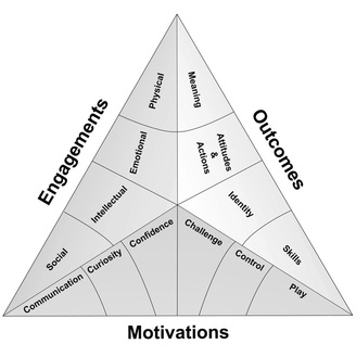
Then, using features of this exhibit as an example, Perry explores the six motivations that sit at the base of the Selinda model of learning (shown below). They’re described in terms that will make the most sense in the context of hands-on exhibits, although the fundamental principles can be applied more broadly. I’ll summarise these briefly below (to the extent that I can summarise several book chapters in a single blog post!) . . .

The Selinda Model of learning (Source: Selinda research)
  1. Communication: “Visitors are smarter than we think they are and know less than we think they do . . . [D]esign interpretation that gives visitors what they need to start a naturally occurring meaning-making process with their companions” (Perry, 2012, p. 94). People often visit museums in groups. Exhibits should acknowledge this, allowing for and encouraging social interaction and collaboration between visitors within social groups. Cater for a range of abilities (especially in exhibits targeted at families where there will be children at different ages). Use natural language in labels. Identify points where visitors may get stuck and offer guidance.
  2. Curiosity: Stimulate perceptual and intellectual curiosity. Pique interest by leaving some things unsaid – while too little information can be frustrating, if things are too obvious then curiosity can wane.
  3. Confidence: visitors will be motivated to learn in situations they feel “safe and smart”. (ibid, p. 118). Feedback should come early and come often. Success breeds a feeling of success and exhibits should guide the visitor through a “series of minisuccesses” (ibid, p. 131).
  4. Challenge: confidence and competence needs to be balanced with an appropriate level of uncertainty and challenge. Ensure visitors are clear what is expected of them, but don’t suggest that success will be automatic – visitors will not feel challenged if they can just go through the motions and be successful anyway.
  5. Control: the need for us to have control over our environment is an important facet of the psychology of visitor experiences. Visitors will feel in control when they have appropriate choices and the power to influence what happens in the environment.
  6. Play: play and the ability to engage the imagination is an essential ingredient of free-choice learning. ” . . . visitors who have the most satisfying and enjoyable experiences are those who feel the most playful – playful with actions yes, but also playful with ideas, playful with thoughts, playful all over” (ibid, p. 171).

Perry, D. (2012). What Makes Learning Fun? Principles for the Design of Intrinsically Motivating Museum Exhibits. Lanham, MD: AltaMira Press.