Rijksmuseum by App

I did a few laps of the Rijksmuseum yesterday – alternating between the printed guidebook and the museum’s free app to find my way around. In my last post I focused on the analog navigation, today I’ll review the app.

The app is essentially the same as the multimedia tour (the successor of the good old audioguide), although by bringing your own device you save yourself 5 euros. As I imagine most people do, I downloaded it while on site using the museum’s free wifi. This worked fine – although the biggest problem I had with using the app was the patchiness of the wifi coverage. Some parts of the museum seemed to be wifi blackspots, meaning parts of the tour wouldn’t download. But when the wifi was working, the app was a useful and easy-to-follow guide.

Some of the guided tours available via the app

The app offered a LOT of different guided tours – ranging from general ‘highlights’ tours to tours covering a specific collection or time period. Each tour also had two different versions: a shorter 45-minute version, and a longer 90-minute one.

Navigation using the app was also made very simple by a combination of navigational photographs and annotation of the same museum map used in the guidebook and in signage.

Navigation images made it clear where you were supposed to be heading to follow your chosen tour.
Close up of the guide map showing the next stop of the tour.

Besides the guided tours, you could also use the app to listen to audio descriptions of selected works by entering in its three-digit number. Importantly, the tours saved your progress. So if you followed a diversion while in the middle of a tour, looking up a couple of different works, you could then go back to the tour and pick up where you left off.

Audio commentary is organised into concise tracks.

Audio descriptions averaged about 1 minute in duration (maybe even less). I think this was the perfect length: short and to the point, with the option to listen to further tracks with additional information if you wished. And the commentary was pitched at the right level, not assuming too much knowledge of art or Dutch history.

The app also revealed some hidden gems that would have been easily missed otherwise. These two paintings were displayed in the same gallery, although not next to each other:

Dignified couples courting, by Willem Buytewech ca. 1620
Dignified couples courting, by Willem Buytewech (ca. 1620)
The fete champetre, by Dirck Hals (1627)

Look at the woman in red to the right of the lower painting. Does she look familiar? Apparently, artists copying each other like this was not uncommon – it was a way of them showing off their comparative skill.

Navigating the Rijksmuseum

First stop on my trip to Europe is Amsterdam. By coincidence, the Rijksmuseum has just been announced as the European Museum of the Year by the European museum forum. The museum reopened in 2013 after an extensive, decade-long refurbishment.

I’d visited the pre-refurbishment Rijksmuseum in 2000, but to be honest, my memories of the place are vague. In any case, my main focus for this visit was the lobby and overall navigation rather than the exhibitions (I’ll review the museum app in a separate post).

The central lobby, which has been created by enclosing what was probably a central courtyard space bounded by the museum building, is HUGE. This picture only captures about a quarter of it:

View on arrival: the cafe with the shop below.

The main lobby is below street level, and is clearly designed to manage large numbers of visitors (apparently queues snaking out and down the street are to be expected during peak periods). But things were relatively quiet at 10am on a Monday morning (this soon changed when the school groups started showing up). Although there is reasonably good seating provision in the galleries themselves, it was pretty limited in this lobby area. It’s obviously designed for throughput, not lingering.

View of the lobby looking away from the cafe/shop towards the ticketing area.
View of the lobby looking away from the cafe/shop towards the ticketing area. The windows show street level, where a cycle path passes through the museum building.

Entrance to the museum proper is at the opposite end of the lobby from the shop/cafe, through some rather imposing outscale rectangular gateways.

Information desk with ticket checkpoint in the background.

The first decision point is just past the ticket checkpoint, and it takes a while to figure out the layout of the historic building – particularly when it came to finding things on Level 3 (Level 3 is actually two completely separate area that don’t connect with one another, and not all stairwells lead to that level).

I’d bought a guidebook at the shop before entering (with 100+ pages it’s very comprehensive and at 10 euros was a bargain), with most of the highlights and recommended tours directing you to Level 2 (you enter at Level 0). This means heading up the stairs you can see to the far right of the photo above.

When you get to Level 2 the first point of arrival is a large hall, and it took me a while to get my bearings. It didn’t help that the map in the guidebook didn’t include gallery numbers, which was the main way that galleries were signposted in situ.

The isometric hand-drawn style of maps used across the app, guide book and site signage
A detail from one of the site directory signs. This axonometric hand-drawn style is used consistently across the app, guidebook and site signage

I can see why they went down that route – gallery numbers everywhere would have unnecessarily cluttered the map and in general the hand-drawn representations of key features in each gallery worked well. But until I worked out which part of the building I was in, I couldn’t use this to navigate. I think the way the map is used in the app works a lot better – but more on this in the next post.

On the road again

It says something about how busy I’ve been over the past month that it takes the enforced downtime of a 7-hour layover in Singapore to get back to this blog.

When I accepted my new job back in late March, it was with the caveat that I’d already committed to a five-week trip to Europe: a combination of a holiday, returning to the UK for the first time in 4 years, and presenting at both the Interpret Europe and ECSITE conferences. While I’ve been looking forward to the trip, I’ve also been really frustrated by the timing. Six weeks in the job is just long enough to start to feel like you’re in the swing of things and finding some momentum, which is now being interrupted by an extended time away. It’s meant I haven’t really had the time (or head space) to think much about blogging. Maybe my travels will give me more inspiration.

And if you’ll be in either Krakow or Trento, I hope to see you there!

The What, When and How of Participant Incentives

[Note: This is a modified version of an article that first appeared in Museum Australia’s Evaluation and Visitor Research Network’s Spring 2014 newsletter]

Introduction

We’ve all seen it; we’ve all done it: Complete our survey and enter the draw to win! Agree to be interviewed and get a free pen! Researchers call these “participant incentives”, which generally speaking are defined as “benefit[s] offered to encourage a person to participate in a research program”.[1] Offering incentives is considered to be good practice in evaluation and visitor research. Visitors agree to give us time out of their visit for the benefit of our research, and it behoves us to value this time and use it ethically[2]. If we consider research as a social contract, incentives are a gesture of reciprocity, acknowledging the value of visitors’ time.

But what kind of incentive is appropriate for a given piece of research? What’s feasible? What’s ethical? What might be some unintended consequences? This article will explore some of the issues surrounding participant incentives.

The Bigger Picture

To understand the role of participant incentives, we first need to consider why people respond to surveys in the first place. There seem to be three main kinds of reasons: altruistic (people who want to help or see it as their civic duty); egotistic (having specific stake in the results, or simply enjoying doing surveys) and study-specific (interest in the topic or organisation)[3]. Incentives increase the “egotistic” reason for completing a survey. But appealing to respondent’s altruism can also increase response rates, as can the fact that many visitors hold museums in positions of high trust and regard.

Particularly for online surveys, incentives have been shown to increase the response rate, but this also depends on the length of the survey, who you’re trying to target and whether they have a stake in the research outcome[4]. As a general rule of thumb, you should state up-front how long any survey is going to take, and offer an incentive that reflects the time commitment you are requesting. For online surveys, anything taking longer than 20 minutes to complete counts as a “long” survey that warrants an incentive. One of the most popular incentives is to give participants the opportunity to enter a prize draw of something of considerable value (e.g. gift certificates valued at least $100, a tablet computer or similar items).

However, a higher response rate isn’t necessarily the ideal – irrespective of the response rate, your survey strategy should aim to minimise systematic differences between people who do respond and those who do not (nonresponse bias). This is distinct from overall response quality, which does not appear to be affected by incentives[5]. Nonetheless, if there is a particular target audience of interest (e.g. teachers, visitors who have participated in a particular programme, visitors from a particular cultural or ethnic group, etc.), you may need to consider ways to increase the response rate among those people in particular.

Compared to the use of incentives in telephone and online surveys, there is very little published research about the practicalities of conducting onsite visitor interviews in museums and similar sites. Rather, examples of practice are shared through informal networks (more on this later).

Ethical Guidelines

Neither the Australian Market & Social Research Society (AMSRS) Code of Professional Conduct[6] nor the Australasian Evaluation Society’s Guidelines for Ethical Conduct of Evaluations[7] specifically mention participant incentives, however both outline important principles with which any choice of incentive should comply. In particular, the AMSRS code specifies that there must be a clear delineation between market research and “non-research activities” such as promotions or compilation of databases for marketing purposes. This may have implications for what you can use as incentives, as well as how you use any contact details you collect for the purposes of prize draws.

Care should be taken to ensure that incentives cannot be interpreted as coercion, particularly if the incentive is large enough to cause certain participants (e.g. at-risk groups) to reluctantly participate in order to receive the incentive. In any case, it has been suggested that it may be better to increase intrinsic motivations rather than rely solely on monetary incentives[8].

Is it an Incentive, a Thank You, or Compensation?

The principle that monetary incentives should only be used as a last resort may appear at odds with the idea that visitors’ time is valuable and should be acknowledged as such. However, it’s largely to do with the way incentives are framed: an incentive can be considered an inducement to participate, but it can also be presented as a “thank you gift” that you give to visitors as a token of your appreciation. In this sense, the timing of the incentive may come into play. Giving an incentive in advance may increase participation and there is no evidence that it raises a sense of obligation among potential participants[9].

There is another type of payment that we should briefly mention here, and that is compensation. This is particularly relevant where participation incurs costs direct costs (e.g. travel to a focus group session). Any costs that participants so incur must always be compensated.

Some Examples

In September 2014, there was a discussion on the Visitor Studies Association (VSA) listserv about the incentives that different institutions give away to visitors who participate in short (<5-10 minutes) onsite surveys. Among this community of practice, the respective merits and drawbacks of different approaches were discussed[10]. The key points are summarised below:

Incentive Features Drawbacks / Considerations
Vouchers for in-visit added extras(e.g. simulator rides, temporary exhibitions, etc.) Adds value to visitors’ experience with little or no direct cost to Museum May lead to unanticipated spikes in demand for additional experiences – e.g. can the simulator accommodate everyone who’s given a voucher?
Small gifts(e.g. pens/pencils, stickers, temporary tattoos, bookmarks, postcards, key-rings) Tangible and popular gifts, especially for children.If you’re surveying adults in a family group, giving children a few items to choose from can keep them usefully occupied while the adults respond to the survey.Cheap if purchased in bulk.


Gift needs to match target audience of survey (e.g. temporary tattoos are great for kids, less so for adult responders)Children may end up using stickers to decorate your exhibits!
Food / coffee / ice cream vouchers Generally popular and well-received. Can create a rush in the café if you’re doing large numbers of surveys.May be limited by the contract arrangements in place with caterers. 
Prize draws Popular with visitors and practical to implement with online surveys.Cost of a single big-ticket prize may work out cheaper than hundreds of small giveaways. Visitor contact details must be recorded for prize draw. These details must be able to be separated from the survey responses to maintain anonymity.Be aware that offering a free membership as a prize may reduce membership take-up during the survey period[11].
Gift certificates Can be used for longer surveys or detailed interviews that involve a longer time commitment and therefore warrant a higher value incentive. Gift certificates may be seen as equivalent to cash from a tax perspective.
Free return tickets No direct costs. Tickets can be given away to friends and family if participants can’t re-visit. Not relevant to free-entry institutions.Could be perceived as marketing.
Discounted museum membership Encourages a longer term relationship with the visitor. Not an attractive incentive for tourists.


Conclusions

Incentives are established good practice in evaluation and visitor research, and are generally intended to represent a token of appreciation for visitors’ time. Although incentives can increase response rates, this is not necessarily the principal reason why incentives are used. Like all aspects of visitor research, decisions regarding the size, nature and timing of giving visitor incentives must be clearly thought through from an operational, financial and ethical perspective at the outset of the research. Done well, incentives offer the dual benefits of increasing responses and creating a sense of good will among visitors.

References

[1] Arts Victoria. (n.d.) Visitor Research Made Easy, p. 82 (sourced from: http://www.arts.vic.gov.au/Research_Resources/Resources/Visitor_Research_Made_Easy)

[2] Bicknell, S., and Gammon, B. (1996). Ethics and visitor studies – or not? Retrieved from: http://informalscience.org/images/research/VSA-a0a4h9-a_5730.pdf

[3] Singer, E., and Ye, C. (2013) The use and effects of incentives in surveys. Annals of the American Academy of Political and Social Science, Vol 645, 112-141

[4] Parsons, C. (2007) Web-based surveys: Best practices based on the research literature. Visitor Studies, Vol 10(1), 13-33.

[5] Singer & Ye (2013).

[6] http://www.amsrs.com.au/professional-standards/amsrs-code-of-professional-behaviour

[7] http://www.aes.asn.au/images/stories/files/membership/AES_Guidelines_web.pdf

[8] Singer & Ye (2013).

[9] Singer & Ye (2013).

[10] Contributors to this discussion included (in alphabetical order): Stephen Ashton, Sarah Cohn, Susan Foutz, Ellen Giusti, Joe Heimlich, Karen Howe, Amy Hughes, Elisa Israel, Kathryn Owen, Beverly Serrell, Marley Steele Inama, Carey Tisdal and Nick Visscher (with apologies to any contributors who have been missed). VSA listserv archives can be accessed via https://list.pitt.edu/mailman/listinfo/vsa

[11] Visitor Research Made Easy, p. 60.

Seizing New Opportunities

Sometimes opportunities arise from unexpected places.

Close followers of this blog will know that I’ve had a long-running relationship with the South Australian Museum. This dates back to when I started my PhD in early 2011, when some people I knew on staff arranged for me to have some desk space in exchange for me using the Museum for the bulk of my fieldwork. The arrangement was informal – I wasn’t on staff, wasn’t reporting to anyone in the Museum, and for practiality purposes was usually categorised as one of the volunteers (but didn’t really fit in that category either). Nonetheless it was an arrangement that worked well, and having a home institution made my research so much easier than if I’d had to make prior arrangements from scratch every time I wanted to collect more data.

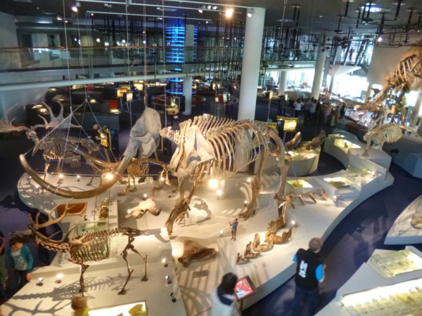
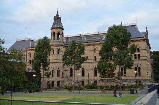
A view of the wing where most of the Museum’s galleries are located.

Fast forward to mid-2014. As I was getting close to submitting my thesis and wrapping up my PhD, I decided it was time to phase myself back into consultancy, and established myself under the name I’d been using in my online presence for several years, interactivate. The rationale behind setting up myself as a consultant was twofold: firstly, I liked the variety and the flexibility associated with being a consultant; and secondly I wasn’t in a position to move cities to pursue employment. I moved across the globe and back in my 20s and early 30s. Now on a personal level I’m established in Adelaide, have roots here, and no desire to move on.

Not surprisingly, given my established contacts there, the South Australian Museum soon became my largest client and I continued to be a familiar face around the place. Then, towards the end of the year, the Director called me to his office.

It turned out the Museum was going through a restructure, and a new position called the Manager of Visitor Experience was being created. It was a response to an identified need to put a visitor-centric lens on the way the Museum operates and presents itself to its audiences. In addition, the role is responsible for the revenue-generating activities of the Museum such as the shop, cafe and events.

Filling the position on a permanent basis would require a formal recruitment process, although the Director didn’t want it vacant for the amount of time that would take. So he invited me to be Acting Manager on a part-time basis in the meantime. My initial contract was for three months, starting in early January.

At first, I wasn’t sure if I would be interested in continuing in the role – I wasn’t confident of my knowledge of the cafe/shop/events side of things* and wasn’t sure if it would interest me; also I’d already invested a fair amount of time and effort in building the consultancy business and wanted to see that through. However, once I started doing the job I found I enjoyed it, liked having the blank slate of a newly-created position to work with, and so I decided to apply for the permanent position.

After an interview that I was sure I’d blown, I was contacted a few days later and told that I’d been offered the job! It’s a full time role, which means I’ll be mothballing interactivate as a consultancy. I’d by lying if I said that decision didn’t come with a tinge of regret. But then again, jobs such as this don’t come around very often, and it’s too good an opportunity not to sieze with both hands! There’s no way I could have imagined something like this would be on the horizon when I first set out on the PhD and consultancy journey.

I still plan to blog regularly (50 posts this year is not an impossible ambition), although I’m aware that it might be more difficult now. Not just the time it takes (although I imagine my job will keep me VERY busy . . . ) but also being aware that being linked to a particular institution means I can’t anonymise my experiences. However, if nothing else, needing some blog inspiration will be a good excuse to keep abreast of the literature.

Wish me luck!

 *Although this is relatively new territory for me, thinking laterally about my experience and discussing it with other people, I found the knowledge gap wasn’t as large as I first feared.

Flying starts, flagging finishes

Do we focus on first impressions at the expense of memorable finishes?

Have you ever had a construction or renovation project that goes something like this: At first, things start off well and there is a good relationship with the contractor. Their approach inspires confidence. Regular progress is made. But then the project hits a snag or two: something takes longer than budgeted for, or there is a delay with supplies. The level of service tapers off, as does the quality of workmanship (although interestingly, the invoices *don’t*).

I get it: most projects are a lot more fun at the front end. That’s the creative bit, and it’s full of possibilities. By comparison, the finishing stages are often full of niggling details and pieces that don’t quite fit as the plans said they should. It’s the point when the bits you didn’t quite think through at the beginning become painfully apparent.

If, at this stage, the contractor’s strategy is one of avoidance; trying to do as little as they can get away with to get the project off their books, the whole job ends on a sour note. And who’s going to recommend a contractor who they’ve had to drag across the finish line?

A project doesn’t have to end this badly for you to be unhappy with the result. All it needs to do is fail to live up to your expectations.

Finishing badly is even more disastrous when you consider the way we remember experiences. According to the peak-end rule, how an experience finishes has a strong influence on the way we recall it overall. Daniel Kahneman and his colleagues demonstrated that when we recall a physically painful experience (such as a colonoscopy, or putting our hands in very cold water), we judge it as being less unpleasant if the final stage was less painful, even if we endured the pain for a longer duration.

If we apply the peak-end rule to how we treat customers (and visitors), it would suggest that finishing on a high note is particularly important. We should definitely deliver what we promise, and only promise what we know we can deliver. If an experience ends with a pleasant surprise, that will enhance memory of the event overall. On the other hand, if it ends with disappointment, it sours the whole experience – no matter how well you did in the early stages.


The 6Ds of Group Dynamics

What’s the right number of people to have working on a project? 

Based on my experience in exhibition development teams, planning groups and various committees, I’ve developed these rules of thumb for group dynamics:

  • To Do and Deliver: I believe small teams of 3-4 people are most suited for completing specific, focused tasks where the desired outcome is well-defined and understood. Groups of this size are large enough to have enough hands to bear the load, while being agile enough to make progress quickly. They make good working groups and subcommittees.
  • To Delegate and Decidethis is the main role of committees and boards, and 8-10 people is usually a good number to have around the table. There are enough people to ensure a variety of perspectives inform the overall strategic direction of a project or organisation, while still being small enough to make decisionmaking manageable. Such committees can include representatives of your “Do and Deliver” subgroups or working parties, who can report on progress and seek guidance on what to do next.
  • In my experience, things get a bit tricky once you try to get more than about 12 people around the table. Too often, the result is less action and more dalliance and deferralDiscussions tend to be unfocused and circular as the sense of “too many cooks” creeps in. It can be hard to reach a decision, meaning progress is slow if not completely sclerotic. Larger groups also quickly factionalise, leading to more conflict than consensus.

Do these tally with your teamwork experiences?

Festival Volunteering

Today the Adelaide Festival and Adelaide Fringe wrap up for another year, the city returns to normal, and our social calendars get a lot less frenetic.

Like many arts festivals around the world, both the Festival and Fringe depend heavily on volunteers to help things go smoothly. And volunteering is a great way to feel part of the festival vibe. This was my 4th year as a Festival volunteer, and this year I decided to be a volunteer for the Fringe as well.

91kFM
My collection of volunteer passes


I’ve just added up the hours from the past few weeks and found that I have volunteered over 50 hours in total. Things I have done over this time include:

  • Live tweeting selected discussion sessions during Adelaide Writers’ Week
  • Operating and minding projectors as part of a multi-site outdoor video art installation
  • Keeping queues orderly and ensuring people were in the right queue for the show they wanted to see
  • Giving directions and handing out lots of maps, flyers and programmes

Festival volunteering is something I more or less fell into: back in 2012, the Festival decided to bring in a dedicated team of social media-savvy volunteers to live tweet selected sessions during Writers’ Week. I was one of the people who was tapped on the shoulder to help out in that first year, and I’ve been involved in every Writers’ Week since, adding additional volunteer duties as my other commitments allow.

I find volunteering in public-facing roles useful for reminding me some important lessons that I can apply to my own work, such as:

  • Signage and maps need to be carefully designed and worded to avoid ambiguity and confusion: what’s clear when you can take your time to find out what’s going on is much less so when you’re arriving at the last minute for a show that’s about to start.
  • People don’t tend to read instructions or the fine print when it comes to booking, purchasing and collecting tickets.
  • Planning can only take you so far: event staff need to be flexibile and ready to respond to unexpected scenarios. There are only so many things you can be specifically trained to handle, although the training you get as a volunteer for a large event gives some good pointers.
  • Being in customer-facing roles can be exhausting! Plus it can be easy to get jaded saying the same thing over and over again to a seemingly endless procession of patrons. Rotating staff across different duties over the course of a shift keeps everyone fresh and able to put their best foot forward.

Right, now I think I’ve earned a few quiet nights in  . . . .

In pictures: First World War Galleries at AWM

Although only officially launched earlier this week, the Australian War Memorial’s new First World War Galleries have been open since late last year. I was in Canberra earlier this month, so I swung by to check them out.

My interest in this exhibition was twofold:

  • A significant new exhibition is always worth a look
  • It’s linked to some of my current work. I’m currently part of a research team that is exploring how Anzac* heritage experiences are related to Australian national identity. So far I’ve conducted 16 in-depth telephone interviews with people who have visited the Gallipoli landing site.

It’s a slightly unusual refurbishment, in that significant portions of AWM’s original World War 1 galleries are heritage pieces in their own right, particularly the original dioramas that were conceived by official war historian Charles Bean. It means that in some cases, the new galleries don’t look all that new at all (although the original dioramas have been significantly reinterpreted and seem far better lit than I remember them being).

P1030487
The exhibition opens with a display of one of the boats used in the Gallipoli landings.

To be honest, I was expecting a more dramatic threshold statement for the exhibition – the boat shown above, while a very signficant object, is in a space that feels pretty much like an extension of the cloakroom area rather than a gallery setting. For me, the layout didn’t herald the end of the logistical process of arriving, and the beginning of an exhibition experience. However, there are interesting uses of thresholds later in the exhibition, in particular the transition from the Turkish/North African theatre of war to the trenches of France. There is a change of colour scheme from one that is dominated by warm shades and sandy tones, to one that is dominated by glossy blacks and uses a vibrant, dramatic red to highlight certain displays.

Looking across the threshold into the exhibits on the France/Belgium stage of the war.

Also visible in the image above is what I called the “Ikea style” visitor route set into the floor. The exhibition is laid out chronologically, and this timeline spine works its way throughout the exhibition with displays off to each side (hence the Ikea reference). Personally I liked this feature – it gave you a clear sense of the order of the narrative without dominating the design or forcing you to take a particular route if you didn’t want to.

Most object labels were on adjacent touchscreens. Thumbnail images of all the objects scrolled across the screen, and I found it quite easy to find and select the object I was interested in.
The original dioramas were also given another layer of interpretation through touchscreens linking the diorama scene to documents and stories of real soldiers.

The use of audio throughout the exhibition was well done: subtle but reinforced the mood of each space. Ambient audio was primarily sound effects; spoken audio (which can be annoying and distracting when you’re trying to focus on something else) was kept to a minimum and mainly used to emphasise key points/events – for instance Ataturk’s tribute to the Anzacs is played on a loop just before you leave this section of the exhibition.

Juxtaposition of old and new displays.
Juxtaposition of (what I assume to be) old and new displays.
I saw these women spend a lot of time at several of these photograph displays. They were apparently more interested in the human stories than the hardware.

I think this exhibition would be an interesting one to study with Pekarik’s IPOP model of visitor preference. Both Objects and People displays were strongly featured in the exhibition, and there were some sensory/tactile aspects as well (Physicality), although I’m not sure how strongly Ideas came through (by which I mean the big-picture context of the conflict). Admittedly, this is a difficult brief when the topic is an extended war, fought on multiple fronts for complex reasons.


*For the benefit of my non-Australian readers: on April 25, 1915, troops from the Australian and New Zealand Army Corps (the ANZACs), landed at Gallipoli Peninsula in Turkey as part of an ill-fated campaign early in the First World War. The anniversary has gained national significance and Anzac Day is the main day of rememberance in Australia.

Our Irrational Brains

Recently I wrote about three interesting books on the psychology of choice. In this post, I want to explore a couple of books that help to explain why humans sometimes make bad choices. Basically, our brain works in ways that can trick us into irrationality.

Nobel prize-winning economist Daniel Kahneman illustrates this with the following example: imagine a bat and ball together cost $1.10. The bat costs $1 more than the ball. How much does the ball cost?

Without thinking, most people will jump in and say 10 cents. Your brain is probably itching to shout it out! But think about it: if the ball cost 10 cents, then the bat would have to cost $1.10 (we know the bat costs $1 more), meaning the two together would be $1.20. If we sit down and do the sums we can see the only answer that satisfies the supplied facts is that the ball costs 5 cents, the bat costs $1.05, and together they are $1.10. It’s basic arithmetic. So why are so many people fooled?

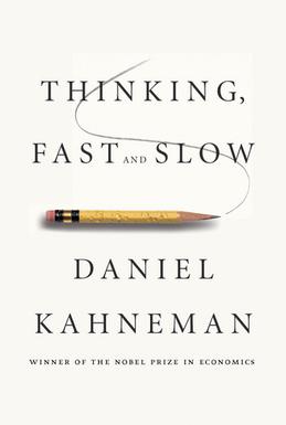
In Thinking Fast and Slow, Kahneman describes two distinct ways our brain thinks:

  • System 1: Fast, automatic, frequent, emotional, stereotypic, subconscious
  • System 2: Slow, effortful, infrequent, logical, calculating, conscious

System 1 is the quick, instinctual and heuristic-led thinking that takes place without any real effort or control on our part. While it’s useful (we sometimes need to act rapidly without methodically thinking through every possible option), it’s also easily fooled in a way that our more methodical System 2 is not. But because System 1 acts subconsciouly, it can be hard not to listen to it. Even when System 2 thinking leads us to the correct answer (such as in the bat and ball example above), System 1 is still nagging us in the background, meaning the rational answer often just doesn’t “feel” right.

There are a number of heuristics the System 1 brain uses. One example is the availability heuristic – we tend to think things are more likely if we can recall specific examples of them happening. This is why people tend to think plane travel is riskier than it actually is, and might also be an explanation for why people tend to consistently overestimate the number of immigrants or the proportion of the population claiming unemployment benefits (two topics that are mainstays of the tabloid media).

In Predictably Irrational, Dan Ariely describes how our economic decisions are affected by the way we think. Some of my favourite examples show how money can skew behaviour in unexpected ways.

In our market society, money is seemed as the ultimate incentive. However, as Ariely shows, it’s not as good a motivator as economic theory would have us believe, and can actually lead to perverse incentives. He describes research in which people who were paid to do a simple task did it less efficiently than people who were doing it without payment, as a favour. Adding money into the equation turns a social contract into an economic one, and it changes the nature of the transaction.

In one striking example, Ariely describes a study of a child care centre in Israel that started to charge fines of parents who collected their children late. Market logic would dictate that the fine would be a financial disincentive, and fewer children would be picked up late as a result. In fact, the opposite happened:  rather than parents apologetically arriving late (because they had transgressed a social norm), late pickups became more common. The fine was essentially seen as a fee-for-service, one which parents could pay for unapologetically. A social transaction had become an economic one. Interestingly, the tardy behaviour continued even when the fine was subsequently removed. A transaction based on goodwill had permanently shifted to one based on financial exchange.

Other studies show how things offered for free are perceived as qualitatively different from ones that attract a charge, even when that charge is quite modest. Even when the free offer is not the best offer available, most people will still opt for the free deal.