Theatre Review: Raoul

I have very little knowledge of theatre, and feel hideously underqualified to review it. But what the heck, I’m going to do it anyway.

But first a little background – particularly for those of you who are not in Australia. We’re currently slap bang in the middle of what Adelaideans call “Mad March” – the time where the city takes advantage of the pleasant Autumn weather and crams in as many activities as physically possible. Most of these events are held under the banner of the Adelaide Festival or the Adelaide Fringe, both huge arts festivals that together manage to take over (what feels like) the entire city for a few weeks each year.

For the past few days I’ve been volunteering as a live tweeter at Artists’ Week and Writers’ Week, which are both part of the Adelaide Festival (more on this in a future post). One of the perks of being a Festival volunteer is being able to pick up heavily discounted tickets for the coming evening’s shows.

During Mad March, choice paralysis is a real problem: there is so much on that it can be hard to decide what to go and see – especially if you don’t feel all that knowledgeable about the performing arts (and I don’t). It’s actually a good insight into barriers to visitiation, but I digress . . . 

This year, the buzz about town seemed to be about the show Raoul – I was hearing people saying it was one of the best things they had ever seen. That kind of endorsement, combined with the fact that I was able to get a very cheap ticket indeed, meant that going to see it was a no-brainer.

A Publicity Shot of "Raoul"

Raoul is a one-man show by French/Swiss performer James Theirree. In the production notes it says that Thierree has worked as a circus performer since the age of 4, which is clear from his acrobatic prowess, precision of movement and sense of comic timing.

The storyline of this almost dialogue-free performance is a little harder to distill – I saw one review that described it as a “philosophical exploration of one’s existence“, but I’d be lying if I said that I read anything that deep into it. For me it was more of a Dali-esque flight of fantasy, a journey into a slightly comic and absurd world filled with improbable creatures and everyday objects that had somehow acquired minds of their own. And then there is Raoul. Or should I say Raouls?

The plot, such as there is one, revolves around the battle for supremacy between different incarnations of Raoul. These different Raouls periodically challenge one another, their battles choreographed through a combination of theatrical effects, deft movements and a body double. There were audible gasps of amazement at the sudden appearance and disappearance of Raoul, and at times it really did seem like Thierree was managing to be in two places at once.

In between these battles-of-the-Raouls, each Raoul contends with recalcitrant props and the increasingly precarious state of his surroundings, combining acrobatics, dance, sound effects and physical comedy (sometimes executed with a knowing wink to the audience). He meets a flighty jellyfish, argues with a large fish, takes flight from a aggressive armoured bug, hangs out with a skeletal bird and cuddles up next to a ghostly elephant (all of these creatures realised through a combination of elaborate costume and puppetry).

The set design has a stripped down and deconstructed feel: the colour palette is muted and desaturated, comprising a backdrop of off-white sails and a central cage-like structure of metal poles. This rickety structure improbably support’s Raoul’s weight as he uses it as a climbing frame, even as it disintegrates before our eyes. By the end of the performance both structure and backdrop have disappeared, leaving a blank and black stage. At this point Raoul is lifted skyward to finish the show.

It is a testament to Thierree’s talent that this solo performance was able to keep an audience captivated for the best part of 100 minutes. And while during the show I periodically worried that there was some deeper ‘message’ that I was somehow failing to ‘get’, by the end of the show I was happy to simply enjoy the spectacle.

Surveillance inside the museum

NB: This article was commissioned by Artlink magazine and was first published in the Art and Surveillance issue (Vol 31 No. 3) in September 2011.

Think back to the last time you visited a museum or gallery. Think carefully – consider each step you took and every decision you made.  Which way did you turn? What did you see and what did you miss? Did you look at any labels? Did you move through some spaces quicker than others?

Answering these questions – what visitors do, why they do it, and how museum design can influence such behaviour – is fundamental to visitor research, and what better way to find out than by watching them?

Early research: drift in; drift right; drift out

The first systematic studies of museum visitor behaviour were conducted in the 1920s and 1930s. These publications[i] continue to be influential and are generally credited as the foundational works in museum visitor observation.

Armed with a stopwatch and notebook, early researchers discreetly followed lone visitors to (mostly) art museums, taking care to observe without themselves being noticed (and thus disrupting the behaviour they were trying to document).

These early studies built up some general patterns of visitor behaviour, and coined terms such as ‘attracting power’ – a measure of how many visitors stop at an exhibit – and ‘holding power’ – a measure of how long they stay – which are still studied today.

A commonly-observed pattern of movement was visitors entering a gallery, turning right, and closely following the wall until they reached the nearest exit. Thus art on the left or centre of the gallery went relatively unobserved. This ‘right turn’ bias is still studied, and while it is by no means universal it has been observed elsewhere (Paco Underhill, in his book Why we buy: the science of shopping, describes a similar rightwards drift in retail settings).

Observation also revealed that as a visit wore on, the pace picked up: visitors took their time to look at art early in their visit, but successively sped up until they were moving through galleries quite quickly, barely pausing to look at any works. This was one of the earliest observations of the ‘museum fatigue’ phenomenon, where visitors gradually run out of physical and / or cognitive ‘steam’, or simply had seen enough for one day.

Late 20th century: diligent or dilettante?

After the second world war, museological priorities shifted and one apparent casualty was visitor observation. The field was virtually neglected until the 1970s and 1980s, when visitor studies came to be recognised as a distinct discipline.

This renewed interest arose with a shift in the perceived role of public museums. Collections, in and of themselves, were no longer seen to be enough. Museums increasingly had to justify their presence (and their funding) as sites of public education and enrichment. The emergence of hands-on museums, with an explicit educational role and a funding-driven need to evaluate their exhibits and programs, also catalysed a shift to a more visitor-focused outlook across the museums sector as a whole.

Again, most of these later studies were done using a stopwatch, pencil and paper, marking where people went, where they stopped, what they looked at and how long they stayed. But the question remained – what can be generalised from these observations? Are they anecdotes or data?

In the late 1990s, through a meta-analysis of over 100 of these observations, some patterns did emerge, and the results might have been disappointing for the curators who had carefully selected objects, designed interactive exhibits and crafted interpretive labels. Most visitors breezed through their lovingly-produced creations in just a few minutes, passing most displays with barely a second glance. One metric of the study was the proportion of ‘diligent’ visitors, defined as those who stopped at over half of all exhibit elements. On average, only a quarter of visitors fell into this category, meaning the vast majority took in less than half what was on offer.

But was this necessarily a bad thing? Recent commentators have pointed out that low ‘diligence’ is an inevitable consequence of visitors following their own agendas. Visitors come to satisfy their own curiosity, which may be gratified long before the exhibition has finished ‘talking’ about a particular topic. From the point of view of the visitor, skimming an exhibition can be just as successful as carefully studying it.

Caught on tape: audio and video recording of visitors

Obviously, researchers cannot faithfully record everything visitors do, say and notice by pen-and-paper recording methods. Real life has no replay button to catch those things you missed the first time around. Thus in-depth study of specific exhibits calls for audio and video recording.

Video recording works best either for individual exhibits, or in small spaces which can be captured in a single camera’s field of view. Using this method, researchers have produced detailed and sometimes profound vignettes of visitor-exhibit exchanges. Audio recordings have caught visitors repeating snippets of label text in their conversations, proving that they are reading more text than first thought.

While audiovisual recording is a source of rich and detailed data, it does not scale well to studies of whole galleries. Trying to follow individual visitors through footage of multiple cameras presents a monumental data management task (and that’s assuming the camera angles catch what you’re looking for in the first place). Audio recordings can be hard to follow after the event, particularly if you don’t know where visitors were standing at any given point in time, and you can’t always distinguish who is speaking keeping the cheap, practical and flexible pencil-and-stopwatch method the standard, at least for the time being.

Where next?

Trackers, smartphones and the ‘O’

To borrow from Niels Bohr: prediction is difficult – especially about the future.

As electronic technology becomes a more ubiquitous presence in our lives, a reliable and cost-effective tracking tool may eventually supersede paper-based methods.

Like it or not, we already share a lot of information about our day-to-day lives through GPS-enabled smart phones, social media and internet use. For market researchers, this is raising the bar of expectation – if we can follow website visits click-by-click, what’s stopping us getting similarly rich data about real-life visits to malls and museums?

Radio Frequency Identifiers (RFIDs) are already widely used in the retail sector for supply chain management. In theory, RFID-tagged tickets or lanyards could be used to track people too – although such an approach can be expensive (not to mention feeling a tad intrusive).

Smartphones offer more promise[ii] as we are already used to carrying them. Data is based on the signals the phone is emitting anyway, and can be collected while maintaining visitor anonymity. Using visitors’ own phones also makes it feel like less of an imposition. This means that the tracking process is less likely to influence visitor behaviour.

Onsite receivers can be installed to make use of the TMSI – the electronic handshake that every mobile phone periodically makes with its nearest base station. Piggybacking on the TMSI signal can allow time-stamped locations to be taken with an accuracy of about 1-2 metres. Weaving together these snapshots can then give an overall visitor path. Drawing on phones’ inbuilt Bluetooth and Wi Fi capacity are also possibilities, but no solution on its own is a silver bullet.

So far, it appears that phone tracking has yet to cross over from retail to museums, although in Australia the Powerhouse Museum is currently trialling a phone-based system in their Lace exhibition, supported by the NSW Trade and Investment’s Collaborative Solutions Program.

Another possibility is to make tracking an intrinsic part of the visitor experience. This is what Hobart’s Museum of Old and New Art (MONA) has done with its “O”, an interpretive device that doubles as a visitor tracker.

MONA has taken the bold step of having no printed labels at all, just the O (an iPod Touch loaded with specialised software) which visitors are given on arrival as their tool for navigating the exhibition spaces. At the same time as providing interpretive material, the O is recording a visitor’s every move: where they stop; what they look at; how long they spend looking at it. “A dedicated sensor network in gallery ceilings and walls monitors the position of an RFID tracking tag attached to the mobile device. It is similar to how GPS works, but for indoors,” says Tony Holzner of Art Processors, a Mona venture created to commercialise the O. The O is thus quite different from website analytics tools, which are based on IP addresses.

Visitors to MONA can get the O to save a copy of their track through the museum and information about what they looked at to their own email addresses. Meanwhile the data accumulates, giving MONA a good sense of what visitors are doing on the gallery floor.

While MONA already has an enormous wealth of information to draw upon, this is still not the whole picture. Where are visitors coming from? What’s being said on the gallery floor? What else are visitors doing? MONA hopes to find out, but so far at least, they are beyond the capabilities of the O. As curator Nicole Durling acknowledges, ‘there are some things you still need to stand there with a clipboard for’.

[i] A more detailed review and bibliography can be found in Timing and Tracking: Unlocking Visitor Behavior by Steven Yalowitz and Kerry Bronnenkant (2009) Visitor Studies, Vol 12 no 1 pp47-64 http://www.tandfonline.com/doi/full/10.1080/10645570902769134.

[ii] For a more detailed overview of mobile phones as visitor tracking devices, see http://conference.archimuse.com/mw2011/papers/mobile_phones_and_visitor_tracking


What makes a scientist?

<<Warning! Philosophical musing ahead!>>

The other week, I participated in one of the monthly #onsci science communication chats on Twitter. (If you have no idea what I’m talking about at this point, try this article as a general intro to hashtags or this one for how they are used in science communication).

At the beginning of the #onsci chat, it is customary for people to introduce themselves: who they are, where they work, how they fit into the overall science communication picture. I described myself as an “ex-scientist”, which a couple of people pulled me up over: “How can you be an ‘ex-scientist’?” “You’re doing a PhD, doesn’t that count?” These questions made me ponder what a scientist is, and why I don’t quite feel comfortable claiming the title anymore.

In my undergraduate years there was no question – I was definitely a scientist. My first degree was in Biochemistry, including an Honours year that was spent almost entirely in the lab. So if a scientist is someone with a tertiary qualification in science, then I definitely am one. And I’m sure my first degree has shaped my thinking and view of the world in ways I can’t articulate and am possibly not even fully aware of. My appreciation of this has increased over the past year as I have been reading about research philosophy as part of my PhD. It has made me think about what I believe knowledge is, and how we come to know it (i.e., epistemology). Science takes a particular view on this point, and it is so intrinsic to the way science is done that it is pretty much taken for granted.

After my first degree, I completed a Graduate Diploma in Science Communication. So still pretty sciencey. But this set me on a career trajectory that took me away from the lab and into (broadly speaking) the museums sector. Museums span many disciplines but they often fall into arts portfolios, and so these days it’s just as likely that I’ll find myself at a table of arts professionals as rubbing shoulders with scientists. Sometimes I feel stuck in the middle: not “sciencey” enough to be a proper scientist, but not “arty” enough to feel fully at ease saying I’m an arts professional myself.

I was wondering whether my reticence to claim the ‘scientist’ title was something of my own making. However, an unrelated conversation last week reinforced my suspicion that many people (including scientists) have a fairly narrow conception of what a scientist is: essentially it is a researcher on an academic career track in the natural sciences. Anyone who strays from that path, no matter how useful or valuable their contribution to the field, is somehow ‘lost’ to the science cause and is therefore not a ‘real’ scientist.

This has real implications for science and science communication. If science builds such a rigid fence around itself, then ‘scientists’ will never be able to fully participate in broader social and cultural conversations – for this would increasingly take them away from the lab bench, and then by definition they are not proper scientists any more. It will also have implications for the people that study science at tertiary level – science degrees will only be attractive to people who envisage a career in the lab. Thus our future business and political leaders will be less likely to have science qualifications, as their ambitions will have taken them to different disciplines. In practice, this means that many of them will not have studied any science beyond year 10 or 11. This creates a distinct imbalance in the knowledge base of our key decision-makers.

So I think the current definition of ‘scientist’ is too narrow. Although I’m struggling to think about how broad to cast the net without it becoming so broad as to be meaningless. This struggle is not a new one – C.P. Snow described the artificial divide between arts and humanities over 50 years ago. And the definition of ‘science’ varies between cultures and languages too as I understand it, for instance the German word Wissenschaft seems to encompass a broader view than ‘science’ as its nearest English equivalent.

So the bottom line is that in many people’s eyes, I probably don’t count as a ‘real’ scientist. However, even if I’m not studying within a science faculty, my PhD uses science (particularly Psychology and Statistics). So maybe I can be less shy about making the claim. Perhaps if enough of us less-conventional types start calling ourselves ‘scientists’ too, then we can help bring science (however it is defined) more fully into the national conversation.


The shifting sands of state heritage funding

(N.B. This is another of my blog posts comparing the 2010 and 2011 versions of the ABS report Arts and Culture in Australia: A Statistical Overview. The first one is here.)

In this post, I’m looking at government funding of arts and heritage and comparing it to 2010’s effort. Again it’s a complex and slightly confusing picture, not least because some of the figures reported for the 2008-2009 year do not always tally between the respective reports. For the purpose of this post, I’ve used the figures cited in the 2011 report wherever possible.

First the overall picture of Federal, State and Local government funding:

Comparison of state funding over the 2008-2009 and 2009-2010 years (Source: ABS)

As with my 2010 post, I’ve made funding increases over 6% green, and decreases over 6% red.

Cultural heritage and ‘other’ museums had a significant funding boost in 2009-2010, particularly at Federal and Local levels. This appears to have been at the expense of large cuts to Federal environmental heritage funding  (local government funding of environmental heritage is not provided in the report). Meanwhile, there has been an increase of state funding of art museums, partially offset by a cut to local government funding in this area.

As with last year, there are significant (and inconsistent) year-on-year changes in funding at state level:

State by state breakdown of heritage funding: 2008-2009 & 2009-2010 (Source ABS)

The big increase in Art Museum funding in NSW appears to be a return to ‘usual’ funding levels, since the 2008-2009 amount was a 32% decrease from 2007-2008 (see table in previous blog post). The drop in Art Museum funding in Qld is also in the context of a far larger increase in the previous year. The ACT has had large funding increases across the board (again balancing cuts from the previous years in some instances.)

It’s possible that state funding cycles are highly variable when looked at on a year-by-year basis like this, hence the erratic numbers – perhaps comparing three-year averages might give a more clear picture of what’s going on.

Another point to note is that while state funding of environmental heritage is relatively static in the aggregate, the individual state breakdowns show some clear winners and losers. I should point out that no states saw cuts to environmental heritage last year, and a couple had reasonably large increases, so the funding picture for environmental heritage may not be as bad as it first appears. However, when taking the federal funding into consideration too, it does look like environmental heritage has had a pretty severe funding blow.

Who’s visiting (now)?

Late in 2010, I wrote a series of posts based on the Australian Bureau of Statistics report: Arts and Culture in Australia: A Statistical Overview, 2010.

It looks like the 2011 version of this report was issued just before Christmas, although I only found out about its release a few days ago. So I thought I’d look at the 2011 report and compare it to the 2010 figures I blogged about previously, to see if there are any interesting changes (or conversely, evidence of stable patterns).

The first post I’m revisiting is Who’s visiting?, which looked at participation rates by age. (‘Participation rate’ is defined as the person having attended that kind of venue least once in the previous 12 month period). Now it looks like the participation rates shown in the 2010 report  were based on data from 2005-2006, whereas the 2011 report has more recent figures (2009-2010). So what has happened to participation rates over the past five years?

Firstly, let’s look at the overall participation rates from each year (NB: the ABS report also includes libraries, archives and performing arts, but these are not included in this analysis):

Attendance rates at Australian cultural venues (people aged 15 or over), as a total figure and as a percentage of the population (Source: ABS).

So it appears that participation rates are increasing across the board, albeit modestly (and the report does not say whether this increase is statistically significant or not). This increase appears to be spread across the age ranges:

Attendance rates at cultural venues by age group, comparing 2005-2006 and 2009-2010 (Source: ABS)

So there is no radical change in any particular age group, and the patterns of participation follow broadly the same patterns in both 2006-2006 and 2009-2010. Similarly to previous years, the report also showed that women are still slightly more likely to be visitors than men. So there is nothing earth shattering, but perhaps there is something to be quietly optimistic about if the increased participation rates are evidence of a slow and steady trend.


Interpretation – just for kids?

A visitor to your average art exhibition might be forgiven for thinking so.

A couple of weeks ago, while I was in Brisbane, I spent an afternoon taking in the Matisse: Drawing Life exhibition at GoMA. As regular readers would know, it was not my first visit to GoMA and given I’m a bit of a Matisse fan (albeit a lay fan, not one with an MA in Art History!), it was something I was looking forward to.

And before I create the wrong impression, I should say that I was definitely not disappointed by what I saw. There was an impressive collection of drawings, woodcuts, etching and collages spread over a significant portion of GoMA’s ground floor. (Unfortunately I was not permitted to take photos of the works to help jog my memory of specific works, but I suspect this was beyond GoMA’s control and part and parcel of hosting an exhibition of this type.)

I probably spent at least an hour and a half in the exhibition – long enough that I didn’t really get much of a chance to experiment in the interactive drawing room at the exhibition’s exit (by this stage it was nearing closing time). However I left feeling that my $16 entry (student concession – a rare perk of the PhD student!) was money well-spent.

Drawing Room at Matisse Exhibition
Part of the Drawing Room. Visitors could try their hand at drawing on iPads (shown) or on paper. The iPad images could be shown on the large screen. Surrounding the benches were a wide range of objects similar to those seen in Matisse's works.

But even so, I think there were some missed opportunities with the overall interpretation of the works. It appeared to me that the main exhibition text was directed at experts and art historians, whereas the real nuggets were either relegated to the “For Kids” text or the virtual tour comprising short video clips accessible via QR code. (These clips were very good by the way – I particularly enjoyed the ones made in conjunction with Griffith University / Queensland College of Art that showed how etchings and such like are made (see here). However, as far as I could tell, I was the only person using the QR codes. I wonder how well they are used?)

The “For Kids” text was written in an informal style, often using the second person and active language. It was broken up into short paragraphs, making it easy on the eye. It pointed out features of the works that you may have missed. And while it was ostensibly “for kids”, in some cases it was the only place where a knowledge of art history was not automatically assumed. As an example, there was a whole room of works that we were told were from Matisse’s ‘odalisque’ period. (Obvious, huh?) While from the context you could more or less figure out what it meant, it was only in the kids’ text that it was explained that ‘odalisque’ is a word for a female nude posed indoors, and is derived from the Turkish word ‘odalik’. So I learned something new. To me that’s not kids’ text, that’s interpretation – and it works for all ages!

As a case in point, here is a comparison of the different interpretations of a work commissioned by the Barnes Foundation – in main text, kids text, and the QR clip (with apologies for the shocking quality of the photos – I hope you get the idea).

The main text for "The Dance"
The Kids Text

I found the kids text far more enlightening about what I was actually looking at, and you have to see the video clip to get the kicker – initially, the work was accidentally made to the wrong scale!

I note from the website that the exhibition was curated by a French curatorial team, so it is likely that the exhibition text is from them as well (although the QR clips are obviously a GoMA production; the source of the kids text is not obvious but I’m guessing that’s GoMA’s too). So it’s possible that there is something lost in the translation, however my (limited) experience of French museums is that exhibition text generally assumes far more knowledge than is usual in the Anglosphere (even topics I know well have had labels that sailed straight over my head). I’m not sure if this represents a real difference in what the average Parisian on the street knows, or just different curatorial attitudes to what people *should* know.

Despite these points that are specific to this particular exhibition, I would argue that art exhibitions in general have more formal and less visitor-focused labels. Perhaps this is because other kinds of museums (particularly natural history) are more consciously focused on a family audience (art museums seemingly have no qualms about being mainly for ‘grown ups’). Or perhaps I’m betraying my relative ignorance of art relative to the sciences (but then again, wouldn’t the typical visitor lack specialist subject knowledge too)?

I just hope it’s not because clear, conversational and accessible text is somehow seen as a “kids’ thing”.


Review: Bouncing Back from Disaster, Queensland Museum

The Queensland Museum on South Bank has just re-opened after being closed for refurbishment for a few months. Since I happened to be in town, I thought I’d drop by and have a look. More on the museum as a whole in a later post – for this one I’ll concentrate on the Bouncing Back from Disaster exhibition about the Queensland floods, which devastated many parts of the state just over a year ago.

As the one-year anniversary has only just passed, it is a very recent event that’s still fresh in everyone’s memories. The exhibition focused not just on what happened, but the resilience of the people who picked up the pieces and moved on in the wake of the disaster. Australians who followed the event on the news will remember this resilience embodied in Queensland Premier Anna Bligh’s emotional “We are Queenslanders” speech:

And in the exhibition we get to see a facsimile of her handwritten notes from that day:

Graphic about resilience including Anna Bligh's notes from her famous "We are Queenslanders" speech.

This is very much a story-led, not an object-led exhibition. There is a great selection of images and dramatic footage of rescue efforts. The relatively few objects are everyday items that had been retrieved during the clean-up. I found that there was an understated power to these objects:

A mud-caked record player retrieved from the wreckage

A sizeable portion of the exhibition is dedicated to a space where visitors (many of whom would have been directly affected by the floods) are able to share their stories (I blogged about the role of museums in sharing these kinds of community memories at the time):

Part of the wall that people could stick up their own experiences of the floods. Note the exhibition has only been opened for a couple of days and there are already a considerable number of contributions. The writing table is to the right and the wall continues to the left of this image.


A poignant personal story of survival and loss

The design of the exhibition is evocative of the ‘rebuilding’ theme – the exhibition panels are mostly bare plywood attached to vertical timber supports, with construction fencing and plastic sheeting used to enclose certain spaces (see above). The design of the graphics (white text and straight lines on a blue background) looks like it is intended to represent the blueprints of a rebuilding project – but this is just a guess on my part. Overall the design fits in well with the story being told.

However, I found the exhibition sections that attempted to put the flood disaster into broader scientific context (i.e., natural disasters across geological timeframes) a bit out of place. For me this was primarily a story of human experience and this alone was strong enough – it didn’t need to be placed in a planetary context. I wonder what the rationale for including this additional content was:  To show that this was not an extraordinary event in the global scheme of things? That life on Earth has adapted and responded in the face of disaster since time immemorial? Maybe something a little less remote from living memory and human experience may have been a better choice if this was the interpretive intent (e.g., the cleanup of the 1974 floods in Brisbane).

One absent story (assuming I didn’t miss it) was the experience of the museum itself during the flood – the South Bank precinct was certainly affected and the museum presumably had to make efforts to ensure collections weren’t damaged or lost. Perhaps this ‘inside story’ was more of interest to people like me and my visiting companion (another museum person of sorts). But even so, making the museum part of the story (instead of just the reporter of it) may have added another dimension to the exhibition – the museum is as much a part of the community as any other public institution. As such, it shares our achievements and challenges.


Exhibition Attendance Figures: The Art Newspaper

If you’re wondering just how big those blockbuster crowds are, then the annual summaries published by the Art Newspaper are a great place to start.

These comprehensive lists show both overall and daily attendance figures for (predominantly) art exhibitions around the world, ranging from the 10,000+ daily visitors to the mega-blockbusters to far more modest ventures. There are also top ten list by category, such as “Decorative Arts” or “Impressionists” or “Antiquities”.

There are several years of data available online, going back to 2003 (links posted below):

That represents a fair data set for spotting longer term trends or changes over time. Looking at this data, I was interested to see how often exhibitions in Japan top the list, with exhibitions in Tokyo and elsewhere often dominating the top ten. This is in contrast to the most visited museums overall, which are predominantly the big institutions in London, Paris, New York and Washington.

Looking at the Australian scene, the top exhibition for 2010 was the 6th Asia Pacific Triennial at Queensland Art Gallery (34th overall).  Both Queensland Art Gallery and its sister institution, GoMA, managed more than one entry in the top 100 as well as additional entries under specific categories.  Other Australian exhibitions to make the list were Masterpieces from Paris at the National Gallery of Australia and the Tim Burton exhibition at the Australian Centre for the Moving Image.

The 6th Asia Pacific Triennial attracted some 4,400 people a day. That sounds like quite a crowd, until you compare it to the top exhibition overall – Hasegawa Tohaku at the Tokyo National Museum – which attracted over 12,000 people per day!

Interpretation: Science, Craft or Art?

A little while ago I was discussing training with my Interpretation Australia colleagues. Unlike some professions, there are no real rules regarding who can call themselves an interpreter, and what specific skills and qualifications these people can have.

While there are tertiary-level courses in interpretation, and some organisations offer accreditation programs, these are not ‘gatekeeper’ qualifications and pretty much anyone can say they do interpretation, regardless of how much knowledge and experience they actually have.

This can make it difficult for experienced interpreters to have their skills recognised and valued in the way that (say) architects and designers can. While the lack of rigid qualifications is not necessarily a bad thing, it can lead to interpretation being relegated behind other (more clearly defined) specialisms, particularly on large capital projects where the people in charge of the purse strings may not really appreciate what interpretation is.

Unlike some professions (neurosurgery springs to mind), interpretation comprises skills that are not necessarily unique to interpreters. I’ve been working in interpretation-related positions for over a decade, but I don’t have any formal qualifications (although I’d argue that my Grad Dip in Science Communication covered many of the skills that interpreters need).  And not all interpretation jobs are the same: if we were to create a one-size-fits-all training and accreditation model for interpreters, how big would it have to be?

Number three of Freeman Tilden’s six principles of interpretation states:

“Interpretation is an art, which combines many arts, whether the materials presented are scientific, historical or architectural. Any art is in some degree teachable.”

My response to Tilden would be that art (like interpretation) can be hard to define. What is art? One person’s masterpiece can be another’s monstrosity! And that’s before you get to the “my four year old could do better” school of art criticism. Thus I would extend Tilden’s definition to incorporate science and craft as well as art:

  • Science: the theories of interpretation (what we know through research and applying theories from education, psychology and the social sciences to the interpretation context);
  • Craft: the skills of interpretation (for instance practical performance or public speaking skills, or learning how to write good interpretive text);
  • Art: the intuition of interpretation (the bit that is hardest to teach – how to instinctively read your audience and know how to hook them in and keep them engaged).

Thinking about interpretation skills this way might make the training requirements for different interpretation tasks easier to conceptualise. We should be able to define the knowledge (science) and skills (craft) that we want interpreters to have.

However (and this is the tricky bit!) it is probably the “art” part that separates the merely competent interpreters from the truly inspirational ones. 


Review: ArtScience Museum, Singapore

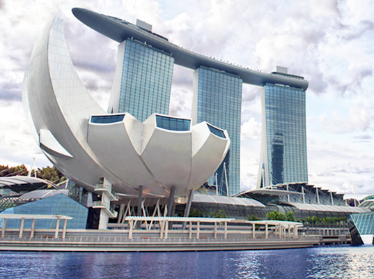
Back in August, en route to the UK on holiday, we broke up the journey with a couple of days in Singapore. A new addition to the landscape since last time I was there (early 2009) was the ArtScience museum, which is part of the Marina Bay Sands development.

Marina Bay Sands complex with the ArtScience Museum in foreground (image from homedit.com)

It’s a landmark building by celebrity architecht Moshe Safdie, which opened in February 2011 (so still pretty new when we visited). The design was inspired by a lotus flower but it also gets called ‘the welcoming hand of Singapore’, with a total of 10 ‘fingers’ extending from the centre.

Regular readers will know that I have my doubts about ‘statement’ museum architecture. And I was wondering if this one was going to be a navigational nightmare. But surprisingly, it isn’t – mostly because the majority of exhibition space is actually below the lotus / finger structure, essentially at basement level. But before I get into the exhibitions, I’ll give an overview of the museum building itself.

Like several other Singaporean attractions (the Singapore Flyer springs to mind), the building seems geared up for high-throughput crowds. (Given our Singapore stopovers seem to always have us visiting attractions in the middle of a weekday, I have no idea the extent to which these crowds actually materialise.) Operationally it feels more of an ‘attraction’ than a ‘museum’ too – your entry ticket is priced according to the number of temporary exhibitions you decide to visit, and your ticket only gets you into each exhibition once.

The intended visitor flow is ‘waterfall’ style – i.e., you are encouraged to start at the top and work your way down through the 50,000 sq.ft. of exhibition space. At the top is the smallest level with only three gallery spaces; immediately below that is the Upper Galleries that run in a loop through all the 10 ‘fingers’. Each of the 10 spaces link together like pearls on a string. It’s one-way traffic and you enter and leave at the same point, limiting disorientation (and it doesn’t feel unduly constraining but it would depend on the exhibition I imagine). Two floors below the Upper Galleries are the main exhibition spaces and the museum shop (the lobby is sandwiched between these two levels).

The 'finger' structures in the Upper Galleries offer some unusual display opportunities.

Running through the centre of the whole building is the ‘Rain Oculus’, which collects rainwater from the curve roof and channeling it into a pool that is used as the water supply for the rest rooms. Water flows fairly constantly (before I figured out what was going on I thought it was raining outside).

The top floor, inside the tips of the tallest ‘fingers’, is the only permanent exhibition space: Art Science – a journey through creativity. This is divided into three separate spaces: Curiosity, Inspiration and Expression. The exhibition is intended as an introduction to the concept of ArtScience showing it as a manifestation of human creativity. The spaces are sparsely populated and, writing this several months later, my lasting impression is of gobos, lighting effects and projections, along with a couple of touchscreen interactives. Because it sets itself up as an introductory space, I was expecting these concepts to be more explicitly linked to in the rest of the exhibition spaces. However, this didn’t really happen as the rest of the gallery spaces are essentially given over to hosting touring exhibitions brought in from elsewhere (this is what is on now).

Unfortunately, the museum website seems to live in an eternal present and does not link in any obvious way to information about past exhibitions – thankfully, Wikipedia has stepped in to fill this gap. When we visited there were three touring exhibitions: Dali – Mind of a GeniusShipwrecked: Tang Treasures and Monsoon Winds; and Van Gogh Alive.

Dali – Mind of a Genius

I’ve been to Dali exhibitions before (Liquid Desire at NGV in 2009 and as part of a Surrealism exhibition in the Pompidou Centre in 2002), so I thought I was familiar with his work – in particular his paintings and films/animation. So for me, the surprising part of this exhibition was the number of bronzes on display (an element of Dali’s work I hadn’t seen before) as well as his forays into furniture design and the decorative arts.

One of Dali's bronzes

There were several versions of the infamous  ‘Melting Clock’ motif (if anything a bit too much really!) although I thought this use of a wall of regular clocks distorted by fairground mirrors was a cute touch to finish off the exhibition:

Regular clocks rendered Dali-esque by fairground mirrors


Shipwrecked: Tang Treasures and Monsoon Winds

This exhibition was about the mysteries surrounding the wreck of a ninth century Arab trading dhow, found in the Java Sea. Laden with Chinese ceramics, the wreck is proof of a maritime trade route between China and the Middle East from the era of the tale of Sindbad the Sailor.

The scope and significance of what was found on the wreck was interpreted well, along with the concept that such a find inevitably raises just as many questions as it answers. The exhibition was quite dark so I don’t have any good photos, but the website linked to above is very comprehensive. It says that the exhibition is set to tour until 2015, but no additional venues are advertised yet.

Van Gogh Alive

I was expecting this to be a fairly conventional exhibition of Van Gogh’s works (perhaps a tour from the Van Gogh Museum I’d visited in 2000) so at first I was a bit taken aback to be in a large space surrounded by tall projector screens showing Van Gogh’s work and photographs all synchronised to a classical soundtrack. But once I got over that I was able to enjoy this immersive experience (that is hard to describe but maybe these still renderings and this Youtube video gives you a bit of an idea):

It was an exhibition space you moved in rather than through – you could sit anywhere in the space and have essentially the same experience. For some reason, on the day we visited it looked like they were using the usual exit door for both entrance and exit, so it means we didn’t see the interpretive panels explaining the concept until we were just about to leave (and we almost missed it entirely).


So in conclusion? It was a pleasant and interesting way to pass 2-3 hours away from the heat and humidity of mid-day Singapore. Given the unconventional shape, the building is not as visitor-unfriendly as you’d first expect. However, at the moment at least, it feels more like a sophisticated exhibition hall than a museum with its own mission and identity.