Transmission metaphors in museums

Embodied in the language we use are all sorts of ideas and assumptions: some of which we are aware, others we are not. A paper in the latest Curator journal (Ntzani, 2015) explores how the “transmission” metaphors that are frequently applied to communications influences the way we conceptualise museums:

“[T]ransmission metaphors make communication seem like an easy or automatic process between active speakers and passive listeners. This presupposition has long haunted museum communication practices” (Ntzani, 2015, p. 63).

Drawing upon the work of Michael Reddy, Ntzani describes two main transmission metaphors: that of the conduit; and that of the container.

Some literal museum conduit - a stairwell at the EMP museum in Seattle (Credit: RogerSmith/Flickr)
Some literal museum conduit – a stairwell at the EMP museum in Seattle (Credit: RogerSmith/Flickr)

The two metaphors are distinct and often incompatible. Conduits are invisible and passive transmitters of information, whereas containers call attention to themselves in the way they hold information and impose a shape onto it.

Ntzani argues that the container metaphor is often implicit in the way we discuss museum objects, exhibits and indeed museum buildings.

 . . . transmission metaphors make us think of museum objects either as containers of intrinsic cultural information, or as conduits of information that are transmitted from museum curators to museum visitors. The first proposition sees museum objects as sealed containers of cultural values that speak for themselveswhile the second proposition sees museum objects as conduits of messages, the signs of a language museums employ to build their narratives.” (Ntzani, 2015, p.65, my emphasis)

That section in particular made me think about the language of objects issue I was grappling with last year. Could the container and conduit metaphors help explain differences in the way different curators conceptualise the object and its communicative role? The former positions the object as being imbued with inherent meaning. The latter renders the object as a mere tool for an interpretive storyline: it says nothing in particular until it’s placed into a wider narrative.

“When museums are discussed as educational institutions, attention falls on the transmission of messages; in this case conduit metaphors take the lead. When discussed as architectural spaces . . . container metaphors are more frequently used.” (Ntzani, 2015, pp.67-68)

The museum itself can be conceptualised as a series of nested containers, analogous to Russian dolls: an exhibit is nested inside an exhibition, which is nested inside a museum that itself is nested within a particular social or geographical context.

Museum architecture can be considered as a series of nested containers - like Russian Dolls (Image credit Bradley Davis/backpackphotography/flickr)
Museum architecture can be considered as a series of nested containers – like Russian nesting dolls (Image credit Bradley Davis/backpackphotography/flickr)

Extending the concept further, Ntzani points out that it is only the outside of each doll that is adorned – the interior is a plain, neutral container for the doll within. In museum buildings, there can be a tension between those who wish to have statement architecture that draws attention to iself, versus those wanting a discreet container that will fade into the background. The conflict between conduit and container may be a new way of conceptualising some of these debates about the role of museums.

Reference:
Ntzani, D. (2015). Under the Spell of Metaphors: Investigating the Effects of Conduit and Container Metaphors on Museum Experience. Curator: The Museum Journal, 58(1), 59–76. doi:10.1111/cura.12098

IPOP Model of Visitor Preference

Most typologies of museum visitors tend to categorise visitors by demographics, motivation, or a mixture of both. The IPOP model, developed by Andrew Pekarik and colleagues at the Smithsonian Institution (Pekarik et al, 2014), is a little different in that it categorises visitors according to their preferred interests. Developed through years of research with visitors across the Smithsonian sites, the IPOP model is based on four key experience preferences:

  • Ideas – a liking for abstract concepts and facts
  • People – attraction to stories, emotional connections and social interaction
  • Objects – appreciation for objects, aesthetics and craftsmanship
  • Physical – attraction to sensory experiences, movement and physicality (this P was a later addition to the model as it evolved).

These are indicative of overall preferences rather than being absolute and mutually exclusive categories. Scores are based on responses to a self-administered questionnaire that is based on agreement to statements such as: I like to know how things are made, or I like to bring people together. The full version comprises 38 items, with shorter 20 and 8 item versions also used. Using responses to these statements, 79% of visitors show a clear preference for one of the IPOP dimensions: 18% Idea, 18% People, 19% Object, 23% Physical. The remaining 21% tend to show a combination of two dimensions (rarely three) rather than a single clear preference*.

By combining self-report IPOP preferences with tracking and timing data, Pekarik and his team have shown that it is possible to predict what exhibits a given visitor will attend to (or indeed, which exhibits they will avoid) based on their IPOP preference. People tend to seek out experiences that suit their preferences and match their expectations. When people see what they expect, they report being satisfied with their experience. However, sometimes visitors are engaged by something unexpected and different from their usual preferences. This phenomenon, described by the authors as “flipping”, can lead to more memorable and meaningful experiences.

The exhibition Pekarik et al (2014) use to illustrate the predictive value of IPOP is Against All Odds, an exhibition at the National Museum of Natural History about the rescue of trapped Chilean miners in 2010. I happened to see this exhibition on my 2012 study tour of Washington DC, and while I recall seeing it, I don’t have any specific memories of it (a consequence of breezing through dozens of exhibitions for days on end). Although I was amused to observe that the two photos I took of the exhibition are very similar to those in the Curator article!

SI-NMNH Chilean miners exhibit
My photo of the entrance / introductory graphic
SI-NMNH Chilean miners exhibit 2
The rescue capsule. The image in the Curator article takes a wider view which encompasses a tactile drill bit on the left and a video on the right. The rescue capsule was the largest and most distinctive object in the display. Whether that is why I photographed it as a way of recording the exhibition, or whether this says something about my IPOP preference I’m not sure.

I’m not sure what to make of this. Either I intuitively grasped which views best encapsulated the exhibition, or I have the same IPOP preference as the person who selected the images. . .

UPDATE 2/5/2014: I’ve just found out that the Pekarik et al article is available online for free. Happy reading!

*Interestingly, the research team categorised themselves according to the IPOP typology and found they had preferences in three of the four dimensions (none of the team was a People person). It strikes me as an interesting exercise for exhibition development teams to conduct at the outset of the project, giving individuals an insight into their own preferences as well as an appreciation of those of their differently-preferenced colleagues – there is more on this point in Pekarik and Mogel (2010).

References

Pekarik, A., & Mogel, B. (2010). Ideas, Objects, or People? A Smithsonian Exhibition Team Views Visitors Anew. Curator: The Museum Journal, 53(4), 465–482. doi:10.1111/j.2151-6952.2010.00047.x

Pekarik, A., Schreiber, J. B., Hanemann, N., Richmond, K., & Mogel, B. (2014). IPOP: A Theory of Experience Preference. Curator: The Museum Journal, 57(1), 5–27. doi:10.1111/cura.12048

Evaluating Evaluation

What is evaluation? Who is it for? Why do it? What’s the difference between evaluation and research? Does it make as much difference as it purports to?

A recent report from the UK, Evaluating evaluation: Increasing the Impact of Summative Evaluation in Museums and Galleries by Maurice Davies and Christian Heath, makes for interesting reading in this area [1]. They observe that summative evaluation hasn’t informed practice as much as it might have, and look at some of the reasons why that might be the case. Their overall conclusion is one of “disappointment”:

Disappointment that all the energy and effort that has been put into summative evaluation appears to have had so little overall impact, and disappointment that so many evaluations say little that is useful, as opposed to merely interesting. . . With some notable exceptions, summative evaluation is not often taken seriously enough or well enough understood by museums, policy makers and funders. The visibility of summative evaluation is low. Too often, it is not used as an opportunity for reflection and learning but is seen as a necessary chore, part of accountability but marginal to the work of museums. (Davies and Heath 2013a, p.3)

I won’t go into their findings in detail as the full report is available online and I recommend you read the whole thing, or at least the executive summary(see references below). But I will tease out a couple of issues that are of particular relevance to me:

Conflicting and Competing agendas

Davies and Heath describe scenarios that are all too familiar to me from my time working in exhibition development: exhibition teams being disbanded at the conclusion of a project with no opportunity for reflection; summative reports not being shared with all team members (particularly designers and other outside consultants); insufficient funds or practical difficulties in implementing recommended changes once an exhibition is open; evaluation results that are too exhibition-specific and idiosyncratic to be readily applied to future exhibition projects.

They also give an insightful analysis of how the multiple potential purposes of evaluation can interfere with one another. They provide a convincing argument for separating out different kinds of evaluation recommendations or at least being more explicit about what purpose a given evaluation is meant to serve:

  1. Project-specific reflection: evaluation as a way of reflecting on a particular project and as an opportunity for the learning and development of exhibition team members
  2. Generalisable findings: the capacity of evaluation results to build the overall knowledge base of the sector
  3. Monitoring and accountability: evaluation reports are usually an important aspect of reporting to a project funder or the institution as a whole
  4. Advocacy and impact: using evaluation results to create an evidence base for the value of museums for potential funders and society at large

As we move down this list, the pressure on evaluation results to tell “good news” stories increases – evaluation is less a way of learning and improvement and more a platform to prove or demonstrate “success”. Museums may be reluctant to share critical self-appraisal for fear that exposing “failure” may make it more difficult to get support for future projects. Such findings may not be shared with other museums or even other departments within the musem – let alone potential funders or other stakeholders. Furthermore, generalisability is often limited by methodological inconsistencies between different institutions and the reporting requirements of different funding bodies.

Comparing Evaluation with Research

On the subject of methodology, I’ll make a couple more observations, in particular the difference between Evaluation and Research (at least in visitor studies). The two terms are often used interchangeably and the line is admittedly blurry, particularly since research and evaluation use essentially the same tools, approaches and methods.

The way I see it, visitor research seeks to understand “how things are”. It tries to advance knowledge and develop theory about what visitor experiences are and what they mean: to individuals, to institutions, to society at large. Visitor research is usually positioned within a broader academic discourse such as psychology or sociology. Research findings can be valid and useful even if they don’t directly lead to changes in practice [2].

In contrast, evaluation is more interested in “how things could be improved”. To quote Ben Gammon, who was one of my first mentors in this field:

Evaluation is not the same as academic research. Its purpose is not to increase the sum of human knowledge and understanding but rather to provide practical guidance. If at the end of an evaluation process nothing is changed there was no point in conducting the evaluation. This needs to be the guiding principle in the planning and execution of all evaluation projects. (quoted in Davies and Heath 2013a, p.14)

Evaluation is therefore more pragmatic and applied than visitor research. The validity of evaluation is less in its methodological rigour than the extent to which the results are useful and are used.

Notes

[1] At the outset of their research, Davies and Heath wrote an opinion piece for the Museums Journal outlining some of the issues they had identified with summative evaluation. I wrote a response to it at the time, which interestingly, was itself cited in their report. Besides being somewhat startled (and delighted!) to see one of my blog posts being cited in a more academic type of publication, it serves as an interesting example of how the lines are blurring between more formal and informal academic writing and commentary.

[2] When I was doing data collection for my PhD, many people assumed the purpose of my research was to “make improvements” to the galleries I was studying. It’s a reasonable inference to make, and I do hope my results will eventually influence exhibition design. However, my PhD is research, not evaluation – and as such is more interested in understanding fundamental phenomena than in the particular galleries I happened to use in my study.

References:

Davies, M., & Heath, C. (2013a). Evaluating Evaluation: Increasing the Impact of Summative Evaluation in Museums and Galleries. Retrieved from http://visitors.org.uk/files/Evaluating Evaluation Maurice Davies.pdf

Davies, M., & Heath, C. (2013b). “Good” organisational reasons for “ineffectual” research: Evaluating summative evaluation of museums and galleries. Cultural Trends, (in press). doi:10.1080/09548963.2014.862002


Museum Atmospherics

I’ve recently had a review article published in the journal Visitor Studies titled  “Museum Atmospherics: the role of the exhibition environment in the visitor experience”. The abstract is here, there’s also a link to the full text [1].

The article is based on the literature review I did in the first year of my PhD and sets the scene for my research. It describes the concept of atmospherics, a term coined in the 1970s to describe how marketers and retail designers can influence consumer behaviour through design choices.

Atmospherics can be considered the psychology of consumer environments, and I provide an overview of the psychological theories that have informed atmospherics research. I also review some of the more notable studies that have been done in retail atmospherics, demonstrating relationships between design features and consumer behaviour. Comparable relationships exist in museum settings, and I argue that museums have sufficient similarities with retail and other service environments to make atmospherics relevant to the study of exhibition environments. Finally, the article sets out a research agenda for museum atmospherics as a way of further characterising the exhibition environment and its role in the visitor experience. This is the research gap that my PhD is helping to address. A work in progress!

[1] – Link to full text is available to Visitor Studies subscribers only (or libraries that have it as part of a Taylor & Francis subscription bundle). If you don’t have access to a subscription but would like a copy, I have a limited number of eprints available – just drop me a line in the contacts page and I’ll send you one.


Museum Visitor Experiences Part 4: Broadening

This is Part 4 of a four-part series of posts based on the book “Designing for the Museum Visitor Experience” by Tiina Roppola. Go to Part 1. Go to Part 2. Go to Part 3.

Broadening: visitors making sense of the museum experience

Broadening is the term Roppola uses to describe “[h]ow visitors find themselves in relationship with the interpretive content of museums” (Roppola, 2012, p.216) as they negotiate “the poetics and politics of display” (ibid. p. 217, original emphasis). Examples of broadening that take place in museums include:

  • Experiential broadening: seeing or doing something you would not normally have the chance to
  • Conceptual broadening: improving understanding of a theoretical principle
  • Affective broadening: exploration on an emotional level
  • Discursive broadening: considering an issue from another point of view

Roppola’s study encompassed a wide range of exhibit types – classical dioramas, multimedia exhibits, artefact-based displays and so on – covering topics across the sciences and the humanities. I’ll summarise some examples very briefly.

Broadening in the sciences:

  • Physical to Theoretical, Theoretical to Physical: the links people made between conceptual scientific knowledge and the physical experience of using hands-on interactive exhibits.
  • Standing in testimony to life: the ability for natural history and nature-based exhibits to increase an appreciation of the value and beauty of the natural world.
  • Science as storied: exhibits provoking visitors to think about the processes of science, science as having agency and acting in a broader social and political context.

Broadening in the humanities:

  • The guts story of people: engaging with powerful human stories on a visceral and emotional level
  • Who is telling whose story, and how? The representation of different cultural groups in the museum context prompts visitors to critically evaluate the way different cultures are presented and from whose perspective.
  • Speaking silences out loud: exhibits providing an opportunity for visitors to talk about things which usually remain unspoken – for instance death or a family member’s experience of war

Conclusion: Bringing it all Together

Framing, Resonating, Channelling and Broadening are not a sequence of processes that visitors undergo – all four can be seen taking place simultaneously over the course of a museum visit. What I find appealing about this study is that the theoretical constructs have emerged from the words of actual visitors in an exhibition context – it is a ‘home grown’ museological theory. Interestingly as well, three of the four concepts, Framing, Resonating and Channelling, are all relatively “content neutral” in that they describe the relationship between visitors and exhibits in a way that transcends the specific interpretive messages that exhibits are meant to convey. This is a novel insight, particularly since most museum visitor research historically has taken as its starting point what visitors “learn” from a given exhibition (however learning is defined).  It’s also encouraging as it mirrors the content-neutral approach my own research has attempted to take:  trying to understand the gamut of visitor experiences that include but are not limited to the specifics of exhibit content.

Summarising the complexities and nuances of a whole book in a mere 4 blog posts is an impossible task – I’ve necessarily been superficial in my treatment. However, I hope I’ve adequately conveyed the main ideas (and encouraged you to read further).

Museum Visitor Experiences Part 3: Channelling

This is Part 3 of a four-part series of posts based on the book “Designing for the Museum Visitor Experience” by Tiina Roppola. Go to Part 1. Go to Part 2.

Channelling: the museum visit through space and time

Museum exhibitions can be considered as four-dimensional media – we physically move through them in both space and time. Roppola describes how visitors navigate this trajectory in terms of “channelling”. More than simply wayfinding, channeling describes how “visitors [find] their way through museums conceptually, attentionally, perceptually as well as physically” (Roppola 2012, p. 174). She defines three different types of channels – spatial channels, narrative channels, and multimodal/multimedial channels.

Spatial channels

The most literal interpretation of the channelling concept, spatial channels pertain to the way that visitors ‘read’ museum environments and act accordingly. Some spaces encourage visitors to linger, others chivvy them along. Seating allows time to rest, recharge and ponder. Where seating is provided, it sends visitors a message that lingering is encouraged. Visitors are more likely to sit and watch a video to the end if there’s a place to sit. Conversely, thin galleries may be perceived as corridors and moved through quickly. Doorways and escalators can have a magnetic effect, pulling visitors towards them. But for other visitors, such thresholds may act as a barrier and they hover at the edges rather than enter. In the same way, small enclosed spaces are inviting to some, offputting to others. (In my own research, I’ve noticed how doorways or even just a slight narrowing of gallery can act as a sort of “reset” function– visitors can be seen to act as if they are in a new environment once they’ve crossed that threshold.)  

Visitors also vary in the extent to which they want spatial channels to guide them along a certain path – something which emerged in my visitor interviews and which I’ve commented on previously.  

Narrative Channels

While spatial channels address the physical movement through an exhibition, narrative channels pertain to the conceptual journey of the visitor. Again, this is something that I’ve been thinking about lately, with respect to my own approach to museum visits. An absence of narrative is often confusing and disconcerting for visitors, but then again not always: it depends on your expectations – do you want to take control or are you happy to go along for the ride? (This brings us back to the concept of Framing which was discussed in Part 1 of this series.)

Without a discernible narrative, an exhibition can be seen as “all mixed up”, “all over the place”, “cluttered”, or having “no real point” (visitors quoted in Roppola, 2012, pp. 204-205). Many visitors described the importance of some kind of theme as a way of organising an exhibition (which will be music to the ears of many interpreters!)

Multimodal/Multimedial Channels

Multimodality is a semiotic concept that encompasses all ways a culture might express meaning. Text, speech, images, gestures and sounds are all examples of semiotic modes. Even fonts and colours can be considered modes in some contexts. Multimodality is thus the integration of multiple modes in the creation of meaning – in a conversation, for instance, meaning is conveyed not just in the words spoken but through tone of voice, gestures and proximity of the speakers. Furthermore, individual modes can be manifested through different media – the mode of text can be communicated through a wide range of media such as a magazine, a scroll of parchment, or an exhibit label.

Multimodal and multimedial channelling thus describes how visitors interact with the different modes and media embodied in museum exhibits. Roppola  describes the following:

  • Restorative channelling: a diversity of media helps “break up” content, enhancing interest and reducing fatigue associated with reading “panels and panels and panels of text” (visitor quoted in Roppola, 2012, p.190).
  • Selective channelling: a way of directing visitor attention. Less is more with selective channeling –  a minimalist approach helps to provide a clear focal point to a display. Text hierarchies are also a form of selective channeling by suggesting an order in which to engage with the content.
  • Fragmented channelling: caused by too much complexity without sufficient coherence to enable visitors to make sense of it (touching on Kaplan’s theories I’ve described previously – complexity is only pleasant if it’s legible enough for us to make sense of). Fragmented channels can also result from having too large a physical distance between related items (e.g. a label too far away from the object it describes), or having adjacent exhibits competing with each other for visitor attention.
  • Synchronous channelling: a harmonious relationship between the multimedial elements of an exhibit. The different parts of the exhibit enhance and complement each other rather than competing for attention. Unlike in fragmented challenging, the complexity of multiple modes and media is complemented by coherence.

One good example of channelling I’ve seen is the “Voices from Eastern State Penitentiary” exhibit (see here). This combined synchronous channelling (the pairing of text, audio and images) and spatial channelling (the sequential positioning of the images along a corridor) help to create a coherent experience through space and time.

Next week – Broadening.

Museum Visitor Experiences Part 2: Resonating

This is Part 2 of a four-part series of posts based on the book “Designing for the Museum Visitor Experience” by Tiina Roppola. Go to Part 1.

Resonating: features that attract and repel visitors

In interviews, visitors often described feeling “drawn to” particular exhibition environments and displays. Roppola uses the concept of resonance to characterise this interaction between visitors and features of the exhibition environment. In physics, ‘resonance’ is used to describe the amplification effect observed when two bodies vibrate at the same wavelength. Similarly, visitors and exhibits can be considered as being in a resonant relationship when they are ‘in tune’ with one another.

Certain environmental features, such as “size, beauty, colour, light, a quality of realism, sensory change/movement and opportunity for action” (Roppola, 2012, p. 126) tend to attract visitors and draw them in. Spatial characteristics can also be resonant – environments that feel pleasant to be in owing to characteristics such as light, spaciousness or aesthetic appeal.

Perceptual resonance

Resonance can be achieved by the way that sensory cues of exhibits interact with our perceptual systems. Sensory cues can be seen as “bottom up” data, which we interpret using “top down” mental constructs – an example is how we readily interpret two dots and a curved line as a smiley face (see below). This process of “filling in” the gap between bottom up sensory data and top down constructs can happen within one sense or between multiple senses (eg. visual cues working with auditory information to create an integrated whole).

Perceptual resonance in the visual sense. This image comprises just three lines but we use this bottom-up visual cue along with our top-down concept of a human face to “fill in” the gaps and perceive this as a picture of a smiley face.

Exhibits can take advantage of this intrasensory augmentation to create an enhanced sense of realism – for instance simulator exhibits combine immersive visual stimuli with a relatively modest amount of movement to create a feeling of flying or being in motion. In immersive exhibits or recreated environments, sound effects and smell can be used to enhance realism by hinting at the presence of things unseen – such as bread baking in an oven or the faint cry of a child in the distance. However, simply combining sounds, sights, smells and textures does not automatically create a coherent perceptual whole; the sensory information needs to be congruent with the top-level mental constructs through which visitors interpret them.


Coalescent resonance and how visitors define “interactivity”

Coalescent resonance occurs when two separate entities come together to form a complementary whole. In an exhibit context, this can mean feeling “part of” the exhibition environment: “visitors can physically, personally and socially interact with, or feel part of, exhibition environments” (Roppola p. 151, original emphasis). Physical coalescence can be literal, such as being able to directly touch or get up close to exhibits; it can also be conceptual as visitors are encouraged to imagine themselves in a given setting or scenario.

Interestingly, Roppola describes several instances where visitors use the term “interactive” in a sense that is very different from the way exhibit designers and other museum professionals use it – namely, that an “interactive” exhibit is one that visitors physically touch or manipulate in some way. This prerequisite seemed less important to visitors, who also used the word “interactive” to pertain to exhibits that allowed physical proximity or social interaction, but not necessarily hands-on contact. A museum professional may call this latter type of exhibit “immersive” rather than “interactive” [1]. This different understanding of the term “interactive” shows the value of qualitative research in validating the terminology we use – when people say they want more “interactive” experiences, do they mean what we’ve assumed they mean?

Impeding Resonance

Just as environmental stimuli can enhance a resonant relationship between visitors and exhibits, they can also impede it. Things that can impede or block resonant experiences:

  • “You can only take so much in” – a museum visit can saturate your sensory and cognitive capacities. Visitors deploy strategies to allocate their time and mental budgets according to their interests. A sense of “too much to take in” can be overwhelming and prevent visitors from engaging with an exhibition.
  • “It’s all jumbled”- the sense of there being too much to take in can be exacerbated by the lack of a clear order or logic with which to make sense of an exhibit. The ‘signal’ of an interpretive message is lost in the ‘noise’ of an overly cluttered display – different features compete and cancel each other out.
  • “The people I’m with won’t let me” – visitors might spend less time on an exhibit than they would like if they feel they’re being hurried along by their companions. Queues and crowding can impede resonance by getting in the way or making an environment less pleasant by their presence.

Next week – Channelling

[1] In my own research, I found that “immersive” was not a word that resonated particularly with visitors when asked to describe exhibit environments. I used the word in my pilot questionnaire and several visitors said they didn’t know what the word meant (and the pilot results suggested these people were just the tip of the iceberg). Given the amount of museological discourse there currently is around “immersive experiences”, this is a point worth noting – we’re potentially talking about visitor experiences in terms visitors would not recognise.

Museum Visitor Experiences Part 1: Framing

Over the next few weeks I’ll be featuring “Designing for the Museum Visitor Experience” by Tiina Roppola (Routledge) [1]. This book is based on Tiina’s PhD research, during which she interviewed over 200 visitors at more than 20 exhibits across a range of Australian museums. Four key elements of visitor experiences emerged from this qualitative, grounded study: Framing, Resonating, Channelling and Broadening. I’ll be presenting summaries of each of these in turn – this week: Framing.

Framing – the assumptions we bring with us

Framing is a semiotic concept used to describe the overarching structures people apply to objects and situations to aid their interpretation.  Frames are essentially a collection of categories, criteria and expectations we use as part of the meaning-making process.

People have frames for museums and for exhibits, which are informed by their past experiences. These “frame” the encounters they will have as visitors. Not everyone brings the same gamut of frames to their museum visit, although there are some common patterns. Accordingly, Roppola identified a number of frames that people tend have about museums and exhibits:

Museum Frames:

  • The “displayer of artefacts” frame: for visitors holding this frame, the defining characteristic of a museum is the display of material objects. Other types of displays and interpretive media may be dismissed or ignored as not being “real things”.
  • The “learning” frame: an expectation that museums are primarily a site for learning, and that the museum will be an authoritative source of facts and knowledge. People may visit museums to enact their identity of being learning-oriented people.
  • The “enjoyment” frame: held by visitors who find museums pleasurable places to be. This could be through interaction with certain kinds of interpretive content or simply through appreciation of the general ambiance. “Enjoyment” can mean “fun”, but not necessarily so: people can also talk about “enjoying” more solemn experiences in a museum context. [2]
  • The “pilgrimage” frame: applies to visits to see specific personally or culturally significant objects or sites. People queue to see the Mona Lisa so they can say that they’ve seen it. In an Australian context, many people visit Melbourne Museum specifically to see the racehorse Phar Lap. War Memorials are also a site of cultural pilgrimage.

Visitors may also hold different frames for different types of museums. So what is deemed appropriate (ie.,frame-congrent) in an art gallery might be considered baffling or even offensive in the context of a natural or cultural history museum. In the art gallery, there is an expectation that exhibits may be metaphorical, but transplant the same item to a museum and it may be taken literally and not recognised as art at all.

Exhibit Frames:

  • “Materially distinct” – an expectation that exhibits will be different from things you can see elsewhere (e.g. in a book, on the web, or on TV).
  • “Explanatory” – exhibits should provide sufficient information and adequate labelling. Insufficient information can leave visitors frustrated and unsatisfied.
  • “Temporal” – exhibits should be regularly updated so that there is always something new to see.

In many cases, these frames were only specifically mentioned when they had been violated in some way. When visitors encountered exhibits that were contrary to their frames of what an exhibit is “supposed” to be, the response was often negative. This is typical of frames more generally – we aren’t consciously aware of them unless we encounter something which is incongruent with them.

Reframing

Our frames are not static and they will evolve and change as we encounter new situations. This reframing can be both positive and negative. For instance, modern museum buildings that are open and bathed in natural light can represent a positive reframing for people who see the traditional museum as “dark and dusty”. But conversely, some visitors may find discordance in the juxtaposition of old objects and modern architecture.

Satisfying encounters with different types of interpretive media can lead to reframing – for instance moving from a more passive “displayer of artefacts” museum frame to one that incorporates a broader mix of media including more tactile and interactive elements.

Next week – Resonating

[1] I first met Tiina at the 2010 Museums Australia conference, where I tracked her down and quizzed her about her research (it was while I was developing my own PhD research proposal). We’ve since become friends and colleagues and her work has been a big influence on mine. As I go through my own data I’m seeing many parallels with her findings, although I remain in awe at the depth and sophistication of what she produced for her PhD. It’s an exemplary piece of qualitative research and I can’t really do it justice here. I highly recommend the book, which is richly illustrated with quotes from the visitor interviews.

[2] Roppola draws the distinction between “enjoyment” (a word that spontaneously emerged in her interviews) and “entertainment” (which was seldom mentioned). This is an important semantic difference to my mind, and one I’ll come back to in a future post. 

Interpretive Activism

Recently I finished reading What makes learning fun? Principles for the Design of Intrinsically Motivating Museum Exhibits by Deborah L. Perry. On one level, it’s a detailed case study of how visitors interact with one of the classic science centre exhibits, Coloured Shadows. On another level, it’s a characterisation of six key motivations that exhibits must satisfy in order to make learning inherently fun. Perry positions these in the context of Interpretive Activism, which she defines as:

. . .the process of advocating for and incorporating research-based, visitor-centered exhibit design principles and strategies that facilitate active visitor participation in the interpretive process. [Perry, 2012, p. 27]

A key element of interpretive activism is to conceive of exhibits as catalysts (for visitors own conversations and active learning) rather than simply conduits (for information):

Rather than lecturing and monopolising the language space . . . what if [museums] gave visitors the tools they need to engage in meaningful conversations with their companions? In other words, what if exhibits (including labels, but other components as well) were specifically designed to contribute to visitors’ conversations rather than interrupting them? [Perry, 2012, p.29]

Over a period of many years, Perry adjusted the design of the exhibit and accompanying interpretive information, testing the results each time with a range of visitors. It’s an interesting example of how certain exhibit features can act as interpretive red-herrings as people make sense of the exhibit.

Coloured shadows is a hands-on exhibit that allows visitors to explore the additive properties of light mixing. (Image source: Exploratorium)

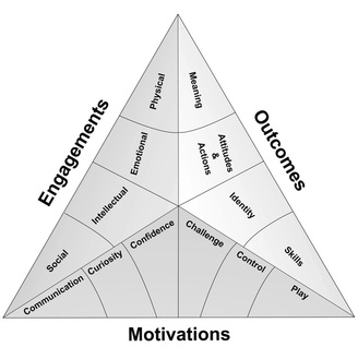
Then, using features of this exhibit as an example, Perry explores the six motivations that sit at the base of the Selinda model of learning (shown below). They’re described in terms that will make the most sense in the context of hands-on exhibits, although the fundamental principles can be applied more broadly. I’ll summarise these briefly below (to the extent that I can summarise several book chapters in a single blog post!) . . .

The Selinda Model of learning (Source: Selinda research)
  1. Communication: “Visitors are smarter than we think they are and know less than we think they do . . . [D]esign interpretation that gives visitors what they need to start a naturally occurring meaning-making process with their companions” (Perry, 2012, p. 94). People often visit museums in groups. Exhibits should acknowledge this, allowing for and encouraging social interaction and collaboration between visitors within social groups. Cater for a range of abilities (especially in exhibits targeted at families where there will be children at different ages). Use natural language in labels. Identify points where visitors may get stuck and offer guidance.
  2. Curiosity: Stimulate perceptual and intellectual curiosity. Pique interest by leaving some things unsaid – while too little information can be frustrating, if things are too obvious then curiosity can wane.
  3. Confidence: visitors will be motivated to learn in situations they feel “safe and smart”. (ibid, p. 118). Feedback should come early and come often. Success breeds a feeling of success and exhibits should guide the visitor through a “series of minisuccesses” (ibid, p. 131).
  4. Challenge: confidence and competence needs to be balanced with an appropriate level of uncertainty and challenge. Ensure visitors are clear what is expected of them, but don’t suggest that success will be automatic – visitors will not feel challenged if they can just go through the motions and be successful anyway.
  5. Control: the need for us to have control over our environment is an important facet of the psychology of visitor experiences. Visitors will feel in control when they have appropriate choices and the power to influence what happens in the environment.
  6. Play: play and the ability to engage the imagination is an essential ingredient of free-choice learning. ” . . . visitors who have the most satisfying and enjoyable experiences are those who feel the most playful – playful with actions yes, but also playful with ideas, playful with thoughts, playful all over” (ibid, p. 171).

Perry, D. (2012). What Makes Learning Fun? Principles for the Design of Intrinsically Motivating Museum Exhibits. Lanham, MD: AltaMira Press.


Death and Suspended Animation

Looks like there’s a dead bird on the, in the display, presumably purposefully . . .
Well they’re all dead I guess.
– visitor to the South Australian Biodiversity Gallery, SA Museum

When it comes to animals in museum displays, it seems that some are more dead than others. There are those that are unapologetically and possibly even offensively dead – insects on pins, dismembered body parts, a beached dolphin in a coastal tableau. But in Natural History displays at least, most specimens are presented in lifelike poses; snapshots of nature scenes rendered in diorama form. It’s like we perceive the creatures to be in some form of suspended animation. Suspended animation or suspended disbelief – the displays don’t seem to trigger that visceral sense of disgust that looking at a ‘dead animal’ seems to do. It’s something I observed several times on my accompanied visits in the Biodiversity Gallery last year:

I like the little, mice doing different things other than just sort of sitting there looking dead.

. . .they’re looking like just dead birds really. Not like the ones in the cases . .

I don’t really like that display because it’s animal parts, like, y’know, having a case full of people’s arms or something . . .oh there’s a large, er Wedge Tailed Eagle, wing, which yeah, that’s all a bit sad really. 

Well, I know the dead dolphin, happens every now and then, and it’s probably the best way to present um, marine animals, but it still looks a bit cruel. . . 

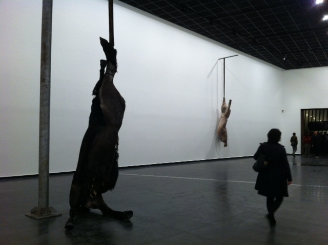
I was reminded of this last week when I went on a preview tour of the newly refurbished Melrose Wing at the Art Gallery of South Australia. Among one of the recent acquisitions displayed in the wing is Berlinde De Bruyckere’s We are all flesh. The work is made of horse skins stretched over a cast of two intertwined horse bodies, suspended in the middle of the room.

A view of the work taken last year (from http://lamblegs.wordpress.com/2012/06/07/we-are-all-flesh-berlinde-de-bruyckere/)

The pending unveiling of the work caused a minor splash in the local media, and I saw at least one letter to the editor of the local paper saying something to the effect of: “If this sort of thing is what’s in the Art Gallery there is no way I’m going to let my grandson go there and be traumatised by it”. Irrespective of any debates about the artistic merit of the work, I doubt the letter writer would have expressed similar concerns about the towering red kangaroo on display in the Biodiversity gallery just next door.

Clearly there are different classes of ‘dead’ when it comes to what we display in our gallery spaces. Why probably matters too – is something that is acceptable when displayed in the name of scientific instruction suddenly scandalous when it’s art?

UPDATE (5/3/13): It looks like the controversy surrounding We are all flesh is prompting renewed interest in the Art Gallery of SA, and possibly reaching new audiences?