Quick review: National Museum of Scotland

On my recent trip to the UK, I managed a quick visit to the newly refurbished National Museum of Scotland in Edinburgh.

Our visit was on a Sunday morning at the height of the Fringe season, on our way to meet some friends for lunch. Having somewhere we had to be, combined with the fact that one of our group was only five months old, meant that realistically this was only ever going to be a lightning trip. Consequently, this review will be of first impressions and a critique of what I did get time to see.

According to this blog post by museum commentator Tiffany Jenkins, the refit took three years and £47 million. It’s proved popular, with visitor numbers passing the 100,000 mark less than a week after opening. Exhibition spaces were certainly beginning to fill up by the time we left.

Arrival and Entrance

One of the changes they have made is to the way visitors enter the building – rather than scaling the prominent steps, you now enter via an adjacent street-level door (although once inside the building it feels more like a basement than an entrance statement).
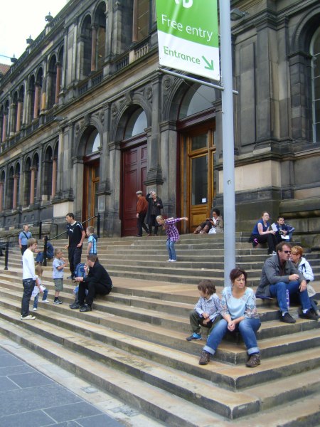
The steps to the original entrance, with signage pointing to the new entrance. (Photo from Tiffany Jenkins' blog, see link above)

In her review Jenkins criticised this move, observing that many visitors gravitated toward the more prominent original entrance and missed the new entrance completely. To be honest I’m still in two minds about what I think about this myself – on the one hand, the street-level entrance was much easier to negotiate with a baby stroller, and I can see the rationale for having an entrance which meets universal access requirements. On the other hand, changes to navigation that go against the grain of usual expectations can be disorienting and counterproductive. It will be interesting to see how this settles in – the photo above shows how the steps have already been adopted as an informal outdoor gathering and relaxation space now that they don’t have to deal with volumes of visitor traffic. If this new purpose settles in and gains currency over time, then the street-level entrance could easily become ‘the new normal’*.

Once you pass through the basement you reach the central atrium of the original grand hall – this is where the original entrance would have taken you. This has been left quite open and minimal with only a few key objects – this works well as a space where you can make the psychological transition from ‘street’ mode to ‘museum’ mode. Most of the exhibition spaces run off this central space; this aids visit planning and site orientation. It could do with a bit more seating though:

The central atrium, National Museum Scotland

Exhibitions

We started our visit in the Natural History area, and having a limited time budget this was one of the few galleries I managed to look at properly. (Later I broke away from the group so I could have a whistle-stop tour around more spaces and get more of an overall sense of the place.)

In the animals exhibition, displays were organised by characteristics of animals, eg. flight, adaptation to climate extremes, locomotion, size. This allowed interesting comparison of different animals’ adaptation to their respective environments and ecological niche. These displays were generally well grouped and signposted, so it was clear why certain animals had been placed together.

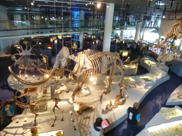
Overview of the animals exhibition, National Museum Scotland

The introductory signage in each exhibition space gave a good, simple overview of the intended interpretive goal:

Introductory text to "Animal World"

However, while I generally liked the succinct and well-layered interpretive text, I think it erred too much on the side of brevity. For instance, in many cases I was left wondering where certain animals were from, and whether they were extinct or abundant in the wild. Such information was all but absent, which struck me as a real gap (particularly as we are used to thinking about animals in terms of where they are from; the displays were not organised by habitat so there wasn’t any conceptual ‘anchor’ in this respect).

There were a few tactile displays, such as this one which allowed you to feel and compare the difference between horns which were made of bone, tooth or keratin:

Tactile display, National Museum Scotland

Next to the Natural History galleries were the spaces dedicated to World Cultures. These were arranged by theme, allowing you to compare and contrast how different peoples around the world approach common aspects of human experience. I watched an interesting video about different wedding traditions, and found a Ghanaian coffin shaped like a Mercedes Benz both fascinating and disconcerting.

Regrouping in the museum cafe afterwards, my partner expressed disappointment that he had not seen anything particularly Scottish during his visit, given that we were meant to be in the country’s National Museum and all. It’s there, but unfortunately the Scottish history and culture displays are tucked away in an adjacent wing. This extension was probably built in the 80s or 90s, but in the layout of the refurbished museum it is a fair way off the beaten track and it was almost by accident that I found it at all.  I’m not sure what the original intent was, but in its current configuration it is a confusing rabbit-warren of dead-end spaces.

The old 'new' part of the National Museum of Scotland - I wonder if this building was conceived and designed from the facade inwards, leaving a legacy of spaces which are less than ideal as exhibition areas.

Few visitors seemed to make it this far, and there was a noticeable thinning of visitor traffic compared to the galleries surrounding the main atrium.

The interior of the museum extension. From this vantage point I could see more exhibition space than I could figure out how to find.

As I said before, I probably only had an hour or so to look around and I’m sure there’s plenty I missed. Plus I never bothered to pick up a visitor map which may have made the extension easier to navigate.

Has anyone else visited NMS either recently or before the refurbishment? What were your experiences?

*Incidentally, I noticed that the National Gallery in London faces a similar dilemma. They have taken the option of maintaining both the original grand entrance as well as a newer alternative at street level. However, the signage was ambiguous and it wasn’t immediately obvious that the street level entrance actually *was* a proper entrance (as opposed to an entrance just for schools or tour groups),  so we ended up needlessly lugging our suitcases up the main staircase.
The Garden of Health

It’s always nice to see a project you’ve worked on come to fruition.

Yesterday I went to the opening of the Garden of Health at the Botanic Gardens of Adelaide. This new garden is designed to show how plants have been used for healing and wellbeing since ancient times. It features medicinal plants from around the world, including plants which have only recently caught the attention of modern pharmacology.

A view of one of the Garden of Health beds

I was appointed to write interpretive text for the signage. The Garden staff were very pleased with the result (as was I!), so bear with me if I show off some of my handiwork (and apologies that the contrasts of daylight have played havoc with the camera a bit):

Ancient plants, cutting edge medicine
Interpretive sign on plants and modern pharmacology


The potential hazards of herbal medicines
Healing plants of Africa

The intent with the interpretive text was to have a casual, conversational style that didn’t get too bogged down in detail but still offered enough interesting facts to make the signs informative and engaging. Signs cover historic periods, healing traditions and geogrpahic areas. (And thanks to Katrina Nitschke from the Garden for giving these signs a nudge in the right direction from time to time!)

The Garden of Health is located near a new Western Entrance to the Garden, made a landmark by this impressive Gingko Gate by artists Hossein and Angela Valamanesh:

The Gingko Gate

If you’re in Adelaide, I hope you have a chance to check it out.

Less is everything

The latest issue of Interpreting Australia (Issue 44) has just come out. It features WA, in anticipation of the “At the Frontier” conference taking place in Perth in November. (This conference is being held jointly by Interpretation Australia and Museums Australia.)

In one article, Luke Donegan writes about his experiences in developing the Fremantle Prison’s Rockbreakers temporary exhibition. He describes familiar challenges:

  • How to choose what to emphasise in a complex storyline?
  • What objects (from a wealth of options) should be included in the displays, and in what context?
  • The research and context development process unearthed a wealth of fascinating facts. Do these add insight or just distract from the story.

Some hard choices had to be made. But, as Luke says, this was precisely the point:

We can’t say all we want to say and show everything there is to show. Our role as exhibition developers and heritage interpreters requires moderation rather than excess; focus rather than diffraction . . . rather than communicating all the facts, shaping a difficult story to reveal a heritage jewel.

Say it simply, say it clearly, say it well.

Cemetery stories

Visiting a cemetery, just for the sheer curiosity of it, probably isn’t top of your ‘must do’ list.  It certainly wasn’t on mine.

But that was before I realised how much cemeteries can tell us about a place and its history. Death is the ultimate unifier and, almost by definition, a cemetery will include a true cross-section of society. In addition, the design of the cemetery and the symbolism of the monuments can tell us a lot about the culture and the values of the society that created them.

About three years ago, I was part of a team that was commissioned to do an Interpretation Plan for West Terrace Cemetery here in Adelaide (I wrote about it at the time in Issue 39 of Interpreting Australia magazine – free download available to IA members). It was an intriguing prospect – while there are a few cemeteries around the world that pull in the crowds (Pere Lachaise in Paris springs to mind), I don’t think many have systematically explored their cultural tourism potential.

West Terrace Cemetery is distinctive in that it dates back to the beginning of South Australia’s colonial history, and was the State’s principal cemetery for the best part of a century. South Australia’s early politicians, explorers, entrepreneurs, priests and paupers all share their final resting place in its grounds. You can consider the cemetery as a window into South Australia’s colonial history in particular (I’ll define ‘colonial’ South Australia as the period from first European settlement to Federation, i.e. 1836-1901).

So, back to the Interpretation Plan.  One of its recommendations was to produce a set of self-guided tours of the cemetery, each exploring a different theme. The first challenge was to choose, out of a longlist of several hundred, which grave sites would be chosen to create the first tour of ‘heritage highlights’. Eventually, a tour comprising 29 stops was developed and I was appointed to write the text for the signage (through Exhibition Studios).

One of the sites on the Heritage Highlights tour. The draped urn at the top of the monument was a common funerary symbol in the late 1800s.

It was quite an undertaking – to interpret the cemetery features and burial sites necessitated getting across a lot of SA’s early history in order to give the stories context and relevance. We needed to provide enough background for visitors who knew little of South Australian history, while still keeping the text succinct. The tone of the text needed to be lively, while still sufficiently respectful of the place it was sited. The content also needed to be approved by the descendents, who remain ownership and control of the burial plots.

The Heritage Highlights trail was officially opened on March 4, and I was delighted to be invited to the celebrations and meet some of the descendents of the people I’d written about. I was careful not to look too closely at the text (I was sure there’d be things I’d wished I’d done differently!), but was pleased to see a project that had been in the pipeline for so long finally come into fruition.

So if you’re in Adelaide, are curious and have a free couple of hours, I recommend you see it for yourself – among the people you will discover are:

  • Colonial powerbrokers such as the Kingstons, Henry Ayers and John Langdon Bonython
  • The entrepreneurs behind household names such as Faulding and Menz
  • The women who campaigned to see SA become the first place in the world to give women full democratic rights
  • Eccentric genius Percy Grainger (yes he’s buried at West Terrace!)
  • Plus the stories of ordinary people caught up in extraordinary circumstances, such as the young Foot Constable killed in the line of duty, and a victim of South Australia’s worst civilian maritime disaster.

I hope that’s been enough to whet your appetite – and do let me know what you think!

The Cemetery is open every day and you can pick up the tour guide brochure at the front gate.


Museums and your Worldview

Does who you are affect what you can talk about?

Exhibitions don’t exist in a vacuum: people experience them in the context of the institution in which they are located. And often that institution has a long-standing reputation (call it a ‘brand’ if you like) which will influence what people expect to see there. (You wouldn’t expect an exhibition in Questacon to be the same kind of thing as an exhibition at the Australian War Memorial, for example).

To explore this idea further, let’s consider museums of science. Does an audience’s expectation-arising-from-reputation mean that science museums are obliged to present only a scientific, empirical view of the world in their exhibitions?

I’d like to explore a case study: the ‘The Science and Art of Medicine’. exhibition in London’s Science Museum. I’ll say up front that I haven’t seen this exhibition, but it is described on its website thus:

The Science and Art of Medicine gallery, one of the world’s greatest collections on the subject, reveals the history of medicine across the world and across cultures . . . A newly redisplayed section deals with other living medical traditions, including African, Chinese, Indian and Islamic practices.

17th Century Acupuncture teaching doll, one of the items on display in the exhibition (From Science Museum website; image no 10284604)

Its coverage of alternative medicine, in particular homeopathy, has apparently caused a bit of a ruckus. As one blogger said:

Depressingly, the [Science Museum] seems to have pandered to the whims of quacks by allowing them to create their own exhibit, and it looks like there was no quality control . . . [this] matters because the [museum] is supposed to promote science and understanding, not fuel an ever increasingly tiresome debate between those that painstakingly research and collect data and those that appear to pick any old idea then try to convince people it works.

The blog post closes with the statement:

Institutions like the Science Museum unfortunately do not have the luxury of sitting on the fence with issues such as these, especially when they hold a huge responsibility of informing the public.

This statement is telling – the writer seems to be just as vexed by the location of the exhibition (in a science museum) as he is about the exhibition’s content. Implicit in his statement is the assumption that the science museum is vested with a sense of authority, and from this comes a responsibility to ensure only scientifically verifiable facts are presented. Indeed, this writer and others suggested the museum should go further and expose unscientific and unsutstantiated claims wherever it can.

There was sufficient a wave of discontent for the museum and the exhibition’s curator to release an official response to the criticism, explaining their rationale for its inclusion of ‘alternative’ medicines in the display:

we take an anthropological and sociological perspective . . .we do not evaluate different medical systems, but demonstrate the diversity of medical practices and theoretical frameworks currently thriving across the world. Our message in this display is that these traditions are not ‘alternative’ systems in most parts of the world. Instead they currently offer the majority of the global population their predominant, sometimes only, choice of medical care. We do not make any claims for the validity of the traditions we present . . . We consider that these ‘alternative’ medical practices are of considerable cultural significance. We also recognise that some may consider the inclusion of these practices in the Science Museum controversial.

This statement in turn triggered its own flurry of comments, such as:

I strongly believe that something so fundamentally unscientific, really has no place in a science museum, no matter how anthropologically and sociologically interesting.

Again, the problem seems to be that the exhibition is presented in the context of ‘science’, more than the fact that the story is being told at all.

I first came across this controversy on Twitter, when someone (a scientist) posted a link to the Science Museum’s response, calling it ‘appalling’. When I retweeted the link, one of my colleagues (a historian) wondered what the fuss was all about, thinking that the inclusion of this content in a science museum was a refreshing dash of ‘anti-imperialism’.

In these different responses, I think I see a bit of a philosophical clash regarding what a museum (particularly a museum of science) is for.

One the one hand there are those who wish to promote a scientific viewpoint of the world, with all the benefits and knowledge science has brought to our lives. They might see the inclusion of alternative medicince as a kind of  slippery slope towards giving airtime to misleading claims and scare stories, leaving society the worse for it. (For instance the consequences of the so called MMR ‘scare’, where the conjuring of a false risk led to a decline in vaccination rates, thus exposing children to the real and deadly risk of diseases like measles).

On the other hand, the ‘march of progress’ narrative which is often implicit in science and technology exhibitions makes some people (in particular some museum professionals) feel a bit uncomfortable. Other experiences and perspectives can appear to be marginalised in a ‘technology trumps all’  kind of triumphalism. Science and postmodernism do indeed make odd bedfellows!

(But this is all getting a bit philosophical . . . and if I sound like I’m sitting on the fence it’s because I think I have a better view of the whole landscape from there . . .)

So let’s bring it back to visitors. What do they expect from a science museum?

There is research to suggest that visitors do see Science Museums as venerable, authoritative institutions. And this does affect the way they perceive exhibits they see there: they expect to be told clear facts and a scientific view of ‘truth’. In this context, a science museum would need to tread carefully: display does not necessarily mean endorsement, but visitors may take what they see at face value unless authorship is made extremely clear.

What this means for this particular exhibition at the Science Museum I can’t say, although I do know that the museum generally conducts thorough audience research during their exhibition planning process. It would be interesting to see what their research says about this one.

UPDATE: Sometimes you get so caught up in planet Interwebs you forget what’s sitting on your bookshelf! Following writing this blog post and others, I’ve once again picked up my copy of “The Politics of Display: Museums, Science Culture” edited by Sharon MacDonald. It looks at the political consequences of scientific displays and argues that they cannot claim to be apolitical. Have a look if you want to explore this topic further.

Interpretation: whose business?

I have a confession to make.

Probably a contentious one, given I am Vice President of Interpretation Australia, but one I will make nonetheless: I’m having a bit of a problem with the word ‘interpretation‘.

The word is tantalisingly – misleadingly – simple: and this in itself presents an interpretive problem. Outside the heritage profession, it has a completely different meaning, usually related to translating foreign languages. And even within heritage circles, I sometimes wonder whether we are all talking about precisely the same thing when we’re talking about ‘interpretation’.

The Interpretation of Dreams, Sigmund Freud from www.alcorngallery.com (One of the top images which came up from a Google search under 'interpretation' - yet another meaning for this vexed term!)

Before I go on, I’ll bring in an analogous example – the word ‘theory’. No-one would need to go look it up in the dictionary. Through common usage we all know it means a ‘hunch’, something we’re basing on conjecture but which we don’t have enough evidence to prove outright. In common usage, ‘theory’ and ‘hypothesis’ are interchangeable terms. But not to scientists. In science, a ‘theory’ is something that is so well backed up by available evidence that it can be taken as an established fact. A hypothesis, on the other hand, is closer to our common understanding of  the word ‘theory’ – we think we know what might be going on, but the results are not yet in.

This disconnect between everyday and specialist usage of a seemingly harmless word such as ‘theory’ has its consequences.  For instance, people who wish to undermine the well-established Theory of Evolution for their own political or religious agenda can turn around and say:  “Well, it’s only a theory, isn’t it?”

Now ‘interpretation’ doesn’t suffer quite like ‘theory’ in the way it is wilfully misinterpreted. But even so, I think the issue of definition runs deeper than just having to clear up confusion when you answer one of those ‘So what do you do?’ questions at dinner parties. How do you get someone to value something when they’re not even sure what it is?

The latest edition of Interpreting Australia focuses on the business side of interpretation: does interpretation make sense from a business perspective? How can we incorporate the value of interpretation into business bottom lines? Is there a firm line where marketing and customer service stop and interpretation begins? And what does this mean for who should be charged with ‘doing’ interpretation?

Sue Hodges writes the first instalment of a thought provoking series (the rest will be coming on the Interpretation Australia website soon) about how the unclear definition and intangible nature of interpretation makes it easy for it to be undervalued and ‘claimed’ by other professions rather than being a separate entity, calling for its own dedicated expertise and budget:

Intepretation suffers from being pluralistic. It spans many disciplines . . . Yet it is this very adaptability that currently threatens our profession; many other disciplines also want our slice of the pie . . . most [interpretation] could theoretically be undertaken by anyone because the required skills base is neither mandatory, legislated nor confined to the arts or sciences. Interpreters are vying for business against specialties which are more clearly defined, such as architecture. . . . it can be hard to justify adaptive and intangible interpretive work against the familiar and tangible work from allied professions. (Interpreting Australia Issue 43, p6)

In this context, consultants from all sorts of fields can claim they can do the ‘interpretation’ part of a project. And if clients aren’t entirely clear what interpretation is, and get different definitions depending on who they speak to, this only muddies the water further.

In a similar vein, I recently had a discussion with someone who is charged with helping local tourism businesses create better experiences (to the end of increasing visitor spend and of course, profits). While we both understood intuitively how interpretation can (and does) enhance tourism experiences, it’s hard to quantify exactly what interpretive ‘inputs’ will lead to a specific set of bottom-line ‘outputs’. And without this hard data, it can be difficult for some business owners, unfamiliar with the term ‘interpretation’ in the first place, to get it (and see why it’s a wise investment).

Our discussion did make me wonder whether the use of the term ‘interpretation’ was actually counter-productive in this instance, and whether we should just be seeing good interpretation as an integral part of creating a distinctive experience, regardless of what we call it?

Or maybe we turn it the other way around –  and show how interpretation is something people know about already! In another of the Interpreting Australia articles, Michele Bain of Designhaus draws upon the example of Jamie Oliver as an ‘interpreter’ of food and nutrition:

. . .he engaged us and inspired us so completely we never even noticed that we were actually learning to cook. (Interpreting Australia Issue 43, p10)

Perhaps if we described interpretation in these more familiar terms – i.e. applying interpretive principles to communicating the very concept of interpretation – we might help businesses make the conceptual leap from seeing interpretation as something that sounds very academic and not particularly relevant to them,  to understanding that it is the ‘secret ingredient’ which makes the difference between so-so and must-see.

To take the cooking analogy a step further: bricks-and-mortar might be the meat-and-potatoes of a destination, but without the carefully planned and expertly created ‘sauce’ that is interpretation, the experience may satisfy the basics but it is hardly going to be unique,  memorable or emotionally satisfying.

Maybe that is the way to describe what I do at the next dinner party . . .

http://www.designhaus.com.au/

Interpretation Australia Symposium Wrap

Last week I joined some 150 fellow interpretation professionals in Launceston for the 2010 IA National Symposium. This was the third IA conference / symposium* I had been to, so there was a good mix of familiar faces and new people to get to know. This post is intended as an overview; I’ve already posted a summary of the workshop I ran and I will cover the field trip (to the Beaconsfield Mine and Heritage Centre) in a separate post. So, without further ado:

Things I learned & things I liked:

  • Zoos Victoria’s Connect – Understand – Act model of interpretation to encourage behaviour change in visitors (as presented by Scott Killeen).  Interpretive activities are designed to fit into at least one of these three categories and there have been some promising signs of behavioural change, at least in the short term (petition signing and phone recycling scheme takeup).
  • Catherine McCarthy (San Antonio, TX) stated that “Heritage sites change at a different pace from technology”. While this is no great revelation, it was a neat way of putting it and a lot of interpretive issues stem from this simple fact. And it’s something which is only going to increase in significance as technological advances accelerate. Plus her presentation raised a few question marks about technological / infrastructural differences and how they might affect interpretation. (She described cellphone-based audio tours and reported quite a high takeup rate compared to what I would expect. But then again this probably says more about the difference in cellphone tariffs between the US and Australia than anything else. In any case, I think the cellphone-based tour will be overtaken well before it even takes off here, by the smartphone App and the downloadable podcast.)
  • Zoos Victoria / Healesville Sanctuary have a superhero called CrapMan. Inspired, brave and memorable.
  • Peter Grant’s (TAS Parks and Wildlife) analogy of interpretation using a jug of ice water. The water itself is the easy content; the ice is the harder, pointer topics; and the water vapour in the atmosphere represents all the non-obvious meanings. The interpreter plays the role of the jug, allowing this meaning to condense and be appreciated. (The rest of Peter’s plenary focused on the inner journey of the interpreter, relating our job as an extension of the internal quest for meaning.)
  • The term ‘disintermediation’ to describe the impact that social media and mobile devices are having on how visitors interact with culture. (And Wikipedia tells me this term is over 40 years old!).
  • Kate Stone (National Film & Sound Archive) alerted us to some interesting websites and social media initiatives. New to me was Ushahidi, a crowdsourcing web platform which arose out of civil unrest in Kenya and was used by citizen journalists to map outbreaks of violence. (Ushahidi means “testimony” in Swahili.  As an aside I wonder if it shares any linguistic roots with the Arabic shahada, which means, among other things, “witness”?).  Also NLA’s Trove website, which brings together books, newspapers, journals, images, video maps and so on together into a single searchable site with an emphasis on Australian content.
  • (this one is new as it seemed to have disappeared from my original notes) Dillon Kombumerri, Australia’s first Indigenous architect, gave a thought-provoking presentation on some of his work which has sought to address Aboriginal disadvantage through culturally-sensitive design. The thing that stuck in my mind was his observation that in Aboriginal culture, people identify with Country first, then Family, then as an Individual. It occurs to me that the ‘European’ colonial culture is more or less the exact opposite of this, particularly in its more recent, highly individualistic, incarnations. I fear this is just one of many examples of how completely different cultural perspectives present a real barrier to mutual understanding and reconciliation. And I don’t know what the answer is.
  • Dr Jody Steele’s (Port Arthur Historic Site) informative and entertaining introduction to the world of public archaology:
Mel Loe and Jen Fry (with Peter Grant in support role) help Dr Jody Steele demonstrate archeological geophysics

Things I noticed

  • The diversity of delegates: the symposium brought together academics, tourism operators, park rangers, designers, historic sites, museums, local government, architects and a wide variety of consultants, to name but a few. The breadth of fields represented in a relatively small number of people would outstrip that seen in your average museums conference, I’d wager.
  • Heritage Interpretation is a hard field to pin down, and not everyone practicing interpretation would self-identify as such. (As a case in point, I started out in Science Communication and at the time had no idea what Interpretation was, even though there are very clear parallels and overlaps.) The upside of this lack of neat definitions is that it allows people from diverse backgrounds to learn from each other in the broad church which is Interpretation. The huge downside is that it can sometimes be hard to convince  category-driven thinkers (e.g. bean counters and property developers) that interpretation is something to be valued and appropriately paid for. (Made worse by the fact that we tend to do our job out of vocation and tend not to be very good at selling ourselves!)
  • Despite (or because of?) the points above, there appear to be some surprising disconnects between the Interpretation and Museum worlds, at least based on my experience. Freeman Tilden was dubbed by one speaker as the “Einstein of Interpretation” and his seminal work Interpreting our Heritage (1957) is often cited by interpreters, 50+ years on. However I don’t think the name has ever come up in museums circles, and I wouldn’t be surprised if mentioning Tilden at a museums conference would attract a lot of blank looks. Conversely, there were a few concepts introduced at the symposium which are reasonably well-worn territory in museums circles, but seemed to be quite new to several delegates (but perhaps I’m just showing my age here?)
  • A couple of the plenary speakers really divided the crowd: some delegates thought they were fantastic; others were left scratching their head wondering what all the fuss was about. I think this probably relates to my first point, in that we are such a diverse crowd and probably bring markedly different expectations to a conference such as this. It could also be that some speakers were better at weaving their presentation into a coherent story.

*I’m really not sure what the difference between a conference and symposium is meant to be. The OED definition of a ‘conference’ is “a meeting or discussion, especially a regular one held by an association or organisation”; whereas a ‘symposium’ is “a conference or meeting to discuss a particular subject” (or “an ancient Greek drinking party”, apparently, but I digress . . .) I think the intended distinction is that a ‘conference’ is a more formal meeting with peer reviewed papers, etc; while a ‘symposium’ is more practice led and hands-on. In my experience, however, I’ve not noticed any real difference. Perhaps if I had been to heavily academic conferences I might.  But, to be perfectly honest, I just found the distinction a bit confusing.

Interpretation Australia Workshop Slides

Last Thursday, as part of the Interpretation Australia National Symposium in Launceston, I presented a 2-hour workshop called “Interpreter as advocate”. This presentation, which I’ve alluded to in this earlier post, was about all the so called “non-interpretive” activities which affect the visitor experience and, ultimately, the message we’re trying to communicate.

I received some great feedback on the day and I’m glad that participants found the workshop thought-provoking and came away energised with new ideas. I’m hoping to continue this conversation on the forum on the IA website, and to this end I’ll post something there soon.

The main point of this post is that several people requested a copy of my presentation, which I’ve attached as a PDF here. Now if I were to do this presentation again I’d probably make a few tweaks and changes. But so that it is a faithful record of the day, I’ve uploded it unchanged.

For those of you who weren’t at the workshop, these slides will probably not be 100% self-explanatory. But whether you were there or not if you have any questions, or would be interested in me coming to your organisation to run something similar, then please do get in touch.

Re-presenting ‘The Lust Branch’

Don’t let the title fool you – this is yet another instalment in my series of posts from the MA National Conference. Allow me to explain . . .

The Conference was held at the University of Melbourne, which is also the site of the Grainger Museum. This museum, built in the 1930s, was established at the behest of Melbourne-born composer, arranger and pianist Percy Aldridge Grainger (1882 – 1961). Grainger created it as an autobiographical museum, documenting his life and influences through a collection of publications, correspondence, musical scores and a range of objects including experimental musical instruments.

There is a link to my current work here, hence the stand-alone post: while Grainger spent the vast majority of his life in Europe and the US, he was buried in Adelaide at West Terrace Cemetery, in the family plot of his Adelaide-born mother. Over the past few months I have been working on interpretive text for a self-guided heritage trail for the cemetery, and Grainger’s grave is one of the stops on the trail. His prolific, diverse and eccentric life have proved challenging to interpret in the context of a small interpretive sign comprising a mere 175 words!

The Grainger Museum has recently undergone a redevelopment, and I managed a quick look around during one of the conference lunch breaks. In addition, Brian Allison from the University presented a paper on the challenges presented by a particular section of the collection.

There was a box of items under lock and key, which Grainger had instructed was not to be opened until 10 years after his death. And so, in 1971, it was time for the curators to open the mysterious box to see what wisdom lay within. Brian said he would have liked to have been a fly on the wall that day. And how. What emerged was ‘The Lust Branch’ – a collection of writings, objects and photographs which graphically explored the darker aspects of Grainger’s sexuality.

To put it bluntly, Grainger was a sadomasochist. He photographed his flagellated body, set out detailed instructions for whipping, and left behind an extensive collection of whips, blood-soaked clothing and other home-made paraphernalia.

whips
A selection of whips from the Grainger museum

Grainger believed his sexual expression was inextricably linked with his artistic expression; thus his creative works could not be fully understood without exploring his darker passions. But this was not a story that early 1970s Melbourne was ready for. Consequently, the collection presented a curatorial headache and has been, in effect, ‘censored’ for the best part of 40 years.

As part of the museum redevelopment, the University decided it was high time to tackle this part of the collection. And while they initially set out to present it no-holds-barred, there were legitimate audience and legal concerns – some of the photographs are sufficiently graphic as to be illegal to put on public display; plus the University had to take into account their target audiences, not least the nearby Ladies’ College who use the museum as an important musical resource.

The resulting display consists of a graphic montage of some of the documents and photographs (not all of them are particularly confronting, but it’s by no means sugar-coated), opposite a case displaying a large collection of whips. It is presented discreetly without being hidden, and I think on balance it is well done and unlikely to cause a furore. Indeed, by 21st century standards, Grainger’s views on racial purity (also covered in the museum) are arguably more controversial than his sexual predilections!

But none of these more controversial elements are presented in a way that overshadows or detracts from Grainger’s talent and achievements in other fields. The majority of the museum is all about the music.

Top 5 barriers to visitor engagement

Everything you do is saying something to a visitor

But do you like what it says?

Sometimes, it is the NON-interpretive elements of a visitor experience that leave the most lasting impression – and not necessarily a good one.

In a few weeks’ time I’ll be presenting a workshop – Interpreter as Advocate – at the Interpretation Australia National Symposium in Launceston.

As part of the workshop, interpretive principles will be turned ‘inside out’ – rather than using interpretation just to engage our visitors, how can we use the same principles within our organisations to help build a better overall experience?

In advance of this, here are five top challenges to creating a coherent and compelling visitor experience.

    1. Barriers: these can be either physical or virtual. Being able to provide universal physical access is the most obvious point here, but there are other aspects: clear directional signage (both to and around your site); intuitive layout of visitor services and facilities; websites which are organised according to the way your audience is likely to look for information (which is not necessarily a mirror of your management structure!)

    2. Inconsistencies: does your interpretation sell a message of environmental sustainability, but your café sells drinks in polystyrene cups and your shop sells myriad plastic trinkets that are likely to be landfill before the year is out? Are your front-of-housers friendly but security staff surly? All these inconsistencies can detract from your interpretive message.

    3. Blind spots & Assumptions: Your institution, and those like it, is very familiar to you. You have probably visiting such places for a lot of your life. There are certain norms and expectations which may be so obvious to you that you don’t even see them. Imagine if you’d never been to a National Park or a Museum before (and didn’t know anyone who had) – would you know what was expected of you? Would you feel comfortable or would you feel concerned that as soon as you crossed the threshold you’d break some unwritten code that would immediately flag you as an ‘outsider’? If this seems a bit weird at first, consider how you would feel going to a place where you would be a complete outsider – for instance a place of worship for an unfamiliar religion, or a social activity that is vastly outside your cultural experience– daunting, isn’t it? And that may be how some potential visitors feel about you!

    4. Misalignment: this includes efforts which are not necessarily wrong, but are aimed at the wrong kind of audience. For an example from another field, consider a friend of mine who recently ordered fluorescent light bulbs from a supposedly ‘environmentally-friendly’ company. Along with her order came: “an unasked-for green bag, two shower timers and a fridge magnet.” Her verdict? Landfill! The company was undoubtedly trying to be mission-consistent, but in the case of my already-converted friend, the preaching was a waste of time and resources. In fact, it ultimately sent her a message which was the exact opposite of that intended.

    5. Superfluous services: related to misalignment, this is offering benefits or services that your audience neither notices nor particularly values. It’s not a barrier to visitor engagement per se; but it can be to the extent that it diverts valuable time and resources which could be better spent elsewhere.

Have you ever encountered these examples, either in your own institution or as a visitor elsewhere? Are there others that I’ve missed out from this list?

Give me your thoughts, or better yet – come to the workshop!