Museum Visitor Experiences Part 2: Resonating

This is Part 2 of a four-part series of posts based on the book “Designing for the Museum Visitor Experience” by Tiina Roppola. Go to Part 1.

Resonating: features that attract and repel visitors

In interviews, visitors often described feeling “drawn to” particular exhibition environments and displays. Roppola uses the concept of resonance to characterise this interaction between visitors and features of the exhibition environment. In physics, ‘resonance’ is used to describe the amplification effect observed when two bodies vibrate at the same wavelength. Similarly, visitors and exhibits can be considered as being in a resonant relationship when they are ‘in tune’ with one another.

Certain environmental features, such as “size, beauty, colour, light, a quality of realism, sensory change/movement and opportunity for action” (Roppola, 2012, p. 126) tend to attract visitors and draw them in. Spatial characteristics can also be resonant – environments that feel pleasant to be in owing to characteristics such as light, spaciousness or aesthetic appeal.

Perceptual resonance

Resonance can be achieved by the way that sensory cues of exhibits interact with our perceptual systems. Sensory cues can be seen as “bottom up” data, which we interpret using “top down” mental constructs – an example is how we readily interpret two dots and a curved line as a smiley face (see below). This process of “filling in” the gap between bottom up sensory data and top down constructs can happen within one sense or between multiple senses (eg. visual cues working with auditory information to create an integrated whole).

Perceptual resonance in the visual sense. This image comprises just three lines but we use this bottom-up visual cue along with our top-down concept of a human face to “fill in” the gaps and perceive this as a picture of a smiley face.

Exhibits can take advantage of this intrasensory augmentation to create an enhanced sense of realism – for instance simulator exhibits combine immersive visual stimuli with a relatively modest amount of movement to create a feeling of flying or being in motion. In immersive exhibits or recreated environments, sound effects and smell can be used to enhance realism by hinting at the presence of things unseen – such as bread baking in an oven or the faint cry of a child in the distance. However, simply combining sounds, sights, smells and textures does not automatically create a coherent perceptual whole; the sensory information needs to be congruent with the top-level mental constructs through which visitors interpret them.


Coalescent resonance and how visitors define “interactivity”

Coalescent resonance occurs when two separate entities come together to form a complementary whole. In an exhibit context, this can mean feeling “part of” the exhibition environment: “visitors can physically, personally and socially interact with, or feel part of, exhibition environments” (Roppola p. 151, original emphasis). Physical coalescence can be literal, such as being able to directly touch or get up close to exhibits; it can also be conceptual as visitors are encouraged to imagine themselves in a given setting or scenario.

Interestingly, Roppola describes several instances where visitors use the term “interactive” in a sense that is very different from the way exhibit designers and other museum professionals use it – namely, that an “interactive” exhibit is one that visitors physically touch or manipulate in some way. This prerequisite seemed less important to visitors, who also used the word “interactive” to pertain to exhibits that allowed physical proximity or social interaction, but not necessarily hands-on contact. A museum professional may call this latter type of exhibit “immersive” rather than “interactive” [1]. This different understanding of the term “interactive” shows the value of qualitative research in validating the terminology we use – when people say they want more “interactive” experiences, do they mean what we’ve assumed they mean?

Impeding Resonance

Just as environmental stimuli can enhance a resonant relationship between visitors and exhibits, they can also impede it. Things that can impede or block resonant experiences:

  • “You can only take so much in” – a museum visit can saturate your sensory and cognitive capacities. Visitors deploy strategies to allocate their time and mental budgets according to their interests. A sense of “too much to take in” can be overwhelming and prevent visitors from engaging with an exhibition.
  • “It’s all jumbled”- the sense of there being too much to take in can be exacerbated by the lack of a clear order or logic with which to make sense of an exhibit. The ‘signal’ of an interpretive message is lost in the ‘noise’ of an overly cluttered display – different features compete and cancel each other out.
  • “The people I’m with won’t let me” – visitors might spend less time on an exhibit than they would like if they feel they’re being hurried along by their companions. Queues and crowding can impede resonance by getting in the way or making an environment less pleasant by their presence.

Next week – Channelling

[1] In my own research, I found that “immersive” was not a word that resonated particularly with visitors when asked to describe exhibit environments. I used the word in my pilot questionnaire and several visitors said they didn’t know what the word meant (and the pilot results suggested these people were just the tip of the iceberg). Given the amount of museological discourse there currently is around “immersive experiences”, this is a point worth noting – we’re potentially talking about visitor experiences in terms visitors would not recognise.
Museum Visitor Experiences Part 1: Framing

Over the next few weeks I’ll be featuring “Designing for the Museum Visitor Experience” by Tiina Roppola (Routledge) [1]. This book is based on Tiina’s PhD research, during which she interviewed over 200 visitors at more than 20 exhibits across a range of Australian museums. Four key elements of visitor experiences emerged from this qualitative, grounded study: Framing, Resonating, Channelling and Broadening. I’ll be presenting summaries of each of these in turn – this week: Framing.

Framing – the assumptions we bring with us

Framing is a semiotic concept used to describe the overarching structures people apply to objects and situations to aid their interpretation.  Frames are essentially a collection of categories, criteria and expectations we use as part of the meaning-making process.

People have frames for museums and for exhibits, which are informed by their past experiences. These “frame” the encounters they will have as visitors. Not everyone brings the same gamut of frames to their museum visit, although there are some common patterns. Accordingly, Roppola identified a number of frames that people tend have about museums and exhibits:

Museum Frames:

  • The “displayer of artefacts” frame: for visitors holding this frame, the defining characteristic of a museum is the display of material objects. Other types of displays and interpretive media may be dismissed or ignored as not being “real things”.
  • The “learning” frame: an expectation that museums are primarily a site for learning, and that the museum will be an authoritative source of facts and knowledge. People may visit museums to enact their identity of being learning-oriented people.
  • The “enjoyment” frame: held by visitors who find museums pleasurable places to be. This could be through interaction with certain kinds of interpretive content or simply through appreciation of the general ambiance. “Enjoyment” can mean “fun”, but not necessarily so: people can also talk about “enjoying” more solemn experiences in a museum context. [2]
  • The “pilgrimage” frame: applies to visits to see specific personally or culturally significant objects or sites. People queue to see the Mona Lisa so they can say that they’ve seen it. In an Australian context, many people visit Melbourne Museum specifically to see the racehorse Phar Lap. War Memorials are also a site of cultural pilgrimage.

Visitors may also hold different frames for different types of museums. So what is deemed appropriate (ie.,frame-congrent) in an art gallery might be considered baffling or even offensive in the context of a natural or cultural history museum. In the art gallery, there is an expectation that exhibits may be metaphorical, but transplant the same item to a museum and it may be taken literally and not recognised as art at all.

Exhibit Frames:

  • “Materially distinct” – an expectation that exhibits will be different from things you can see elsewhere (e.g. in a book, on the web, or on TV).
  • “Explanatory” – exhibits should provide sufficient information and adequate labelling. Insufficient information can leave visitors frustrated and unsatisfied.
  • “Temporal” – exhibits should be regularly updated so that there is always something new to see.

In many cases, these frames were only specifically mentioned when they had been violated in some way. When visitors encountered exhibits that were contrary to their frames of what an exhibit is “supposed” to be, the response was often negative. This is typical of frames more generally – we aren’t consciously aware of them unless we encounter something which is incongruent with them.

Reframing

Our frames are not static and they will evolve and change as we encounter new situations. This reframing can be both positive and negative. For instance, modern museum buildings that are open and bathed in natural light can represent a positive reframing for people who see the traditional museum as “dark and dusty”. But conversely, some visitors may find discordance in the juxtaposition of old objects and modern architecture.

Satisfying encounters with different types of interpretive media can lead to reframing – for instance moving from a more passive “displayer of artefacts” museum frame to one that incorporates a broader mix of media including more tactile and interactive elements.

Next week – Resonating

[1] I first met Tiina at the 2010 Museums Australia conference, where I tracked her down and quizzed her about her research (it was while I was developing my own PhD research proposal). We’ve since become friends and colleagues and her work has been a big influence on mine. As I go through my own data I’m seeing many parallels with her findings, although I remain in awe at the depth and sophistication of what she produced for her PhD. It’s an exemplary piece of qualitative research and I can’t really do it justice here. I highly recommend the book, which is richly illustrated with quotes from the visitor interviews.

[2] Roppola draws the distinction between “enjoyment” (a word that spontaneously emerged in her interviews) and “entertainment” (which was seldom mentioned). This is an important semantic difference to my mind, and one I’ll come back to in a future post. 

Parrawa, Parrawa! Go Away!

On my recent trip to Hobart I took in the recently refurbished Tasmanian Museum and Art Gallery. Overall I was impressed, but now it’s a couple of months later I think the thing that sticks in my mind the most is an exhibit on the top floor of the refurbished Bond Store building – the Parrawa, Parrawa! exhibition. This deals with the European invasion of lutruwita (Tasmania) and the resulting war between 1823 and 1831.

P1020555

The space is fairly understated in its design and is reasonably sparse with respect to density of exhibits (I mean this in a good, less is more sort of way).

The exhibit I spent the most time at was a set of paired projections – on opposite sides of the gallery from one another – one telling stories of battles from a European perspective and the other from an Aboriginal perspective. It’s hard to capture in images but here’s a few examples:

P1020561

P1020562

P1020564

P1020565

This short video clip (15 secs) might give a better idea of the juxtapostion of the screens within the gallery. I took the video from a bench that was positioned offset from but between the two screens. I sat there for a while alongside a fellow visitor, while we periodically turned our heads from side to side to see the two screens, as they are both screening simultaneously (I mused that we might have looked like spectators at a tennis match, although we weren’t always moving in sync with one another!).

It’s interesting for me to reflect on this experience from both the perspective of a visitor and a former exhibition designer. Had I been on the design team for this exhibition, I can imagine that I may well have argued against this positioning of the screens such that you had to keep turning your head to follow them both. However, I would have been proven wrong as I think in this instance it actually works.

For a start, it positions the two opposing views as more clearly “facing off” against one another. It’s hard to see both perspectives at once (which mirrors the intellectual concept of the exhibit nicely – war is often about ‘taking sides’ whether you want to or not). Also, the provision of a bench makes all the difference – it signals a vantage point from which you can view both screens without obstructing others. And viewing them seated also allows a more reflective engagement with the content. I overheard one visitor say to her companion that “it’s hard to look at*, but that’s good because it makes you want to watch it again.” 

This would be an fascinating exhibit to observe visitors at – once visitors did engage with it, they did seem to spend a fair bit of time at it. But if you breezed past, you may not necessarily have “got” what the exhibit was all about – it could have looked like two disconnected screens depending on what was going on when you walked past. I wonder how these different levels of engagement would look over an extended period of time – over to you, TMAG!


* From the context it was clear she meant physically difficult, not ‘hard’ as in the ‘hot’ nature of the subject matter – although that may also apply in this instance.

Interpretive Activism

Recently I finished reading What makes learning fun? Principles for the Design of Intrinsically Motivating Museum Exhibits by Deborah L. Perry. On one level, it’s a detailed case study of how visitors interact with one of the classic science centre exhibits, Coloured Shadows. On another level, it’s a characterisation of six key motivations that exhibits must satisfy in order to make learning inherently fun. Perry positions these in the context of Interpretive Activism, which she defines as:

. . .the process of advocating for and incorporating research-based, visitor-centered exhibit design principles and strategies that facilitate active visitor participation in the interpretive process. [Perry, 2012, p. 27]

A key element of interpretive activism is to conceive of exhibits as catalysts (for visitors own conversations and active learning) rather than simply conduits (for information):

Rather than lecturing and monopolising the language space . . . what if [museums] gave visitors the tools they need to engage in meaningful conversations with their companions? In other words, what if exhibits (including labels, but other components as well) were specifically designed to contribute to visitors’ conversations rather than interrupting them? [Perry, 2012, p.29]

Over a period of many years, Perry adjusted the design of the exhibit and accompanying interpretive information, testing the results each time with a range of visitors. It’s an interesting example of how certain exhibit features can act as interpretive red-herrings as people make sense of the exhibit.

Coloured shadows is a hands-on exhibit that allows visitors to explore the additive properties of light mixing. (Image source: Exploratorium)

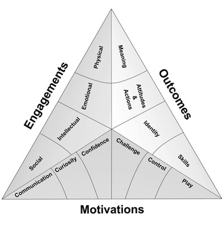
Then, using features of this exhibit as an example, Perry explores the six motivations that sit at the base of the Selinda model of learning (shown below). They’re described in terms that will make the most sense in the context of hands-on exhibits, although the fundamental principles can be applied more broadly. I’ll summarise these briefly below (to the extent that I can summarise several book chapters in a single blog post!) . . .

The Selinda Model of learning (Source: Selinda research)
  1. Communication: “Visitors are smarter than we think they are and know less than we think they do . . . [D]esign interpretation that gives visitors what they need to start a naturally occurring meaning-making process with their companions” (Perry, 2012, p. 94). People often visit museums in groups. Exhibits should acknowledge this, allowing for and encouraging social interaction and collaboration between visitors within social groups. Cater for a range of abilities (especially in exhibits targeted at families where there will be children at different ages). Use natural language in labels. Identify points where visitors may get stuck and offer guidance.
  2. Curiosity: Stimulate perceptual and intellectual curiosity. Pique interest by leaving some things unsaid – while too little information can be frustrating, if things are too obvious then curiosity can wane.
  3. Confidence: visitors will be motivated to learn in situations they feel “safe and smart”. (ibid, p. 118). Feedback should come early and come often. Success breeds a feeling of success and exhibits should guide the visitor through a “series of minisuccesses” (ibid, p. 131).
  4. Challenge: confidence and competence needs to be balanced with an appropriate level of uncertainty and challenge. Ensure visitors are clear what is expected of them, but don’t suggest that success will be automatic – visitors will not feel challenged if they can just go through the motions and be successful anyway.
  5. Control: the need for us to have control over our environment is an important facet of the psychology of visitor experiences. Visitors will feel in control when they have appropriate choices and the power to influence what happens in the environment.
  6. Play: play and the ability to engage the imagination is an essential ingredient of free-choice learning. ” . . . visitors who have the most satisfying and enjoyable experiences are those who feel the most playful – playful with actions yes, but also playful with ideas, playful with thoughts, playful all over” (ibid, p. 171).

Perry, D. (2012). What Makes Learning Fun? Principles for the Design of Intrinsically Motivating Museum Exhibits. Lanham, MD: AltaMira Press.


Empathic Design

Over the past couple of days I’ve been catching up on back episodes of Suse Cairns’ and Jeffry Inscho’s Museopunks podcast series. This morning I was listening to Episode 2, which is on design and design thinking for museums.

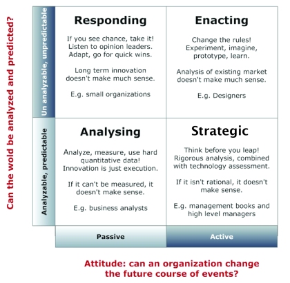
Now while I’ve heard a lot said about design thinking over the past couple of years, I have to confess I’ve had a bit of trouble wrapping my head around what design thinking actually is. Then just last week someone helpfully tweeted a link to this post, which I found enormously enlightening as it positioned design thinking in contrast to other, more traditional ways of thinking and problem solving. In essence, design thinking comes about as a consequence of seeing the world as being essentially unpredictable, but at the same time seeing people and organisations as having the power to influence the future (although the outcomes of our actions can’t be predicted at the outset). In that conceptual framework, I can see how the iterative, prototype-and-test approach of design thinking fits. (Ironic that my analytic brain needed a box to fit it in before I could really grasp it!)

A model of design thinking (enacting), contrasting it to analytical, strategic and responsive approaches. (Source http://designinteams.files.wordpress.com/2013/06/matrix-01.jpg?w=420&h=411)

Then this morning I was listening to Dana Mitroff Silvers being interviewed on museopunks and got really excited when she mentioned empathy [1] as the jumping off point for design thinking (more on this in her Museums and the Web paper). Essentially, before we can go off designing “solutions” to things, we need to empathise with our audiences/users, in other words understand whatever “problem” we’re trying to solve from their perspective:

. . . the majority of museums have yet to adopt mindsets and attitudes that are truly visitor-centered. . .  Despite the lip service paid to the voice of the visitor, the expertise of museum staff is often afforded higher priority than the visitor insights and experiences. . . As a result, museums have been slow to keep pace with the expectations and interests of visitors, who increasingly expect experiences, services, and products that are intuitive, responsive, and well designed. [2]

The depth of understanding required to achieve this empathy goes beyond that possible with simple surveys or focus groups, and requires ethnographic methods and detailed interviews. The paper offers some useful tools and approaches for doing this.

The five processes of design thinking. This is not necessarily a linear process and there may be multiple iterations of each process in a given project. (Source: Mitroff Silvers et al: http://mw2013.museumsandtheweb.com/wp-content/uploads/2013/02/mitroff.fig1_.jpg)

The M&W paper gives a good summary of these five stages, including examples and practical tips. There is also a spinoff website: Design Thinking for Museums.

I find these ideas really fascinating and exciting, and they present a real challenge to the “traditional” model of exhibition design procurement. This is the model I have worked within when working as a design consultant, particularly for new-build museums: exhibitions are procured using very similar processes to those used in construction or engineering (in new museums, the overall project management team is likely to be the same people who oversaw the cranes-and-concrete stage). Exhibitions are viewed as products that are subject to competitive tender and linear signoff processes. Going back to the grid above, these processes are very much in the bottom half – analytic and strategic – outcomes are assumed to be quantifiable and predictable at the outset. In contrast to an iterative design process, these processes result in something I’ll call “ratchet design” – design as a one way process. If something doesn’t turn out as originally planned, then that counts as a “failure” which is going to result in lost time, sunk costs and a whole lot of finger pointing.

For several years, designers (and others) have been saying that the “ratchet” approach doesn’t do anyone any favours. Follow any design group on LinkedIn for long enough and the same issues will reappear: design competitions as part of a tendering process force designers (often without payment) to solve a problem before they have a chance to adequately define it. Then, once a designer appointed, the lack of scope for iteration makes it easier for everyone to just “play it safe”, limiting creativity and innovation. Ironically, exhibition projects are often shoehorned into this analytical-strategic construction model in the interests of “best value”. Uncertainty might scare the bean counters, but all that ends up happening is that everyone hedges against it by upping their contingencies, ultimately driving up costs.

At the moment, it appears that design thinking in museums is most commonly applied to smaller, agile projects run by in-house teams (although I’ve been out of the consultancy game for a while now and maybe the tide has turned somewhat). It would be great to see a design thinking approach applied more widely and at larger, whole museum scales (and for the bean counters to have sufficient faith in the process to allow this to happen).


[1] Recently I’ve been thinking and writing about empathy in the context of interpretation and the relationship between museums and their visitors/guests/however we are to define them. I was writing about this, completely unaware of this parallel discussion that had been going on around empathy and design. It’s great to see synchronicities like this.

[2] Mitroff Silvers, D, Rogers, M and Wilson, M. (2013) Design Thinking for Visitor Engagement: Tackling One Museum’s Big Challenge through Human-centered Design. Paper presented at the 2013 Museums and the Web conference, Portland, Oregon.


Signposts or Serendipity?

There has recently been a fair bit of discussion online about immersive theatre, and what the implications might be for exhibitions (helpfully summarised on Ed Rodley’s blog). One thing that has struck me about this discussion is that people seem to fall into one of two camps: those who cheerfully check their inhibitions at the door, go with the flow and lose themselves in the moment; and others who are consumed by anxiety at not knowing where the whole experience is headed and whether they’re going to miss the most important bit because there’s no obvious route to find it. These are ideas I’ve circled around a couple of times in different contexts over the past few months – firstly in considering meaning making versus meaning reading, and later in a discussion on exhibition layouts.

It seems some people delight in the serendipity of not knowing what’s coming next, while others need their signposts – without them, they feel cast adrift.

This raises a couple of questions for me – are these two inherently different kinds of people, or do circumstantial factors (e.g., audience expectations, social context, design of the setting, how an experiences is framed from the outset) play a significant role?

The answers to these questions have important implications for visitor psychology in general and exhibition design in particular. If we are dealing with distinct personality types, how can they both be accommodated in a given exhibition experience? Is this even possible? If circumstantial factors are important, then which ones? How can we orchestrate experiences and design spaces that assuage the anxiety of the signposters without spoiling the punchline for the serendipitous?


Exhibition Costs – what’s in *your* budget?

One of the most popular posts on this blog is one from way back in mid-2011: Exhibition Costs – Constants and Variables. Working out what a museum exhibition should cost to develop is *the* FAQ that exhibition planners hear the most. And it’s a subject that’s featured in a recent article by Sarah Bartlett and Christopher Lee [1].

Compared to visitor numbers, data on exhibition costs are hard to come by. Many exhibition projects include, at least in part, contracts with outside design companies and exhibit fabricators, who understandably play their costing cards pretty close to their chest. Most of the available data is therefore derived from informal, self-selected survey responses. Also, whereas it’s pretty easy to agree on what constitutes a ‘visitor’, deciding what counts as part of an ‘exhibition budget’ is not so straightforward. Not everyone factors the same costs into their exhibit budget equation. So even when we do have numbers, it’s hard to tell if we’re comparing apples with apples (a point I have made previously).

Bartlett and Lee cite data from their own informal survey (the full report is apparently available on splitrock studios website but at the time of writing I couldn’t find it) based on 71 responses across the US. Responses were mostly from History / Natural History / Art Museums, with relatively few science centres and children’s museums (this contrasts the survey by Mark Walhimer that I reported in my earlier post, where more hands-on style museums were represented). In the Bartlett and Lee sample, the vast majority of exhibitions came in under US$100/sq.ft., although some were over 10 times this amount. This is reflected in the average cost for science / technology museums and visitor centers being over US$500/sq.ft.

But that’s far from the whole story, because survey respondents didn’t spell out what costs were included in their $/sq.ft. figure – and what was below the line. Bartlett and Lee identify the following categories that may or may not be included in an exhibit budget, to which I’ve added a few additional comments:

  • Differing base fit-out costs of a new versus existing building (to which I’ll add the complexities of working in heritage buildings or in spaces with limited access, which increases on-site costs).
  • Basic finishes such as painting, track lighting and flooring (it’s amazing how much it can cost just to get a space up to an ‘inhabitable’ standard!)
  • Changes to building infrastructure like new walls or electric/data cabling
  • Preparatory costs, such as research, planning, design and management fees (to which I’ll add formative evaluation costs)
  • Audiovisual and Electronic interactives (I’d say it’s worth adding that this could also include software and devices that are not strictly part of the fit-out such as apps or audioguides)
  • Staff costs, both in-house and contract personnel (I’m aware that it’s often hard to quantify the amount of in-house time spent on an exhibition, particularly if staff are not required to quantify hours spent. Anecdotally I’ve heard there is often internal resistance to the idea of doing such quantifying as staff feel they’re being ‘checked up on’)
  • Maintenance costs (to which I’ll add other post-opening costs such as snagging, consumables, staffing costs and of course summative / remedial evaluation!)
  • Object-related costs such as conservation, packing and loan negotiations.

With this many variables in what people routinely count as part of the exhibition budget, it’s easy to see how you can get variations that vary by an order of magnitude or more. The most basic of exhibitions may draw upon the existing collection and not involve any changes to gallery infrastructure such as lighting, painting or display cases, and staff costs may be absorbed into day-to-day operating budgets rather than costed out. At the other extreme are highly media-rich and interactive exhibitions that involve considerable research and hiring in of a multitude of outside experts. Bartlett and Lee also identify geography as a factor in costs, at least across different parts of the US.

1. Bartlett, S., and Lee, C. (2012). Measuring the Rule of Thumb: How Much to Exhibitions Cost? Exhibitionist, Vol 31(2), pp 34-38.

Free Choice and the “Forced March”

Nina Simon has just posted a thought-provoking piece on her blog about linear storytelling and how it relates to the design and layout of museum exhibitions. She observes that while the digital world theoretically allows for infinite possibilities when it comes to navigation and storytelling, “simplicity trumps possibility” and most digital storytelling still has a linear backbone. She goes on to ask:

“[D]oes this preference for linearity impact people when visiting museums? Are people overwhelmed or confused by the “infinite paths” that we offer through galleries, collections, and exhibitions?”

Simon describes museums like the International Spy Museum and the US Holocaust Memorial Museums (both in Washington DC) as “fixed march” experiences: visitors are fed into a common entrance and the exhibition galleries follow a fixed linear path, like beads on a string. You always know you’re on the ‘right’ path because there is no real mechanism to stray from it. Simon, like a lot of museum professionals, was sceptical of this approach – aren’t fixed marches dictatorial? Are we sacrificing opportunities for visitors to do their own thing, make their own meanings, because linear exhibitions are easier to operate and manage? But she is now questioning this scepticism – museum professionals likely take this view because they know museums well. The standard experience seems boring and humdrum to them, and they want to explore different ways to subvert it.* But perhaps less frequent visitors like the comfort and grounding of knowing they are on the ‘right’ path?


My PhD research to date would suggest that most visitors like to know they are on the ‘right’ path, or at least that they haven’t missed anything. On accompanied museum visits I conducted last year, some of my research participants said things like:


“. . . it’s very difficult to choose where you’re going to go from here. You almost need like directions about where you should be starting. . . “

“. . .and it’s a bit of a maze, in a way, in terms of um there’s no obvious, um, path to proceed around, in terms of um you could just follow them around but there’s a lot of branches that you could, navigate . . .”

“Um I find it a little bit tricky because I like to, go through and know that I’ve seen everything, whereas if there’s lots of different pockets that you need to go past, um you lost track of which areas you’ve seen and which you haven’t.”

But it is also true that linearity limits a visitor’s options, particularly if they are more interested in seeing something in particular than checking out the museum in general:

“. it’s less linear in terms of, er, it’s not so, it’s um  .. .it’s it’s less like a sausage machine you’re going in one and coming out the other, you seemed to be able to get more lost and be able to go from one thing to another as we certainly did today.”

“. . .it’s a gallery to me that makes you wind around, which is probably intentional but, sometimes it’s nice to be able to see a big view and work out ‘yes I’m interested in one particular aspect I’m heading over there’, whereas you are forced to wander around, the gallery to find something.”

I visited both of Simon’s cited examples, the Spy Museum and the Holocaust Museum, earlier this year. While I understand what she means about the ‘fixed march’, the experiences did not seem overly restrictive to me. Yes, the galleries were in a fixed linear order, but once you were in a particular gallery it was sufficiently open and spacious that you could choose what you wanted to see or decide what would be a logical path (or how to navigate around the summer crowds). And you were able to tell when you’d seen everything and were ready to move on.

In this sense I think ‘fixed march’ experiences are suitable for museums where a majority of your visitors are likely to be one-off tourists. I could imagine if you were a regular visitor to such museums, the need to trudge through a line of galleries to get to what you really want to look at would be a chore. It brings to mind a trip to Ikea where (except for a handful of easy to miss ‘shortcuts’) you are forced to walk through every section before you get to the checkouts. The rationale for their strategy is clear of course – I have never left Ikea with the ‘just one or two things’ I went there for!

As an alternative to the fixed path I would suggest layouts that incorporate a common ‘home base’ – for instance a central spine off which galleries radiate (like a lot of ‘traditional’ museums) or a hub-and-spoke or cloverleaf arrangement where all galleries open off a central hub or atrium. This is supported by space syntax [1] studies in museum spaces. Space syntax characterises spaces in terms of two main properties: connectivity (a highly connected room has many other rooms opening off of it) and integration (a measure of how directly you can move from any given room to another in a building). A highly connected central hub or spine (or atrium across multiple levels, as below) limits the linear trudge, while at the same time providing a common navigational reference point: all roads lead to Rome, so to speak.

The central atrium, National Museum Scotland

The need for common points of reference in a building has been reinforced to me during some visitor observations I have been doing this week. Most of the exhibition spaces are in a long, thin building that spans four levels, with stairs and lifts at each end. I was tracking visitors in an exhibition space that takes up the entire second floor, where the ‘logical’ route would be to enter via the stairs/lift at either end, and then exit the other. In contrast, I observed several visitors traverse almost the entire length of the gallery, only to double back to enter where they came from. In a couple of instances, visitors did exit from the other end, but shortly thereafter turned around and re-entered the gallery to head back to the exit they came in from. Presumably ending up somewhere different from where they started meant they felt lost, so their solution was to retrace their steps. I would expect that common hubs (where practical) would eliminate this problem.

*Comments on Nina Simon’s blog suggests a cultural dimension to the distaste for linearity. One commenter observed that linear experiences are the norm in Germany, so it is something that German visitors do not question as it has been ever thus. I wonder if the US, as a highly individualistic culture, has more visitors with a yearning to be able to carve out their own path?

[1] Hillier, B., & Tzortzi, K. (2011). Space Syntax: the Language of Museum Space. In S. Macdonald (Ed.), A companion to museum studies (pbk., pp. 282-301). Wiley Blackwell.

Mind the Gap

Have you ever wondered how it is that so many of your visitors miss a prominent sign or installation – after all it’s in plain sight, right by the entrance? Chances are it’s in the Transition Zone.

Transition Zones were identified by Underhill [1] (see previous post on Underhill here) in his observational studies of retail spaces. When people first enter a store, they can be seen going through a reorientation and refocusing period – adjusting to their new environment, working out where to go next, and so on. In these few metres they are passing through the Transition Zone. In the Transition Zone, people are focused on where they are going, not where they are. Their immediate surroundings are, in effect, invisible to them.

I was reminded of the Transition Zone this week, as I am reading a doctoral thesis by Janine Fenton Sager [2], who applied Underhill’s methods to contemporary art exhibition spaces. Not surprisingly, the same Transition Zone effect applies – both at the entrance to museums as well as to individual exhibition spaces where there is a new environment and/or new topic to adjust to.

The South Australian Museum’s main entrance is a fairly typical example:

The main entrance atrium of the South Australian Museum. Visitors enter this space through a set of automated glass sliding doors, and pass through the second set before entering the entrance lobby proper.

I had discussions with the Museum about the use of this atrium space about a year or so ago, not long after I had read about Underhill’s Transition Zones. While I have not spent a lot of time observing how this particular space is used, the Transition Zone concept would suggest that most visitors have psychologically ‘exited’ the atrium pretty much as soon as they have entered it. They can see the information desk and key decision points in the main lobby beyond (the shop, cafe and galleries all fan off this lobby), and are probably already thinking about where they might go first. Consequently I advised the museum to keep this space minimal, and that any signage in this space would be as good as invisible to most visitors, at least on their way in to the museum. (I notice some brochure racks have crept in since then, and I wonder how well and at what stage of the visit they are used . . . perhaps they are picked up on exiting?)

The large iron meteorite on display in here is an interesting one – it’s an impressive object and possibly sufficiently unusual that visitors may be stopped by it. However it may be more readily noticed on the way out than the way in, and I also wonder what role children play in whether the meteorite is noticed and stopped at. (I suspect children are less susceptible to Transition Zone effects but I’m not sure if this has actually been studied or observed).

These nuances aside, the lesson here is not to position important orientation or introductory signage right by the entrance – it’s too close to the Transition Zone and will end up being missed by the majority of your visitors.

[1] Underhill, P. (1999). Why we buy – the science of shopping. New York: Simon & Schuster.

[2] Sager, J. F. (2008). The Contemporary Visual Art Audience: Space, Time and a Sideways Glance (Unpublished Doctoral Thesis). University of Western Sydney.


Compare and Contrast: Diorama Design

The diorama, typically comprising “preserved organisms and painted or modelled landscapes” (Tunnicliffe and Scheersoi, 2010, p. 187), has been a mainstay of Natural History museums for well over a century. While they are often much maligned as old fashioned by many museum professionals, they continue to be popular with visitors and can be valuable learning tools (Tunnicliffe and Scheersoi, 2010).

My recent visit to the US as well as my own research have got me wondering about the essential ingredients of ‘diorama-ness’. What would a psychological schema of a diorama be from a visitor’s perspective? When does a diorama stop being a diorama?

I would suggest that the displays at the American Museum of Natural History would be the closest to the traditional diorama archetype.

Diorama at the American Museum of Natural History, New York. There is relatively little interpretation beyond the description of the region it depicts.

Traditional dioramas attempt to re-create a naturalistic setting as closely as possible. The back wall of the diorama is often curved to enhance the effect of a foreground and a horizon:

The sand in the foreground and the painted background merge together to create a distant horizon

The dioramas are the principal focus of the exhibition, with the surrounding areas kept in relative darkness:

View into the African Dioramas in the American Museum of Natural HIstory

By contrast, the mammals displays in the Smithsonian Museum of Natural History take a different approach. Rather than a sequence of identically sized and evenly spaced dioramas, the space is more open and varied in height and scale:

A general overview of the Mammals area in the Smithsonian Museum of Natural History

While backdrops are still used to evoke a habitat or setting, there is no attempt to make these look realistic. Rather, the multiple layering of two-dimensional images gave a ‘picturebook’ feel to the displays:

Picturebook dioramas – the animals’ habitat is eluded to rather than directly represented

The Smithsonian displays also sometimes showed multiple levels of the same scene, something I don’t recall seeing in the AMNH dioramas. For instance some dioramas included peepholes to see creatures hiding below ground:

Peep-hole displays showing life above and below ground. The label in the foreground asks “What does this coyote smell?” A beaver hides beneath.

While I’m happy to consider these displays as a version of a diorama, I wonder if other visitors’ interpretation is as flexible. Consider the Biodiversity Gallery at my research site, the South Australian Museum:

A view of the South Australian Biodiversity Gallery. Interpretation is via touchscreen rather than traditional labels.

As with the Smithsonian, these displays are a variation of the diorama archetype. While the displays have quite realistic foregrounds, these are set against a simple blue background:

A desert diorama. The blue is evocative of the clear blue skies of inland Australia, although this link is not made explicit.

Beyond the dioramas, there is further use of design to evoke the habitat – in the forests area, lighting combines with a ceiling feature to create an arboreal feel to the space:

The forests area of the SA Biodiversity Gallery

However, this effect is subtle for those not attuned to seeking out design features. It was not explicitly mentioned by most visitors who I accompanied through this space, suggesting they either didn’t notice it because their attention was absorbed by the displays themselves, or they didn’t think it was worth mentioning. (Some noticed a change in the feel of the space but couldn’t quite put their finger on what was different.)

Design concerns aside, do the displays in the Biodiversity gallery count as dioramas? In the words of one of my research participants:

It’s not even a proper diorama, because the background’s missing. . . . 

Further probing revealed that the painted background on a curved background (creating the artificial horizon) was an essential part of the diorama ‘schema’ for this visitor. However she continued to use the word ‘diorama’ to describe the displays, presumably in the absence of a more appropriate word.

What are the essential ingredients of a diorama to you?

Reference:
Tunnicliffe, S. D., & Scheersoi, A. (2010). Natural History Dioramas: Dusty Relics or Essential Tools for Biology Learning? In Anastasia Filippoupoliti (Ed.), Science Exhibitions: Communication and Evaluation (pp. 186-216). Edinburgh: MuseumsEtc.