Museum Visitor Experiences Part 1: Framing

Over the next few weeks I’ll be featuring “Designing for the Museum Visitor Experience” by Tiina Roppola (Routledge) [1]. This book is based on Tiina’s PhD research, during which she interviewed over 200 visitors at more than 20 exhibits across a range of Australian museums. Four key elements of visitor experiences emerged from this qualitative, grounded study: Framing, Resonating, Channelling and Broadening. I’ll be presenting summaries of each of these in turn – this week: Framing.

Framing – the assumptions we bring with us

Framing is a semiotic concept used to describe the overarching structures people apply to objects and situations to aid their interpretation.  Frames are essentially a collection of categories, criteria and expectations we use as part of the meaning-making process.

People have frames for museums and for exhibits, which are informed by their past experiences. These “frame” the encounters they will have as visitors. Not everyone brings the same gamut of frames to their museum visit, although there are some common patterns. Accordingly, Roppola identified a number of frames that people tend have about museums and exhibits:

Museum Frames:

  • The “displayer of artefacts” frame: for visitors holding this frame, the defining characteristic of a museum is the display of material objects. Other types of displays and interpretive media may be dismissed or ignored as not being “real things”.
  • The “learning” frame: an expectation that museums are primarily a site for learning, and that the museum will be an authoritative source of facts and knowledge. People may visit museums to enact their identity of being learning-oriented people.
  • The “enjoyment” frame: held by visitors who find museums pleasurable places to be. This could be through interaction with certain kinds of interpretive content or simply through appreciation of the general ambiance. “Enjoyment” can mean “fun”, but not necessarily so: people can also talk about “enjoying” more solemn experiences in a museum context. [2]
  • The “pilgrimage” frame: applies to visits to see specific personally or culturally significant objects or sites. People queue to see the Mona Lisa so they can say that they’ve seen it. In an Australian context, many people visit Melbourne Museum specifically to see the racehorse Phar Lap. War Memorials are also a site of cultural pilgrimage.

Visitors may also hold different frames for different types of museums. So what is deemed appropriate (ie.,frame-congrent) in an art gallery might be considered baffling or even offensive in the context of a natural or cultural history museum. In the art gallery, there is an expectation that exhibits may be metaphorical, but transplant the same item to a museum and it may be taken literally and not recognised as art at all.

Exhibit Frames:

  • “Materially distinct” – an expectation that exhibits will be different from things you can see elsewhere (e.g. in a book, on the web, or on TV).
  • “Explanatory” – exhibits should provide sufficient information and adequate labelling. Insufficient information can leave visitors frustrated and unsatisfied.
  • “Temporal” – exhibits should be regularly updated so that there is always something new to see.

In many cases, these frames were only specifically mentioned when they had been violated in some way. When visitors encountered exhibits that were contrary to their frames of what an exhibit is “supposed” to be, the response was often negative. This is typical of frames more generally – we aren’t consciously aware of them unless we encounter something which is incongruent with them.

Reframing

Our frames are not static and they will evolve and change as we encounter new situations. This reframing can be both positive and negative. For instance, modern museum buildings that are open and bathed in natural light can represent a positive reframing for people who see the traditional museum as “dark and dusty”. But conversely, some visitors may find discordance in the juxtaposition of old objects and modern architecture.

Satisfying encounters with different types of interpretive media can lead to reframing – for instance moving from a more passive “displayer of artefacts” museum frame to one that incorporates a broader mix of media including more tactile and interactive elements.

Next week – Resonating

[1] I first met Tiina at the 2010 Museums Australia conference, where I tracked her down and quizzed her about her research (it was while I was developing my own PhD research proposal). We’ve since become friends and colleagues and her work has been a big influence on mine. As I go through my own data I’m seeing many parallels with her findings, although I remain in awe at the depth and sophistication of what she produced for her PhD. It’s an exemplary piece of qualitative research and I can’t really do it justice here. I highly recommend the book, which is richly illustrated with quotes from the visitor interviews.

[2] Roppola draws the distinction between “enjoyment” (a word that spontaneously emerged in her interviews) and “entertainment” (which was seldom mentioned). This is an important semantic difference to my mind, and one I’ll come back to in a future post. 
Parrawa, Parrawa! Go Away!

On my recent trip to Hobart I took in the recently refurbished Tasmanian Museum and Art Gallery. Overall I was impressed, but now it’s a couple of months later I think the thing that sticks in my mind the most is an exhibit on the top floor of the refurbished Bond Store building – the Parrawa, Parrawa! exhibition. This deals with the European invasion of lutruwita (Tasmania) and the resulting war between 1823 and 1831.

P1020555

The space is fairly understated in its design and is reasonably sparse with respect to density of exhibits (I mean this in a good, less is more sort of way).

The exhibit I spent the most time at was a set of paired projections – on opposite sides of the gallery from one another – one telling stories of battles from a European perspective and the other from an Aboriginal perspective. It’s hard to capture in images but here’s a few examples:

P1020561

P1020562

P1020564

P1020565

This short video clip (15 secs) might give a better idea of the juxtapostion of the screens within the gallery. I took the video from a bench that was positioned offset from but between the two screens. I sat there for a while alongside a fellow visitor, while we periodically turned our heads from side to side to see the two screens, as they are both screening simultaneously (I mused that we might have looked like spectators at a tennis match, although we weren’t always moving in sync with one another!).

It’s interesting for me to reflect on this experience from both the perspective of a visitor and a former exhibition designer. Had I been on the design team for this exhibition, I can imagine that I may well have argued against this positioning of the screens such that you had to keep turning your head to follow them both. However, I would have been proven wrong as I think in this instance it actually works.

For a start, it positions the two opposing views as more clearly “facing off” against one another. It’s hard to see both perspectives at once (which mirrors the intellectual concept of the exhibit nicely – war is often about ‘taking sides’ whether you want to or not). Also, the provision of a bench makes all the difference – it signals a vantage point from which you can view both screens without obstructing others. And viewing them seated also allows a more reflective engagement with the content. I overheard one visitor say to her companion that “it’s hard to look at*, but that’s good because it makes you want to watch it again.” 

This would be an fascinating exhibit to observe visitors at – once visitors did engage with it, they did seem to spend a fair bit of time at it. But if you breezed past, you may not necessarily have “got” what the exhibit was all about – it could have looked like two disconnected screens depending on what was going on when you walked past. I wonder how these different levels of engagement would look over an extended period of time – over to you, TMAG!


* From the context it was clear she meant physically difficult, not ‘hard’ as in the ‘hot’ nature of the subject matter – although that may also apply in this instance.

Interpretive Activism

Recently I finished reading What makes learning fun? Principles for the Design of Intrinsically Motivating Museum Exhibits by Deborah L. Perry. On one level, it’s a detailed case study of how visitors interact with one of the classic science centre exhibits, Coloured Shadows. On another level, it’s a characterisation of six key motivations that exhibits must satisfy in order to make learning inherently fun. Perry positions these in the context of Interpretive Activism, which she defines as:

. . .the process of advocating for and incorporating research-based, visitor-centered exhibit design principles and strategies that facilitate active visitor participation in the interpretive process. [Perry, 2012, p. 27]

A key element of interpretive activism is to conceive of exhibits as catalysts (for visitors own conversations and active learning) rather than simply conduits (for information):

Rather than lecturing and monopolising the language space . . . what if [museums] gave visitors the tools they need to engage in meaningful conversations with their companions? In other words, what if exhibits (including labels, but other components as well) were specifically designed to contribute to visitors’ conversations rather than interrupting them? [Perry, 2012, p.29]

Over a period of many years, Perry adjusted the design of the exhibit and accompanying interpretive information, testing the results each time with a range of visitors. It’s an interesting example of how certain exhibit features can act as interpretive red-herrings as people make sense of the exhibit.

Coloured shadows is a hands-on exhibit that allows visitors to explore the additive properties of light mixing. (Image source: Exploratorium)

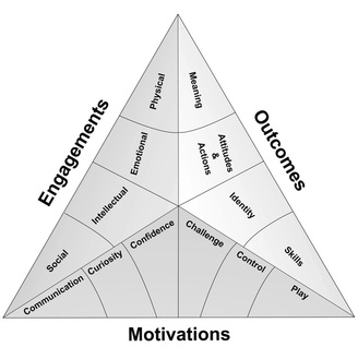
Then, using features of this exhibit as an example, Perry explores the six motivations that sit at the base of the Selinda model of learning (shown below). They’re described in terms that will make the most sense in the context of hands-on exhibits, although the fundamental principles can be applied more broadly. I’ll summarise these briefly below (to the extent that I can summarise several book chapters in a single blog post!) . . .

The Selinda Model of learning (Source: Selinda research)
  1. Communication: “Visitors are smarter than we think they are and know less than we think they do . . . [D]esign interpretation that gives visitors what they need to start a naturally occurring meaning-making process with their companions” (Perry, 2012, p. 94). People often visit museums in groups. Exhibits should acknowledge this, allowing for and encouraging social interaction and collaboration between visitors within social groups. Cater for a range of abilities (especially in exhibits targeted at families where there will be children at different ages). Use natural language in labels. Identify points where visitors may get stuck and offer guidance.
  2. Curiosity: Stimulate perceptual and intellectual curiosity. Pique interest by leaving some things unsaid – while too little information can be frustrating, if things are too obvious then curiosity can wane.
  3. Confidence: visitors will be motivated to learn in situations they feel “safe and smart”. (ibid, p. 118). Feedback should come early and come often. Success breeds a feeling of success and exhibits should guide the visitor through a “series of minisuccesses” (ibid, p. 131).
  4. Challenge: confidence and competence needs to be balanced with an appropriate level of uncertainty and challenge. Ensure visitors are clear what is expected of them, but don’t suggest that success will be automatic – visitors will not feel challenged if they can just go through the motions and be successful anyway.
  5. Control: the need for us to have control over our environment is an important facet of the psychology of visitor experiences. Visitors will feel in control when they have appropriate choices and the power to influence what happens in the environment.
  6. Play: play and the ability to engage the imagination is an essential ingredient of free-choice learning. ” . . . visitors who have the most satisfying and enjoyable experiences are those who feel the most playful – playful with actions yes, but also playful with ideas, playful with thoughts, playful all over” (ibid, p. 171).

Perry, D. (2012). What Makes Learning Fun? Principles for the Design of Intrinsically Motivating Museum Exhibits. Lanham, MD: AltaMira Press.