Over the past couple of days I’ve been catching up on back episodes of Suse Cairns’ and Jeffry Inscho’s Museopunks podcast series. This morning I was listening to Episode 2, which is on design and design thinking for museums.
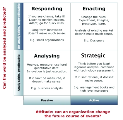
Now while I’ve heard a lot said about design thinking over the past couple of years, I have to confess I’ve had a bit of trouble wrapping my head around what design thinking actually is. Then just last week someone helpfully tweeted a link to this post, which I found enormously enlightening as it positioned design thinking in contrast to other, more traditional ways of thinking and problem solving. In essence, design thinking comes about as a consequence of seeing the world as being essentially unpredictable, but at the same time seeing people and organisations as having the power to influence the future (although the outcomes of our actions can’t be predicted at the outset). In that conceptual framework, I can see how the iterative, prototype-and-test approach of design thinking fits. (Ironic that my analytic brain needed a box to fit it in before I could really grasp it!)

Then this morning I was listening to Dana Mitroff Silvers being interviewed on museopunks and got really excited when she mentioned empathy [1] as the jumping off point for design thinking (more on this in her Museums and the Web paper). Essentially, before we can go off designing “solutions” to things, we need to empathise with our audiences/users, in other words understand whatever “problem” we’re trying to solve from their perspective:
. . . the majority of museums have yet to adopt mindsets and attitudes that are truly visitor-centered. . . Despite the lip service paid to the voice of the visitor, the expertise of museum staff is often afforded higher priority than the visitor insights and experiences. . . As a result, museums have been slow to keep pace with the expectations and interests of visitors, who increasingly expect experiences, services, and products that are intuitive, responsive, and well designed. [2]
The depth of understanding required to achieve this empathy goes beyond that possible with simple surveys or focus groups, and requires ethnographic methods and detailed interviews. The paper offers some useful tools and approaches for doing this.

The M&W paper gives a good summary of these five stages, including examples and practical tips. There is also a spinoff website: Design Thinking for Museums.
I find these ideas really fascinating and exciting, and they present a real challenge to the “traditional” model of exhibition design procurement. This is the model I have worked within when working as a design consultant, particularly for new-build museums: exhibitions are procured using very similar processes to those used in construction or engineering (in new museums, the overall project management team is likely to be the same people who oversaw the cranes-and-concrete stage). Exhibitions are viewed as products that are subject to competitive tender and linear signoff processes. Going back to the grid above, these processes are very much in the bottom half – analytic and strategic – outcomes are assumed to be quantifiable and predictable at the outset. In contrast to an iterative design process, these processes result in something I’ll call “ratchet design” – design as a one way process. If something doesn’t turn out as originally planned, then that counts as a “failure” which is going to result in lost time, sunk costs and a whole lot of finger pointing.
For several years, designers (and others) have been saying that the “ratchet” approach doesn’t do anyone any favours. Follow any design group on LinkedIn for long enough and the same issues will reappear: design competitions as part of a tendering process force designers (often without payment) to solve a problem before they have a chance to adequately define it. Then, once a designer appointed, the lack of scope for iteration makes it easier for everyone to just “play it safe”, limiting creativity and innovation. Ironically, exhibition projects are often shoehorned into this analytical-strategic construction model in the interests of “best value”. Uncertainty might scare the bean counters, but all that ends up happening is that everyone hedges against it by upping their contingencies, ultimately driving up costs.
At the moment, it appears that design thinking in museums is most commonly applied to smaller, agile projects run by in-house teams (although I’ve been out of the consultancy game for a while now and maybe the tide has turned somewhat). It would be great to see a design thinking approach applied more widely and at larger, whole museum scales (and for the bean counters to have sufficient faith in the process to allow this to happen).
[1] Recently I’ve been thinking and writing about empathy in the context of interpretation and the relationship between museums and their visitors/guests/however we are to define them. I was writing about this, completely unaware of this parallel discussion that had been going on around empathy and design. It’s great to see synchronicities like this.
[2] Mitroff Silvers, D, Rogers, M and Wilson, M. (2013) Design Thinking for Visitor Engagement: Tackling One Museum’s Big Challenge through Human-centered Design. Paper presented at the 2013 Museums and the Web conference, Portland, Oregon.


