The diorama, typically comprising “preserved organisms and painted or modelled landscapes” (Tunnicliffe and Scheersoi, 2010, p. 187), has been a mainstay of Natural History museums for well over a century. While they are often much maligned as old fashioned by many museum professionals, they continue to be popular with visitors and can be valuable learning tools (Tunnicliffe and Scheersoi, 2010).
My recent visit to the US as well as my own research have got me wondering about the essential ingredients of ‘diorama-ness’. What would a psychological schema of a diorama be from a visitor’s perspective? When does a diorama stop being a diorama?
I would suggest that the displays at the American Museum of Natural History would be the closest to the traditional diorama archetype.

Traditional dioramas attempt to re-create a naturalistic setting as closely as possible. The back wall of the diorama is often curved to enhance the effect of a foreground and a horizon:

The dioramas are the principal focus of the exhibition, with the surrounding areas kept in relative darkness:

By contrast, the mammals displays in the Smithsonian Museum of Natural History take a different approach. Rather than a sequence of identically sized and evenly spaced dioramas, the space is more open and varied in height and scale:

While backdrops are still used to evoke a habitat or setting, there is no attempt to make these look realistic. Rather, the multiple layering of two-dimensional images gave a ‘picturebook’ feel to the displays:

The Smithsonian displays also sometimes showed multiple levels of the same scene, something I don’t recall seeing in the AMNH dioramas. For instance some dioramas included peepholes to see creatures hiding below ground:

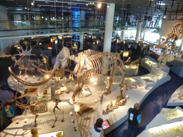
While I’m happy to consider these displays as a version of a diorama, I wonder if other visitors’ interpretation is as flexible. Consider the Biodiversity Gallery at my research site, the South Australian Museum:

As with the Smithsonian, these displays are a variation of the diorama archetype. While the displays have quite realistic foregrounds, these are set against a simple blue background:

Beyond the dioramas, there is further use of design to evoke the habitat – in the forests area, lighting combines with a ceiling feature to create an arboreal feel to the space:

However, this effect is subtle for those not attuned to seeking out design features. It was not explicitly mentioned by most visitors who I accompanied through this space, suggesting they either didn’t notice it because their attention was absorbed by the displays themselves, or they didn’t think it was worth mentioning. (Some noticed a change in the feel of the space but couldn’t quite put their finger on what was different.)
Design concerns aside, do the displays in the Biodiversity gallery count as dioramas? In the words of one of my research participants:
It’s not even a proper diorama, because the background’s missing. . . .
Further probing revealed that the painted background on a curved background (creating the artificial horizon) was an essential part of the diorama ‘schema’ for this visitor. However she continued to use the word ‘diorama’ to describe the displays, presumably in the absence of a more appropriate word.
What are the essential ingredients of a diorama to you?
Reference:
Tunnicliffe, S. D., & Scheersoi, A. (2010). Natural History Dioramas: Dusty Relics or Essential Tools for Biology Learning? In Anastasia Filippoupoliti (Ed.), Science Exhibitions: Communication and Evaluation (pp. 186-216). Edinburgh: MuseumsEtc.

Hi Regan, this is an interesting discussion. I worked for Mothers Art when we were designing the Biodiversity Gallery and worked on the general layout of the space. I haven’t seen the finished work though! I also discuss dioramas in my thesis – I’m a critic and an admirer. Lucky you for getting to the US to see such iconic dioramas first hand. The postmodern reinvention of taxidermy in new open case displays still belies their origins as trophies from exotic lands set into contrived visions of nature.
I didn’t mean that to sound as though I designed anything – I just worked on mapping out the vast amount of content and specimens and how we could group them.
Hi Toni,
I would argue that the sorting and grouping of specimens is part of the design process too! I think we’re in a similar boat here, with both of us having worked in design firms but not being designers as such. I used to be very careful to not call myself a ‘designer’ as that wasn’t the skill set I brought to the table.
Maybe this is the long lens of hindsight talking, but I’m less reluctant to claim the ‘designer’ mantle as I once was. When I was at HSD I think the best work we did was when ‘Interpretation’ people and ‘Design’ people bounced off each other, influenced each other and created things that we probably wouldn’t have managed in isolation from one another. I now see that as integral to the design process and something I still love getting my hands on whenever I get the chance!